In my last post, I covered speccing RGB colors for brand guidelines, colors that are becoming more important as we shift away from a print world. Today I’m going to talk about font specifications, an area that is also commonly misunderstood by designers.
The trend I see over and over is that designers will either specify fonts that are trendy, or fonts that are unusual. Useability seems to be way down on the list of font attributes in a designer’s mind.
Trendy Fonts: Curse of the Brand Guidelines
Examples of trendy fonts include Gotham at the moment, Frutiger for the last 10 years and before that Helvetica. Remember when everyone used Helvetica for everything? Thank god those days are over. Trendy fonts are both a stylish and safe choice. After all, if everyone else is using it, it must be hip and it must be good!
In reaction to the safe, stylish choices, some designers choose to be bold iconoclasts and spec fonts that are quirky or odd. These are designers who want to be remembered for their bold choices and their ability to define new directions.
But hmmm, what’s missing? Are we forgetting something? Oh right, the needs of the client!
As soon as you start to work directly with the client to implement guidelines in the real world, you immediately notice a number of drawbacks to the choices of fonts:
- Most designer fonts are not embeddable in Microsoft Office. Word and PowerPoint only allow TrueType fonts to be embedded, but most fonts in use by designers are PostScript or OpenType.
- Even when the fonts are embeddable, often the resulting document is not editable because paranoid type foundries have crippled the fonts.
- Specifying a designer font for corporate documents means that the fonts would have to be purchased for all users in the company (a huge cost) and then installed on each desktop and laptop (a giant hassle for I.T.).
- If the client emails documents to clients or partners for collaborative input, the designer fonts are silently substituted and the whole appearance of the document falls apart.
After we walk designers through the steps above, their usual decision is to spec designer fonts for printed pieces (an ever-shrinking piece of the brand pie) and Arial and Times New Roman for everything else! Well that certainly leaves the client looking anonymous! What was it they hired a designer for again?
This is so sad, but folks, it doesn’t have to be this way. It’s 15 years since the only choices were Arial or Times New Roman. Microsoft Office comes with a wealth of fonts that are installed with the software. Yes, some of these are crappy, there are are many gems in there too.
Brand Guidelines That Show Your Client Some Love
We’ve created a list of useful fonts that come with Microsoft Office. These are useable text fonts, we didn’t include display faces, script fonts or faces that only have one weight. Our list tells you which Office versions have which fonts. Our list gives you clickable previews of the whole font.
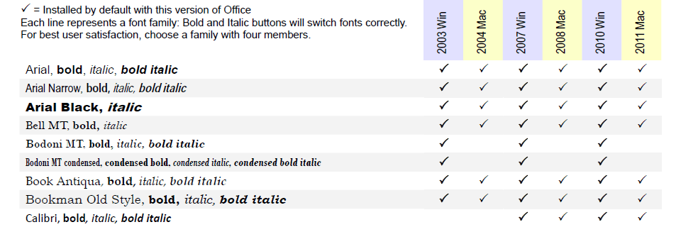
Part of our PDF showing useful fonts that are installed with Microsoft Office.
These are the best fonts to choose for user-filled text.
Contact us for the full PDF that shows full-font previews.
Drop me an email and I’ll send you the full PDF, updated for current versions.
Significant Advantages for Your Client
There are significant advantages to speccing these fonts:
- They come free with Microsoft Office and are already installed on every computer. This saves your client a boatload of money and installation hassles.
- Since these fonts are are most computers that have Word, collaboration is possible. Your client can email a document to their clients or partners without fonts being substituted. The document remains fully editable.
- You can still achieve a distinctive brand identity for client documents with only a few moments research.
Desktop-generated documents are the vast majority of documents created by your client, dwarfing the few printed pieces they may create. It’s time to jump out of the print-oriented mindset and find ways to brand your client in every document from every source. Creative use of available fonts is one way to get there!

