Word’s default settings hide crucial formatting information. Professional editing of Word docs requires you to change the program’s display parameters.
In effect, paragraph formatting is stored in the paragraph mark and section formatting is stored in the section break after the relevant content. But Microsoft decided users wanted a pretty interface rather than a functional one, so they chose to hide both entities by default. Every hour of every day, thousands of documents are getting mangled because of this design decision.
Likewise, every graphic in a Word document is anchored to a paragraph. Delete the paragraph, poof, graphic gone. Move the text to a new page and the graphic moves with it. But the anchor is invisible! Let’s fix this!
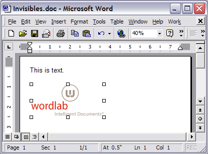
The normal Word view: pretty, but not informative.
Here we can see that the graphic is anchored to the first paragraph and that anchor is locked. The first paragraph is separated from the second by a continuous section break, which means the page formatting could be totally different for the two paragraphs. The word “text” has been bookmarked. We can take care to format this without ruining any of these characters, now that we can see them.
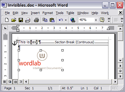
Word’s Useful View
How to Set Up Word for Windows for Professional Editing
The first step to professional editing in Word is to display all the hidden formatting marks. Here’s how to do that in each version:
Word 2003
- Choose Tools>Customize>Options.
- Uncheck Show full menus after a short delay and
- Check Always show full menus. Click on Close.
- Choose Tools>Options>View.
- In the Show section, check Bookmarks.
- In Formatting Marks, check All.
- Under Print and Web Layout options, check Object anchors, Text boundaries, White space between pages and Vertical ruler.
Word 2007
- Click on the Office button and then on the Word Options button.
- Select the Display pane.
- Check Show all formatting marks.
- By default,Show white space between pages in Print Layout view should already be checked. If not, check it.
- Now choose the Advanced pane.
- Under the Show document content section, check Show bookmarks and Show text boundaries.
- By default, under Display, Show vertical ruler in Print Layout view should already be checked. If not, check it.
Word 2010
- Click on the File tab and then the Options button.
- Select the Display pane.
- Check Show all formatting marks.
- By default,Show white space between pages in Print Layout view should already be checked. If not, check it.
- Now choose the Advanced pane.
- Under the Show document content section, check Show bookmarks and Show text boundaries.
- By default, under Display, Show vertical ruler in Print Layout view should already be checked. If not, check it.
Word 2013 and 2016
- Click on the FILE tab and then the Options button.
- Choose the Display pane.
- Check Show all formatting marks.
- By default,Show white space between pages in Print Layout view should already be checked. If not, check it.
- Now select the Advanced pane.
- Under the Show document content section, check Show bookmarks.
- By default, under Display, Show vertical ruler in Print Layout view should already be checked. If not, check it.
How to Set Up Word for Mac for Professional Editing
Word 2004, Word 2008 and Word 2011
- Choose Word>Preferences>View.
- Under Show, check Object anchors, Bookmarks and Text boundaries.
- Under Nonprinting characters, check All.
- Under Window, Vertical ruler should already be checked. If not, check it.
Word 2016
- Choose Word>Preferences>View.
- Under Show in Document, check Object anchors and Bookmarks.
- Under Show Non-Printing Characters, check All.
- Under Show Window Elements, Vertical ruler and White space between pages in Print Layout View should already be checked. If not, check them.
Some Useless Options
Unchecking these options can save your time and sanity:
- When selecting, automatically select entire word, to enable per-character formatting and correcting,
- Keep track of formatting, so Word will not create a new style for every little formatting change, and
- Scale content for A4 or 8.5×11″ paper sizes, so all branding and placed graphics will print undistorted.
Just doing these steps will give you a leg up on 99% of the rest of the world in terms of professional formatting in Word. The great majority of formatting screwups are the result of inadvertently deleting the hidden formatting characters. Next post, we’ll get into more details about how these formatting marks actually work.
Is Microsoft Publisher better than Word? For design-intensive documents like newsletters, the answer is YES!
We recently had a request to transcribe a full-scale 16-page magazine layout from InDesign to Word. We recommended using Microsoft Publisher. In addition to the usual Word, PowerPoint and Excel, many versions of Office include Microsoft Publisher, a lightweight but capable desktop publishing program.
MS Publisher is comparable to PageMaker, for those of you that have been in the industry long enough. The interface is similar enough to other Office products that the learning curve is fairly low. But the best part is that it’s free and already installed in most offices. Your client doesn’t have to buy or install anything to get good quality design documents.
Users will find useful features like:
- master pages,
- Pantone and CMYK color models,
- the ability to make color seps and print to a real press,
- measurements to 1/1000 of an inch and
- many others.
Word doesn’t have any of these.
Microsoft Publisher for Modular Design
But perhaps the greatest advantage lies in a fundamental design choice in Word. Publisher does not link everything to the text stream. Just like InDesign and Quark, pages and graphics exist as independent entities that stay where you put them. In Word, all page breaks, placed graphics, column breaks, etc. are anchored to the text string. When the text is edited, all elements move in relation to it. This isn’t a defect, just the fundamental difference between a word processor and a page layout program.
Designers rarely recommend Publisher simply because they’re unfamiliar with it. It’s a Windows-only product, so they don’t see it in their copy of Mac Office. Microsoft doesn’t advertise it as a feature product. But Publisher is ideal for newsletters, brochures and magazines. Consider it for any document where you need a flexible layout with lots of graphics, photos and articles.
These types of files can be done in Word, but they are always less reliable and more limited. Word is still a better choice for documents that must be editable by anyone at the client’s office. Publisher is not universally installed and does require a little familiarity. For design-intensive Word files, we suggest additional tech support time to help handle the inevitable “I deleted a paragraph and my photo disappeared as well!” questions.
Microsoft Publisher Case Study
New York University needed a flexible ask brochure to help raise construction funds from donors. They required an electronic document that could have pages added and removed at will (not a strong point of Word!). They also needed to customize the brochure with each donor’s name and information before printing it out on a color copier. Publisher met their needs for handling large linked graphics and color consistency using Pantone specs. Here’s what the cover looked like:

Cover of NYU ask brochure in Microsoft Publisher
Do you have a client newsletter project coming up? Give us a call at +1 201 664 6007 to discuss whether Microsoft Publisher might suit your client better.
Theoretically, there is no such thing as RGB tints. Color theory uses “tint” as any lighter hue of a color. Often this will be explained as what happens if you mix a color with white, though anyone who has spent any time mixing colors has noticed that adding white pigment changes colors in other ways than simply making them lighter.
In the commercial art world, tint is nearly synonymous with screen, because the traditional way of creating lighter shades of a base color is to print it with a halftone screen.
Because of this tradition, brand guidelines often augment a base set of colors with a subset of pastels referred to as tints or screens. This all makes perfect sense in a print-oriented world. However, when you move into digital display color, there are no screens any more. So how do we interpret brand guidelines for RGB-only software like Word, PowerPoint, Excel and the web?
Brand guidelines now normally include RGB numbers for the base colors of a brand, but tints rarely have an RGB equivalent. The designer just specs 20% of PMS 286 and lets you figure it out.
A Calculator for RGB Tints
You can do it with Illustrator, but it’s a little roundabout. You create an RGB color, save it as a swatch, being sure to over-ride Illustrator’s efforts to keep turning it into CMYK. Then you can spec a percentage of the swatch and finally find out the RGB value of that percentage.
Or you can just use the handy dandy RGB Tint calculator on this very web site. Simply enter an RGB or hexadecimal color value, then the tint percentage, and you get an instant readout of the new color values along with a preview of the color appearance. In addition, it makes a useful RGB-hexadecimal convertor, though there are plenty of other ways to do that operation.
This is a tool we developed for our own template creation work, but you may as well get some use of it too. Enjoy!
In my last post, I covered some basics on logo production for use in Word, PowerPoint and Excel. This post will continue that topic with some trade secrets, tips and tricks to make logo production easier.
Let’s start at the beginning with the file that’s to be turned into a graphic. Is there a black element in the logo? If there is, you need to do some special handling. In most design programs, black is not necessarily black. Most artists, coming from a print production background, assume that applying C0 M0 Y0 K100 will give them black. If this was a logo you were actually printing, it would. But you’re not.
You’re going to translate this logo into RGB, which is the only color model used by Word, PowerPoint and Excel. (If you use Office on the Mac, the color picker makes it appear you are choosing other color models, but behind the scenes your choices are all translated to RGB.)
If you watch the color values in Illustrator, when you change C0 M0 Y0 K100 to RGB, you’ll see that you do not get black (R0 G0 B0). You get dark grey, something like R35 G31 B32. Shake off that print mentality! The rule of thumb is: on all designs destined for Office, change all color values to RGB, preferably using the Pantone Color Bridge values.
Logo Production Trade Secret
The trade secret for this piece is a shortcut that will save you lots of time at the cost of some system setup. For most logos, we do not use the Illustrator file that is linked to the final art. Instead, we use a PDF of the final art, since the logo has been placed at its final size here. To get our logo file, we resize the PDF to get the total number of pixels we want, make a screen grab of the logo, then paste it into Photoshop.
Here’s the theory behind what we’re doing. The screen grab is at screen resolution, but our final file must be print resolution at 600 d.p.i. (For PowerPoint, we use 384 d.p.i., which is exactly 4 times the default Windows screen resolution. This displays beautifully and still prints well.) So we’re enlarging the PDF to get the number of pixels we need on the display. Then when the screen grab is pasted into Photoshop, we tell it that the resolution is 600 d.p.i. If our math is right, the final logo will be exactly the same physical size as the final design, but at a high resolution.
Here’s the system setup part. The calculations are a LOT easier if both your screen and Acrobat are set to 100d.p.i. If you’re using Windows, setting your screen to 100 d.p.i. means opening your Display control panel, clicking on the Setting tab and the Advanced button. On the General tab, change DPI setting to Custom setting and try 104%. On most systems, that will get you 100 d.p.i.
Non-Retina Macs should already be running at 100 d.p.i. Now open Acrobat and choose Edit>Preferences>Page Display. Under Resolution, choose Use system setting, which should say 100 pixels/inch. OK out.
You should be good to go. Open the design PDF with logo, set the zoom to 600% and choose the Edit>Take a Snapshot command. Draw a marquee around the logo. Here’s a cool tip: even if the logo does not fit on your monitor, drag the marquee over to the side of the window, forcing the graphic to scroll. Acrobat captures all parts of the selection even after it has scrolled off to the side! When you let go of the mouse, the screen will blink, indicating that the image is on the clipboard.
Now switch to PhotoShop. Choose File>New and the suggested size should match the area you just grabbed. Change the resolution to 600 d.p.i. Paste the logo.
Now crop it. Our practice is to do the initial crop leaving one pixel of background clear on the top and left sides of the image. This compensates for Word 2003’s propensity to display the logo on-screen looking like the top or left is “clipped”, even though it prints fine. Crop the right and bottom edge to contain the faintest shading of the logo and no more.

Left: raw screen grab
Right: initial crop – 1 pixel top and left, no clearance right and bottom.
Minimal File Size with Precise Sizing in Office
Word, PowerPoint and Excel can only measure to 1/100″. So if your logo is big or small by a few thousandths, Word will resize it vertically or horizontally to make it fit. Your logo will be slightly distorted. So now we’re going to add back some of the background. In PhotoShop, choose Image>Canvas Size and change the units of measurement to inches. Round the numbers up to the next highest 1/100 of an inch, so 1.999 becomes 2.0, 12.742 becomes 12.75, etc. Set the canvas addition to flow to the right and bottom, as in this screen shot:
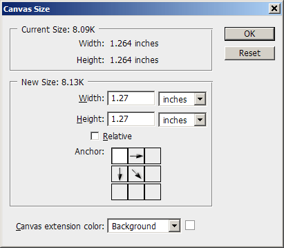
Dimensions rounded up to next 1/100″, canvas set to increase right and bottom size.
Click on OK. In the Layers palette, choose Flatten Image. Now follow the steps from last week’s post: choose Image>Mode>Indexed Color, set Palette to Local (Adaptive), reduce the colors to 8 for each color in the original logo (so a 2-color logo will use 16 colors), set Forced and Dither to None, click on OK. Save as PNG for most uses.
There you have it, your first professional Office-ready logo file! It will look good and print sharp, it will be size-accurate and the file size is tiny. Congratulations!
March 2017 edit: This article is still relevant if you must use bitmap-format logos. Vector-based logos offer significant advantages, like not getting blurry when image compression is used on the file. Here’s the state of the art: Best Quality Logos for Office
JPEG logos are the automatic choice for most artists when a client needs a wordmark in Office. It’s the worst possible format.
JPEG seems to be the all-purpose file format where the designer realizes they need to place an image with a smaller file size than a full-scale EPS or TIFF. The JPEG format is fine for photos and photo-like graphics, such as graduated tone areas. But it has 2 things going against it for flat color line art: lossy compression and the RGB color space.
The Disadvantages of JPEG Logos
Lossy compression renders flat color as a pixelated and sharpened hodge-podge where every pixel can be a different variation on the original color. You’ve all seen this on blowups of low-quality JPEGs where weird textures are introduced to areas that were formerly smoothly shaded. Lossy compression does reduce the size of the file, but at a visual cost. When you’re dealing with flat color, this visual cost is all too noticeable.
The other down-side to JPEG is the RGB color space. While admirably suited to photos, it’s simply not needed for line art logos. The RGB color space means thousands of color definitions are stored in the file, even for a logo that started as 1 color when it was a happy piece of vector art. This bloats the file size
The net result is a fuzzy, textured logo that is just too big. Then the client wonders why their letterhead template is over a megabyte before they type one word. Instead, let’s go back to first principles and figure out how to do this right.
The Alternative to JPEG Logos
The average logo starts life as an Illustrator file colored with one or two colors. How can we keep it as close to that original as possible?
Let’s start by throwing out the RGB color space. We don’t need millions of colors, we only need a few. Let’s use Indexed Color instead. With indexed color, only a few color definitions need to be stored in the file, so the file size goes way down. It goes down so much, that we can now increase the resolution of the image to get better sharpness.
Let’s go through it step by step. If you’re using Adobe products, it takes 2 steps to get to indexed color. First you have to export the logo from Illustrator as RGB, but to a file format that is not lossy, like TIFF. Then you open the RGB file in PhotoShop and reduce the image to indexed color.
Open a test logo in Illustrator. Start with a one-color version to make life simple. Now use the File>Export command with the following settings:
Save as type: TIFF
(Click on Save)
Color Model: RGB
Resolution: Other 600dpi
Anti-aliasing: Art Optimized (Supersampling) – assuming logo text has been converted to curves.
Check LZW Compression and click on OK
Now open the TIFF in Photoshop. Choose Image>Mode>Indexed Color and the following settings:
Palette: Local (Adaptive)
Colors: 8
Forced: None
Dither: None and click on OK
The format to save in depends on which version of Office your client is using (you did ask, didn’t you?). GIF format stores more compactly in Office 2003 and earlier. PNG has a smaller file size in Office 2007 and above. The difference is not huge and PNG has the advantage of remembering its resolution, so you could safely just stick with it if you’re not sure. GIFs always import into Office under the assumption that they are 72 d.p.i., which means your logo have to be reduced to the correct size after placing in Word or PowerPoint.
The Proof That JPEG Logos Suck
Are you skeptical that it’s worth the trouble? Here’s an enlargment of a typical artist’s result at left versus a Brandwares logo on the right:

Enlargement of a typical artist-supplied 300dpi RGB JPEG.
OK, it’s obvious the indexed color image looks way better. But the other benefit is that it’s also much a much smaller file size. Typically, the crappy-looking JPEG will be 8 (yes, eight) times larger! I know, file size may not matter to you, but it does to your client. They have to pay for storage for thousands of documents based on your template. The rule of thumb is: if your letterhead is bigger than 100kb, you’re doing something wrong. Ours range between 40kb and 90kb.

Enlargement of a Brandwares 600dpi indexed color PNG.
It’s not a lot more work to give your client a superior product. Forget JPEG as a logo format, just use it for photos. Indexed color PNGs are the way to go for line art.
March 2017 edit: This article is still relevant if you must use bitmap-format logos. Vector-based logos offer significant advantages, like not getting blurry when image compression is used on the file. Here’s the state of the art: Best Quality Logos for Office
In my last post, I covered speccing RGB colors for brand guidelines, colors that are becoming more important as we shift away from a print world. Today I’m going to talk about font specifications, an area that is also commonly misunderstood by designers.
The trend I see over and over is that designers will either specify fonts that are trendy, or fonts that are unusual. Useability seems to be way down on the list of font attributes in a designer’s mind.
Trendy Fonts: Curse of the Brand Guidelines
Examples of trendy fonts include Gotham at the moment, Frutiger for the last 10 years and before that Helvetica. Remember when everyone used Helvetica for everything? Thank god those days are over. Trendy fonts are both a stylish and safe choice. After all, if everyone else is using it, it must be hip and it must be good!
In reaction to the safe, stylish choices, some designers choose to be bold iconoclasts and spec fonts that are quirky or odd. These are designers who want to be remembered for their bold choices and their ability to define new directions.
But hmmm, what’s missing? Are we forgetting something? Oh right, the needs of the client!
As soon as you start to work directly with the client to implement guidelines in the real world, you immediately notice a number of drawbacks to the choices of fonts:
- Most designer fonts are not embeddable in Microsoft Office. Word and PowerPoint only allow TrueType fonts to be embedded, but most fonts in use by designers are PostScript or OpenType.
- Even when the fonts are embeddable, often the resulting document is not editable because paranoid type foundries have crippled the fonts.
- Specifying a designer font for corporate documents means that the fonts would have to be purchased for all users in the company (a huge cost) and then installed on each desktop and laptop (a giant hassle for I.T.).
- If the client emails documents to clients or partners for collaborative input, the designer fonts are silently substituted and the whole appearance of the document falls apart.
After we walk designers through the steps above, their usual decision is to spec designer fonts for printed pieces (an ever-shrinking piece of the brand pie) and Arial and Times New Roman for everything else! Well that certainly leaves the client looking anonymous! What was it they hired a designer for again?
This is so sad, but folks, it doesn’t have to be this way. It’s 15 years since the only choices were Arial or Times New Roman. Microsoft Office comes with a wealth of fonts that are installed with the software. Yes, some of these are crappy, there are are many gems in there too.
Brand Guidelines That Show Your Client Some Love
We’ve created a list of useful fonts that come with Microsoft Office. These are useable text fonts, we didn’t include display faces, script fonts or faces that only have one weight. Our list tells you which Office versions have which fonts. Our list gives you clickable previews of the whole font.
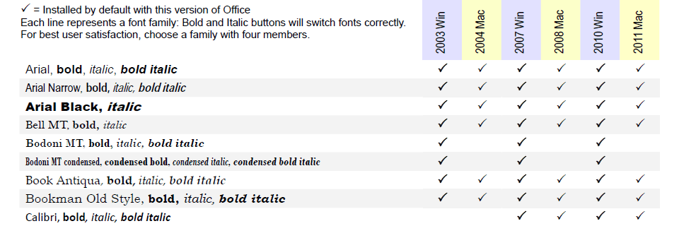
Part of our PDF showing useful fonts that are installed with Microsoft Office.
These are the best fonts to choose for user-filled text.
Contact us for the full PDF that shows full-font previews.
Drop me an email and I’ll send you the full PDF, updated for current versions.
Significant Advantages for Your Client
There are significant advantages to speccing these fonts:
- They come free with Microsoft Office and are already installed on every computer. This saves your client a boatload of money and installation hassles.
- Since these fonts are are most computers that have Word, collaboration is possible. Your client can email a document to their clients or partners without fonts being substituted. The document remains fully editable.
- You can still achieve a distinctive brand identity for client documents with only a few moments research.
Desktop-generated documents are the vast majority of documents created by your client, dwarfing the few printed pieces they may create. It’s time to jump out of the print-oriented mindset and find ways to brand your client in every document from every source. Creative use of available fonts is one way to get there!
Brand guidelines are an essential part of establishing worldwide graphic standards for any large company. When they are done right, they’re an effective way to propagate the corporation’s standards to remote markets. Unfortunately, when they contain errors, those errors are almost impossible to correct in a systematic way.
Brand guidelines are a top-down or hierarchical means of propagating the corporation’s brand. One design firm sets the standard, the standard is approved by head office and then distributed to subsidiary designers. There are two weak points in this structure that can lead to branding errors, if not disasters.
The first weak point is at the graphics company that creates the standard. Brand guidelines are a lot of work and many hands are required to meet the deadline. All too often, tasks that are deemed “less important” are farmed out to junior designers and approval of their work can be perfunctory under pressure. Even when senior people are working hands-on with specifications, their familiarity with all the end uses of the guidelines can be hazy or rooted in old practices that are no longer relevant.
Vulnerability number 2 is at the approval stage by the client business. This is a yawning chasm, because there is often a huge knowledge gap between the designer and the client. More often than not, the client looks over the pages, gets all impressed and loses any sense of critical analysis of the content. If there are errors in the document, they are unlikely to get caught here.
Brand Guidelines must include RGB
One of the ways that I discern expertise in a design company is by how they specify RGB equivalents for the colors in brand guidelines. As with many aspects of the design world, color specification had its roots in defining standards for print applications. The dominant model was and is the Pantone Matching System and it’s poor brother in process color, the CMYK equivalent. PMS and CMYK numbers have been the main modes of color specification in brand guidelines for decades.
RGB equivalents to Pantone specs are relative newcomers to the party. They’ve really only become commonplace in the last 10 years. RGB colours are vital to web and mobile applications, but they are also the native color model for Microsoft Office. Even Adobe Acrobat, when queried as to the color of an element, reports back in RGB. Let’s face it, the digital realm is RGB and the digital realm is the future. So let’s get it right!
Getting it right sounds easy, but there is no universally accepted equivalence between Pantone or CMYK and the RGB color models. It’s notoriously difficult to compare monitors with ink swatches. Each software vendor has come up with their own conversion tables. Adobe provides swatches for 10 different versions of Pantone colors. Between coated vs uncoated, process vs solid and color bridge vs solid to process EURO, its amazing anyone gets any colors picked at all! The RGB numbers that you get out of these models is all over the map. I’ve seen blues that were supposed to resemble the rich deep blue of PMS 286 that looked more like a robin’s egg!
The RGB in Brand Guidelines Can’t be Invented In-House
Even worse is the plucky designer (I’ve spoken to more than one!) who tries to make up their own RGB colours by invented new combinations on their monitor. They either forget, or have never learned, that Mac displays and Windows monitors show very different results, and that in the Windows world, color uniformity is only a theoretical dream. The colors you pick on your Mac monitor are guaranteed to look different on your client’s PC.
Needless to say, this is a hazardous way to pick colors for your client’s web site and office documents. I’ve seen it too many times: a Pantone 486 that looks like salmon on the web, a Pantone 116 that comes out lemon in Microsoft Word. This is not a brand identity, this is brand suicide!
If anyone is listening, I’d like to suggest a solution that has worked well for my company and my clients: the Pantone Color Bridge swatch books and Pantone Color Manager software. It’s not that I’m an avid fan of Pantone, but I have found that the RGB values are, on average, across platforms and displays, closer to the appearance of printed PMS colors. It’s also a simpler process than trying to choose from a multiplicity of software color models.
With the books, there’s one for coated colors and another for uncoated and you have the reference swatch right in front of you while working. With the Pantone Color Manager software, you have access to all 11,000 Pantone colors and their RGB equivalents for a very reasonable price.
If you have a branding color horror story, or a suggestion for a superior RGB conversion table, please feel free to comment. I’d love to hear from you!
In the years I’ve spent creating great documents for companies, its become painfully obvious that the best practices are unknown to design professionals. Almost all of the files we receive as source material, whether they have been created by graphic artists or end user, are badly constructed and unreliable.
Best Practices are not about looks
I’m not talking about aesthetics. The documents created by artists are usually quite pretty. I’m talking about how well they are constructed. Most artist-created Office documents are like beautiful houses built on sub-standard foundations. It just takes a little tremor to make them crumble.
This is not the fault of the users or artists. There is no leadership from Microsoft or Adobe. There’s no awareness of this issue at educational institutions. There is some good information from the web community, but you have to seek it out and discern good from bad advice. This is why I have started this blog, to create a place for sharing proven best practices for document creation.
This will not be a hard and fast set of rules. There are always many ways to solve problems and I’m always discovering new creative solutions to seemingly intractable problems, both through my own work and by looking at the work of others. My guiding philosophy is to always picture the end user. What will make their life easier? How can I create a document that will be so easy to use and bullet-proof, it disappears? Disappears in the sense that it becomes a conduit for the user’s efforts instead of an impediment to their work.
I hope you will find this journal useful and informative. I hope it will let you work better. And I hope it will remind you to always look at your work from your clients or users point of view.

