Love it or hate it, but Microsoft has made decisions on how you should work with office software. Working within their limitations, your users can have productive careers and get things done. Ignore the limits and you are sentencing your users to hours of formatting hell. A prime example is Office charts
Office charts should have 6 colors maximum. The is a rule made by Microsoft. The exception to this rule is charts in Excel 2003 and earlier, which can have a maximum of 56 colors (see my previous posts for the details on Excel 2003). The following applies to Microsoft Word, but it’s more often a problem in PowerPoint.
If you design charts with more than 6 colors, you are forcing your users to either:
- copy, paste and reformat a sample chart into the one they want, or
- manually enter the colors for the series above 6 from a reference table of RGB values.
Neither of these could be considered a PowerPoint “Standard Operating Procedures”. Both workarounds are slow and error-prone.
Office Charts in Office 2003 for Windows or 2004 for Mac

PowerPoint 2003 Some color palette slots are used for as many as 3 functions. This makes it tricky to design a color sequence that works for all purposes.
PowerPoint only has code in place to automatically assign 6 palette colors to charts. In PowerPoint 2007 and higher, these are 6 distinct colors that are only used for charts and object fills. In PowerPoint 2003 and earlier, the chart colors are taken from the 8-color palette that is used for other elements as well. This has consequences you have not considered. Here’s how it works:
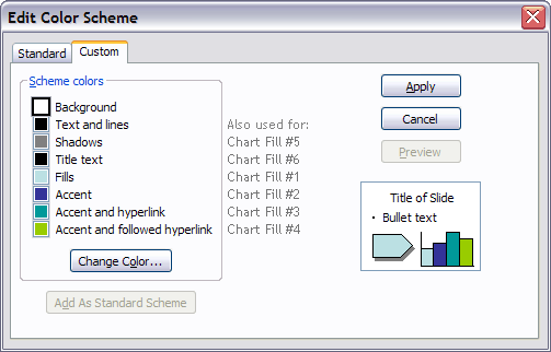
PowerPoint 2003 and earlier have color palettes with 8 colors maximum. In order, the colors are used for Backgrounds, Text and lines, Shadows, Title text, Fills, Accent, Accent and Hyperlink and finally Accent and followed hyperlink. Applying the recommended color position to a presentation element will mean that that element can be automatically updated if the palette is changed. This is a handy way to create color-coded sections in a presentation.
However, the same colors are used for Office charts. The colors are assigned in this order: Chart Color #1 is always taken from the Fill position. CC#2 is Accent, CC#3 is Accent and hyperlink, CC#4 is Accent and followed hyperlink, CC#5 is Shadows and CC#6 is Title text. Therefore, if you have designed a series of chart colors that is different from the code colors used the the presentation, you must give your users one of two headaches:
User headache number 1: You assign the color palette positions to create an automatically-filled chart, then manually assign all other presentation elements with RGB colors. This means new charts look swell, but color-coded sections cannot be easily updated. In fact, the colors of the entire presentation are must be updated manually element by element. Slow!
User headache number 2: You assign the color palette positions to the correct elements i.e., Title text is filled from the Title text palette position. New charts come in with goofy colors and each series must be manually reassigned from RGB values.
For PowerPoint 2003 and earlier, Microsoft has decided you only need 8 colors for everything. Designing with more colors does not make it a better design. It just makes it harder to use.
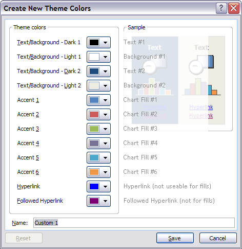
Office Charts in Office 2007/2010/2013/2016 for Windows or 2008/2011/2016 for Mac
For PowerPoint 2007 and later, Microsoft has decided you only need 12 colors for the presentation. Fortunately, now there is separation between color functions, with 2 colors for backgrounds, 2 for text, 6 for charts and fills and 2 specifically for hyperlinks. But you still only get 6 automatic chart colors. And in Office charts as in so many Office features, if it isn’t automatic, it’s a time-waster. So the advice still holds that speccing more colors is really imposing lower productivity on your users.
Charts apply this sequence in a predictable way. In a standard column chart, the leftmost column is color #1, with each extra column getting the next color in the sequence. Stacked columns display color #1 as the bottom layer and pie charts apply color #1 to the first pie segment, and by default this pie segment has its left border at 0 degrees, pointing straight up. If you design the presentation with this in mind, implementation is easy for the user.
In Office 2007 and later, there is one potential workaround that gives users access to 10 additional colors. It’s the Custom Color XML hack. This hack adds colors to the color picker in Windows and in Office 2016 for Mac. These colors cannot fill charts automatically and they will not show in the Office 2008 or 2011 for Mac color picker. However, it’s still a less cumbersome workaround than the 2 kludges I mentioned at the start of this article.
Are these limitation fair? No. Are Microsoft’s choices well considered? Not really. Are you going to change the way PowerPoint works by ignoring its limitations? Sadly, the answer is also no.
My recommendation is to incorporate a little Zen into your attitude, accept that PowerPoint (particularly the 2003 and earlier versions) is a deeply flawed and limited program. Then go and create some great Office chart designs with 6 colors or less that are easy to use.