In my last post, I covered some basics on logo production for use in Word, PowerPoint and Excel. This post will continue that topic with some trade secrets, tips and tricks to make logo production easier.
Let’s start at the beginning with the file that’s to be turned into a graphic. Is there a black element in the logo? If there is, you need to do some special handling. In most design programs, black is not necessarily black. Most artists, coming from a print production background, assume that applying C0 M0 Y0 K100 will give them black. If this was a logo you were actually printing, it would. But you’re not.
You’re going to translate this logo into RGB, which is the only color model used by Word, PowerPoint and Excel. (If you use Office on the Mac, the color picker makes it appear you are choosing other color models, but behind the scenes your choices are all translated to RGB.)
If you watch the color values in Illustrator, when you change C0 M0 Y0 K100 to RGB, you’ll see that you do not get black (R0 G0 B0). You get dark grey, something like R35 G31 B32. Shake off that print mentality! The rule of thumb is: on all designs destined for Office, change all color values to RGB, preferably using the Pantone Color Bridge values.
Logo Production Trade Secret
The trade secret for this piece is a shortcut that will save you lots of time at the cost of some system setup. For most logos, we do not use the Illustrator file that is linked to the final art. Instead, we use a PDF of the final art, since the logo has been placed at its final size here. To get our logo file, we resize the PDF to get the total number of pixels we want, make a screen grab of the logo, then paste it into Photoshop.
Here’s the theory behind what we’re doing. The screen grab is at screen resolution, but our final file must be print resolution at 600 d.p.i. (For PowerPoint, we use 384 d.p.i., which is exactly 4 times the default Windows screen resolution. This displays beautifully and still prints well.) So we’re enlarging the PDF to get the number of pixels we need on the display. Then when the screen grab is pasted into Photoshop, we tell it that the resolution is 600 d.p.i. If our math is right, the final logo will be exactly the same physical size as the final design, but at a high resolution.
Here’s the system setup part. The calculations are a LOT easier if both your screen and Acrobat are set to 100d.p.i. If you’re using Windows, setting your screen to 100 d.p.i. means opening your Display control panel, clicking on the Setting tab and the Advanced button. On the General tab, change DPI setting to Custom setting and try 104%. On most systems, that will get you 100 d.p.i.
Non-Retina Macs should already be running at 100 d.p.i. Now open Acrobat and choose Edit>Preferences>Page Display. Under Resolution, choose Use system setting, which should say 100 pixels/inch. OK out.
You should be good to go. Open the design PDF with logo, set the zoom to 600% and choose the Edit>Take a Snapshot command. Draw a marquee around the logo. Here’s a cool tip: even if the logo does not fit on your monitor, drag the marquee over to the side of the window, forcing the graphic to scroll. Acrobat captures all parts of the selection even after it has scrolled off to the side! When you let go of the mouse, the screen will blink, indicating that the image is on the clipboard.
Now switch to PhotoShop. Choose File>New and the suggested size should match the area you just grabbed. Change the resolution to 600 d.p.i. Paste the logo.
Now crop it. Our practice is to do the initial crop leaving one pixel of background clear on the top and left sides of the image. This compensates for Word 2003’s propensity to display the logo on-screen looking like the top or left is “clipped”, even though it prints fine. Crop the right and bottom edge to contain the faintest shading of the logo and no more.

Left: raw screen grab
Right: initial crop – 1 pixel top and left, no clearance right and bottom.
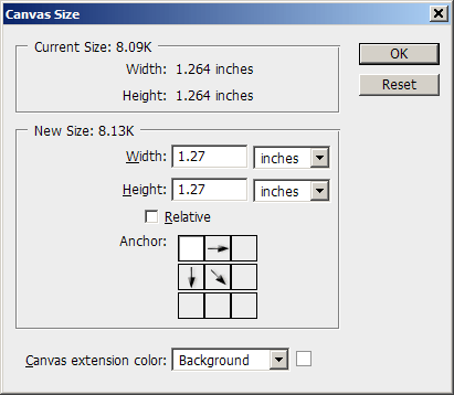
Minimal File Size with Precise Sizing in Office
Word, PowerPoint and Excel can only measure to 1/100″. So if your logo is big or small by a few thousandths, Word will resize it vertically or horizontally to make it fit. Your logo will be slightly distorted. So now we’re going to add back some of the background. In PhotoShop, choose Image>Canvas Size and change the units of measurement to inches. Round the numbers up to the next highest 1/100 of an inch, so 1.999 becomes 2.0, 12.742 becomes 12.75, etc. Set the canvas addition to flow to the right and bottom, as in this screen shot:

Dimensions rounded up to next 1/100″, canvas set to increase right and bottom size.
Click on OK. In the Layers palette, choose Flatten Image. Now follow the steps from last week’s post: choose Image>Mode>Indexed Color, set Palette to Local (Adaptive), reduce the colors to 8 for each color in the original logo (so a 2-color logo will use 16 colors), set Forced and Dither to None, click on OK. Save as PNG for most uses.
There you have it, your first professional Office-ready logo file! It will look good and print sharp, it will be size-accurate and the file size is tiny. Congratulations!
March 2017 edit: This article is still relevant if you must use bitmap-format logos. Vector-based logos offer significant advantages, like not getting blurry when image compression is used on the file. Here’s the state of the art: Best Quality Logos for Office