It’s a challenge to create the absolute best quality logos for client files in Microsoft Office. Most artists choose bitmap formats for logos, usually JPEG format. Apparently this is some kind of received wisdom from artist to artist, because JPEG format is close to the worst possible format for logos. But I’ve already covered this subject in JPEG Logos? Fail! back in 2013.
Brandwares has used indexed-color PNG format for most line art (a term for non-photographic art that is mostly flat color areas). Most logos qualify as line art. But there are a couple of disadvantages to using any type of bitmap format for branding information.
With Office files, Microsoft is determined to foist image “compression” on us. I put compression in quotes because Microsoft’s solution is really downsampling by another name. Whatever the name, the results are blurry and absolutely do not reinforce the brand. All bitmap files will be downsampled unless the user chooses only a single file. You can’t protect the company logo, even with XML hacking. Let’s face it, sooner or later, bitmap logos will look like mush.
The other persistent problem with bitmap formats is what happens when you create a PDF from a document. Acrobat’s default settings assume you want to create a small file to post on a web page. This was a serious problem 20 years ago. So, once again, a software company’s helpful authoritarianism leads to default settings that cream the logos in any Office file.
Vector Formats for Best Quality Logos
For many years, we at Brandwares were aware that a vector format was a potential way out of this. Vector formats are naturals for line art, because they easily handle geometric shapes with simple coloring. But there are relatively few vector formats from which to choose, and the available formats didn’t seem up to the job.
One grandaddy of vector formats is the EPS file. Well-known to designers, the EPS doesn’t get great support in Office programs. Printing them at high resolution requires PostScript support from the printer, which is dicey in most business offices. Office programs can’t ungroup them, so adding theme color support in an Office file is out of the question.
CGM was an early contender, and is still used in technical applications. But it never got support in common file formats. SVG is making inroads on the web, but Office is only beginning to support the format.
Let’s be honest, Microsoft offers the best support to the formats it invents. For vector graphics, that is WMF and EMF. WMF is a 16-bit format that was invented in the ’90s. In practice, it’s not too useful today. All too often, WMF files do not render the inside curve of shapes like O or D. In addition, Adobe Illustrator’s WMF export is horrendous, turning every curve into a series of angled straight lines. Corel Draw does a better export, but the format is limited by its 16-bit capacity.
The format we’re left with is EMF (Enhanced MetaFile). Brandwares has developed a method to create the highest quality EMF files possible. Whatever you do, do not use EMFs exported by Adobe Illustrator! Illustrator’s curve accuracy goes down the toilet when it exports as EMF. Here’s what you’ll get, versus the type we produce:
EMF from Adobe Illustrator: wonky curves!EMF from Brandwares
We create robust logos with a tiny file size and razor sharpness at any resolution and transparent backgrounds and they will never get downsampled by Office or Acrobat!
Best Quality Logos In Use
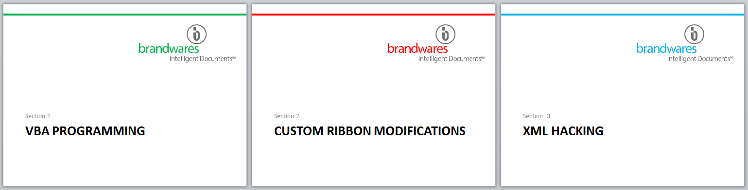
Once we’ve placed our EMF logos in your presentation, they can be ungrouped in Windows versions of PowerPoint, then you can key part or all of it to a theme color. If your presentation contains multiple color themes, changing theme colors will change the keyed logo element automatically. This can be a slick trick for presentations with different sections in different code colors. If you’re working with a Mac, let us know and we can ungroup and key the logo parts for you.
The layout for these slides is identical. Each uses a different color theme that varies one code color.
Transparency is not supported in most EMF exports, but by importing and ungrouping the logo, you can add transparency back in. In PowerPoint, choose Drawing Tools>Shape Fill>More Fill Colors…, then set the Transparency slider. This works the other way around from Illustrator, but the units are the same. If the Illustrator file used 40% Opacity, set 60% Transparency in PowerPoint.
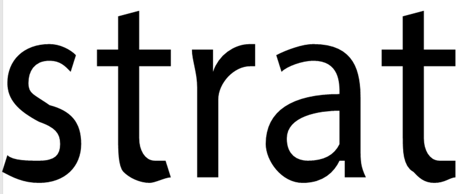
From L to R: each character has 10% more transparency. You can’t get this by adding transparency in Illustrator, you must re-create it in Office.
EMF are not a great candidate for objects like disclaimers. Each letter includes one or 2 complex curves, so a paragraph of text will be much larger that the same disclaimer rendered as an indexed-color PNG or even a JPEG of the same text. But for logos, they’re pretty great. You get the same small file size and pin-sharp appearance regardless of how much you enlarge it. Applying image compression or printing to a low-res PDF leaves EMF logos in pristine condition. It’s by far easiest way to create the best quality logos for Microsoft Office.
Subscribe to the Best Practices blog and get a free copy of our new Control Control add-in. This is the easiest way to create the same modern form controls that are in Word for Windows. Enter your real email and hit Subscribe in the right-hand column of this page. You’ll receive the add-in and installation instructions within 3 days.