When you choose fonts for Office, it takes a different approach than selecting typefaces for an InDesign document. One obvious difference is that you only need to install the font for a design document on the computer where it’s being created. Using the same font in an Office program will require the font to be installed on every computer using the document. Clearly, this is a much more costly solution. Aside from that, let’s look at the pitfalls of choosing fonts for Office templates.
Choosing Fonts for Office – Best Practices
Choosing Fonts for Office – Fake News
Most of what you see on the internet comparing font formats is wrong. Almost all modern professional fonts are OpenType format. There is PostScript-flavor OpenType, favored by Adobe and ending with .OTF And there is TrueType-flavor OpenType, Microsoft’s choice, ending with .TTF. It’s the continued use of the .TTF file ending that has misled many into thinking that they’re old-fashioned TrueType fonts. They’re not.
To verify this in macOS, open FontBook and examine a font with a .TTF ending. Make sure choose View>Show Font Info. Now look at the Kind parameter. Old-fashioned TrueType fonts would say TrueType here, but more likely you’re seeing OpenType TrueType.
In Windows, if you right-click on any file ending in .TTF and choose Properties, Type of file is reported as TrueType font file (.TTF). But this is illustrative of Windows’ relatively brain-dead design rather than any real information about the font.
Confirming this in Windows requires a few more steps. Start by opening the C:\Windows\Fonts folder. Set the View menu to Details. Now right-click in the row that displays the categories like Name, Font Style, etc. A list of avilable categories display. Choose Font Type. Now you can see that almost all the fonts are OpenType. You’ll only see TrueType if you’ve installed some old fonts from the 90s.
Choosing Fonts for Office – Designer Vanity
Designers from different geographic areas spec fonts differently. As one example, Toronto designers tend to focus on the practicalities of electronic document distribution. As a result, they will often choose Arial or Times New Roman for the user-filled portion of a template. By contrast, designers from New York focus on creating a distinct visual appearance. They choose unusual designer fonts. This creates logistical problems for their clients. They must spend money licensing for all workstations and then take time to install the fonts for each user.
Test fonts from small foundries to licensing a lot of copies. I’ve written about this issue before: Cross-platform Fonts from Small Foundries: Beware! In a mixed Windows/OS X environment, a poor quality font will not display correctly in documents that move between Mac and PC. One typical symptom is Italic text that displays as Roman or Bold when viewed on a different OS, or some similar weight/style mixup.
Choosing Fonts for Office – Collaboration
If the client uses Office documents for collaboration (Don’t know? You should be asking these questions!), you should seriously reconsider a “designer-y” font choice. When the documents arrive at your client’s client, that computer will not have the fonts and the document appearance will change drastically. Unlike web pages, Office documents do not have a font fallback setting. There is no practical way to preset which font will be substituted when the original is missing.
I know what you’re going to say next: “What about if we embed the fonts?” Here are several reasons why that might not work.
- Embedding does not work at all in Office 2011 or earlier for Mac. Users of these versions can neither embed fonts, nor can they view fonts that have been embedded in Windows.
- Embedding doesn’t work in Word or Excel for Mac, in both the 2016 and 2019 versions. PowerPoint 2016 for Mac users must have at least version 16.11 to view embedded fonts. The 2016 retail version (as opposed to the Office 365 subscriber version) cannot embed fonts in PowerPoint. Mac users must have at least Office 2019 retail or Office 365 version 16.17 to save embedded fonts in a PowerPoint file.
- Many typefaces have restrictive embedding permissions. So even if you can embed the font and your client can see it, they will not be able to edit the document using the embedded font. You can get around this if you contact the foundry and request a version with Editable or Installable permissions. Expect to pay a surcharge for this. Some foundries charge a lot for this service, because they’re concerned about losing sales to possible piracy.
Choosing Fonts for Office – Font Families
Designers are used to Single versions of fonts. The is where each font variant appears as a separate entry in the font list in Office. If you want to change to bold or italic, you select a different font from the list. Office doesn’t usually work this way and Office users are not used to this method.
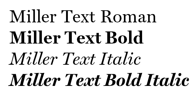
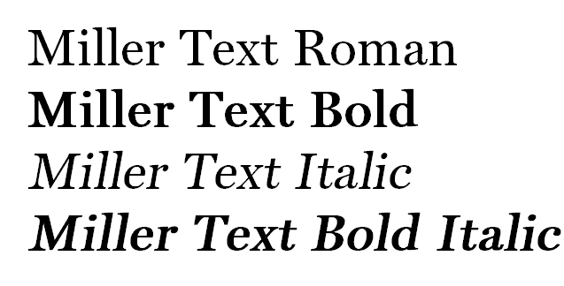
Instead, Office users are familiar with Family fonts. This is where where a group of (usually 4) fonts is linked. To get bold or Italic variants, they click on the Bold or Italic buttons, leaving the font name the same. The foundry usually creates the font families, though there are some type utilities available that let you make a family out of single fonts. As I mentioned earlier, Microsoft hasn’t figured out how to consistently display an .OTF font family correctly. Symptoms vary but are along the lines of you choose Bold and you get Bold Italic, or a similar variant. The wrong font is shown and printed. Typocially this will manifest when moving a Windows-created document to macOS or vice versa.
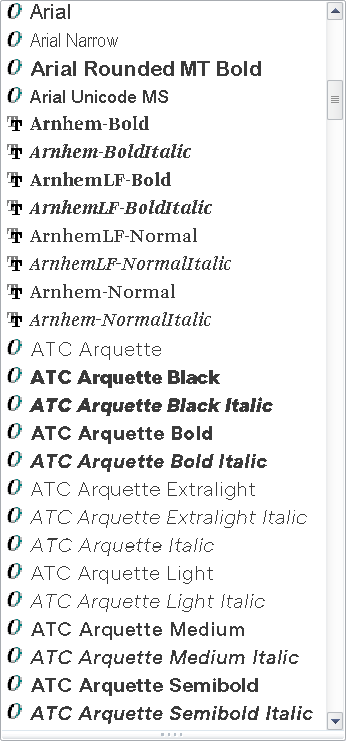
In macOS, it’s not obvious when you are using single versus family fonts. MacOS creates family groupings on the fly. In Windows, it’s easy: install the fonts, then look at the font menu in an Office program. A font family will only have one entry for the family, while singles will list every font variant. In this screen shot, the Arials are families. Arnhem and ATC Arquette are collections of single fonts:
The logical conclusion to the font family approach is that your client should almost never be licensing just one or two typefaces. If four family members are not installed, Office will fake them by stroking the font for bold and slanting it for italic. As you might guess, this looks ghastly and completely off-brand.
The exceptions to this rule are:
- If the document is a fillable form in Word or Excel. Those documents are typically locked so the user can’t change the font or its attributes.
- The the font is used only for Headings. These are usually bold and stay that way, so there is less chance of a user applying attributes.
In either of these 2 situations, you should be able to get away with licensing a single typeface instead of a complete family.
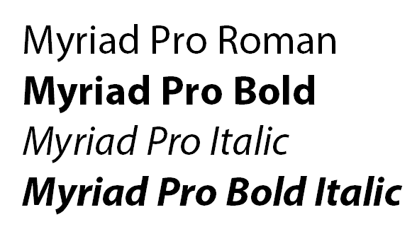
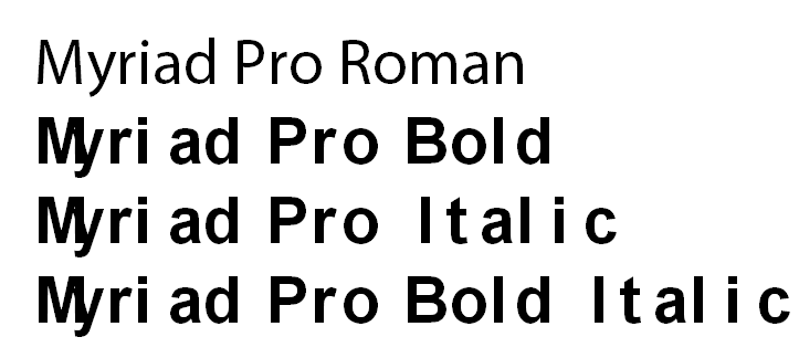
If your design calls for an unusual mix of weights, like Light and Demibold instead of Regular and Bold, contact the foundry to request a custom family. There is normally a small charge for this service. However, if the licensing deal is large enough, the foundry may waive this.
Choosing Fonts for Office – 2 Solutions
To sum up, for each different font used in your design, your client should be licensing a complete family of 4 typefaces in TrueType or Truetype-flavored OpenType.
Brandwares is a font reseller and we’ve been speccing type for Office for years. If you choose us to create your templates, we can also source your client fonts in the correct format and family. This service includes free tech support. We’ll help your client with any installation or usage issues and communicate with the foundry, if necessary.
Working on your own? A simple way to eliminate all these issues is to design with the fonts that are already installed by Office. There are many faces more interesting than Arial and Times New Roman in this collection. The fonts that come with Office don’t require any additional licensing fee. They are already installed and they have relaxed embedding permissions to make collaboration easy. They are all high-quality typefaces licensed from major foundries like Monotype. Here is a list of the families that are useful for business communications (we left out Comic Sans!). For maximum compatibility among all versions of Office, use a font that is checked in every column.
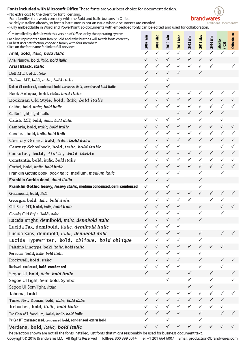
This list is available as a free PDF that shows character listings for every font by clicking on the font name. Email me to get a copy: production@brandwares.com

This is an excellent article and PDF resource — thanks John!
As you say, the safest approach is to use MS Office fonts wherever possible. This is obviously best for portability and compatibility, but also means you can confidently set heading/body fonts in the XML or theme.
If a client is supplying their own we’ve found that Truetype format works best, but have had mixed results with Opentype (even if Truetype-flavoured). Sometimes the Opentype fonts behave better if converted to .ttf using something like http://www.fontconverter.org/.
Hi Peter,
When you say that .ttf fonts behave better than .otf, what specific behaviors are you referring to?
I’m running into issues using an .otf version of Gotham across Mac and PC.
If I select Gotham Bold on a Mac, a PC user opens and it has a fake bold applied as well (with the “B” bold button selected in PowerPoint).
I would love to know more about the .ttf advantages, since switching could be a huge mess with over 100 users that would need to change, on top of LOTS of decks that would need to be updated to the new font.
Would the .ttf resolve issues of weights between Mac and PC?
Hi Kimberley,
There are 2 possible causes of font weight changes when moving between Mac and Windows. One is that you have bad fonts. If your Gotham came direct from the foundry Hoefler & Co., that’s unlikely. If your Gotham is one of the free downloads floating around on the Internet, it’s more of a possibility. Cross-platform Office font families only work reliably when all fonts are from the same source and that source knows what they’re doing.
The other possibility is that you’re using only Office 2016 on the Mac side. That version has been plagued with font and weight substitution issues. It’s especially bad in the current release under High Sierra. To test for this, try opening the same document in Office 2011 for Mac. It is more reliable.
Hello,
what do you think of the new Cloud Fonts from Microsoft. Are they suitable for PowerPoint enterprise templates. Is the spread of Office 365 in medium and larger companies sufficient to use Cloud Fonts? Or should we wait and rely on the secure system fonts. What is your opinion on this.
Cloud Fonts depend on Microsoft. Microsoft’s track record with free internet-supplied content is poor. As one example, they used to supply clip-art and stock photos. Then internal business decisions led to them drop that service. In addition, my experience with the icon feature in Office suggests that they also have trouble running content servers that are reliable. This leads to complaints that “Icons have disappeared from my Office installation”. I would stick with standard fonts for now.
Hi John,
I wonder if you have updated the list of TTF fonts since 2017, and if there are more selections now?
I have had numerous issues with distributing documents (Word, PPTX, etc.) with embedded fonts. In particular “light,” “narrow”, and “condensed” fonts. There are only a few choices for these styles in the list you provided. I have grudgingly gravitated to Arial and Arial Narrow families for this reason.
Except for the recent addition of Aptos, the list of fonts included with Office has remained the same. Microsoft has switched to adding new fonts as Cloud Fonts, though those are only available to Microsoft 365 subscribers. Cloud fonts are not a reliable design choice. Users of the retail versions (Office 2029, 2021 and 2024) will still see the same font list as seen in Office 2016.