Specifying fonts for electronic documents creates more hassle for clients and users than designing for print or web. This is because desktop applications need to have the font installed on each computer creating the documents. The cost can be high and installation by the client’s I.T. department is usually required. But these are technical hurdles that can be overcome if the client buys into a perceived necessity to have a different look than the competition.
There are 2 inter-related problems that crop up next: font families and cross-platform use. Font families are grouping of fonts that are linked so the user can switch between regular, italic and bold variants by clicking on attribute buttons. This is different from standard usage in the design world, where single fonts predominate. Designers are used to switching to a bold or italic look by picking a different font from the font menu, rather than by clicking on a bold or italic button. I’ve previously discussed font family issues here.
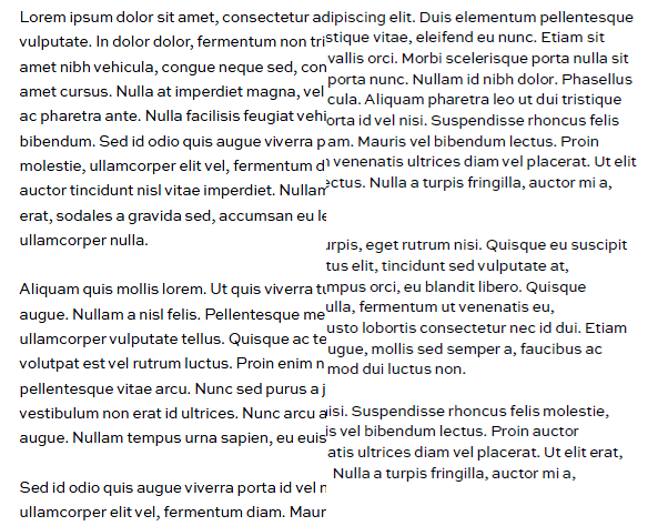
Same font, same document, different platform.
The small-foundry font displays and prints with tighter linespacing on a Mac (at right).
Today I’m focussing on the awful things that can happen when font families are specced for use with both Windows and Mac OS X. Surprisingly, it is not easy or simple to create families that work well on both platforms. The most popular software used by independent font designers doesn’t do this correctly, though we have filed numerous bug reports with the company. The net result is that if you spec a font from a small foundry that is going to be used on both Mac and Windows, it’s very likely not going to work. It’s not universal, there are some very skilled individual font jockeys who have the knowledge and skill to do it right. But you’re only going to find out the hard way, by buying the font and trying to use it.
Let me clarify, these fonts will work fine on either Windows or Mac. We can set up a template to make it work for either platform. You only see the anomalies when you move a document from one platform to the other.
Brandwares can provide fonts for your client’s project. Our service includes speccing the correct family groupings and supporting installation and troubleshooting. This includes working with the foundry to create correct families for cross-platform fonts.
I also encourage designers to ask your client the Mac/Windows question sooner rather than later. Call the foundry and ask if they can test on both platforms. I’ve known type designers who only own a Mac and don’t have any way of testing on Windows. When files are going to be used on both, speccing fonts from a large foundry is a good solution. They use different software and we have never seen a bad Mac/Windows family from one of the big companies. But the most practical solution is to stick with the wide variety of fonts that come free with Microsoft Office. They are high-quality faces, already installed and FREE! Your client appreciates a bargain, too!

Testing Light and Regular font families from a small foundry.
Windows on the left, OS X on the right.
Yes, they’re supposed to be the same. No, they’re not.

