Users create charts in Excel and import them to Word and PowerPoint. Reports frequently require charts. Put these together and you’ll see that when a client asks for a report template, you should also be giving them a compatible Excel template for the report charts they will need.
These charting templates do not have to be complex. Defining a default font and color palette is usually sufficient. The actual steps differ between Excel 2003 and Excel 2007/2010/2013/2016, so make sure you ask your client what version they are using.
The first step with any program is to design the color palette. Excel uses the colors in the order they are entered. In a bar chart, the colors are used left to right as each data series is added. Pie and doughnut charts always start with left edge of the first segment at the 12 o’clock position and proceed clockwise from there. Go with the flow and enter palette colors in the order you want them to appear by default. There is only 1 palette sequence active, so all report charts in your design should use the same color order, or you’ll drive your users crazy.
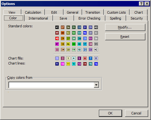
Report Charts in Excel 2003

The numbers show the order used in Excel 2003 charts.
If your client is using Excel 2003 or earlier, open a spreadsheet in that version, use the Tools>Options command and choose the Color tab. For each color in the “Chart fills” row, start at the left, click on a color, then click on the Modify button. Choose the Custom tab and enter the RGB values. Click on OK, then choose the next Color fill patch to the right and repeat.
Occasionally Office 2003 clients will insist on more than 6 chart colors. In that case, keep filling palette spaces with custom colors using the order shown in the illustration. This will give you up to 56 custom data series that will automatically be filled correctly. Be forewarned, when your client upgrades to a later version of Office, they will, in effect, be back to 6 chart colors. Later versions of Excel do not allow this extended palette.
As a final step, choose Format>Style, ensure the Normal style is selected and click on the Modify button. On the Font tab, set the font to the desired typeface, size and weight to match the Word templates into which these will be inserted. OK out and save the file as a template with an “.xlt” file ending. You’re done!
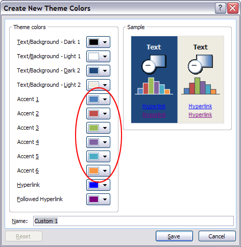
Report Charts in Excel 2007/2010/2013/2016
Circled: the 6 colors that will automatically color Excel 2007-2016 charts.
For clients on Excel 2007 or later, the palette system works differently, and not for the better. Users have lost the capability to set 56 chart colors, now you can only preset 6! The Office 2007/10/13/16 Theme Color dialog displays slots for 6 Accent Colors. Set these with RGB values in the sequence they are t appear in the report charts. If report charts use more than 6 colors, Excel’s default behavior is to color the additional series with automatically generated tints of these 6. To get more custom colors, users must enter them manually. In real life, they’re probably not going to do this. First they have to turn off the automatic series fill, then they have to look up the colors they are supposed to use (where is that tutorial again?), then they have to enter the RGB values. It’s just not a realistic workflow for end users on a deadline.
One alternative is to create a sample chart with manually filled extra data series. This looks good for a client sign-off, but in actual production, the user has to find the sample chart, copy and paste it to their presentation and then change the chart type and data to match what they are trying to show. Again, most users are unlikely to go to this trouble, especially if time is tight.
Finally, if you’re up to a little XML hacking, you can add up to 10 custom colors to the Windows color picker by using my tutorial XML Hacking: Custom Colors. While these colors are not used automatically in chart fills, it’s a simpler process to fill a series by clicking on a custom color than looking up an RGB value.
If possible, it may be best to try talking your client out of using more than 6 colors for charts. The lower expectations will make everyone happier and the end-users would thank you, if they knew who you were.
To wrap up this template, click on the Page Layout tab of the Ribbon, look for the Themes group and click on the down-pointing arrowhead beside Fonts. Click on Create new theme fonts… at the bottom of the list. Set the fonts for both Heading and Body and click on OK. Save the file as an Excel Template with an “.xltx” ending and distribute with the report templates.
An alternative workflow is to save the themes from the Word or PowerPoint file that accompanies the Excel template, then apply those themes to the Excel worksheet. Or course, you still have to apply the same thought process in arranging the colors to create charts that automatically have the right color sequence. It helps that charts created directly in Word or PowerPoint follow the same logic and color order.
Report Charts in Excel 2008, 2011 or 2016 for Mac
In Mac versions of Office, you’ll have to create the Color Theme in PowerPoint, then import it to Excel. Unfortunately, while you can use the Custom Color XML hack to add custom colors to a color theme, you can’t preview them in Office 2008 or 2011.
For the font theme, you can use my tutorial XML Hacking: Font Themes and apply the resulting theme to your Excel template.