Word is found everywhere, but Word users with training are a scarce commodity. It’s a shame, because a little training can go a long way to get really nice results. This article will cover the most common formatting mistakes that Word users make. If you’re a designer, you could still benefit, I see plenty of these errors from design companies as well.
5 Word Formatting Mistakes – Best Practices
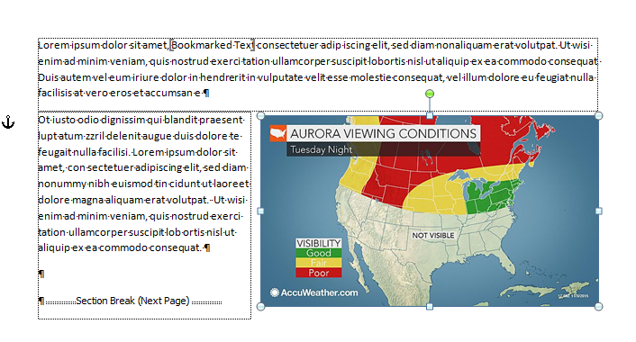
Formatting Mistake #1: Not making the Non-printing Characters Visible
Pretty View
By default Word is set up to show “pretty” documents. Microsoft has decided that users want to see what the printed output will look like on-screen. So Word hides all the control characters that are vital for reliable formatting. Users can’t see the hidden formatting that they are inserting or deleting. Result: formatting mistakes! The only way you can provide professional documents for clients is by making these visible so you can deal with them. When you want to see the printed result, do a Print Preview. It’s fast and more accurate than the “pretty” screen display.
Useful View
The exact steps for show the control characters is slightly different for each version of Word, so I’m not going to list them all here. To start in OS X, look for Word>Preferences>View, in Windows, choose File>Options>Display. Make all the non-printing or formatting characters visible. It’s also helpful to display Bookmarks, Object anchors and in Word 2010/2011 or earlier, Text Boundaries. In Windows, these last three are found on the Advanced tab of Options.
Now you can see Paragraph Marks, which hold the paragraph formatting for the text that precedes it. You can see the Section Breaks that hold all the header/footer, margins and page orientation information for the paragraphs preceding it. And you can see the Anchors for text boxes and floating pictures, which makes it much easier to anchor to a paragraph that is likely to stay on the same page.
Formatting Mistake #2: Creating New Pages with Multiple Carriage Returns
This is the classic hallmark of the Word user who has never taken a course or cracked a book. At the end of a topic, they’ll type enough carriage returns to get to the next page, then type a new heading. It looks perfectly fine on the original computer:
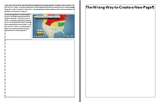
How it looks on your computer.
But then it’s sent to a different computer with different fonts or a different printer. The heading that supposed to be at the top of a page either moves to the bottom of the preceding page, or moves down so it’s not at the top of the page anymore. It doesn’t matter much which one happens, because the formatting mistakes scream Amateur Hour:
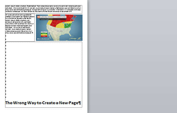
How it looks on a different computer.
Text flow in Word depends heavily on the font being used and the printer that has been selected. If you move the document to a different computer, they might not have the same font. Even a change in the version of a font is enough to make the text break differently. As for the printer, Word fabricates pages on the fly by using the metrics of the selected printer. These metrics come from the printer driver. So if the user who receives the documents has a different printer, or even a different driver for the same printer, the pages will be laid out differently.
The knowledgeable Word worker will insert a Page Break (not a Section Break) at the end of a text block to create a new page:
Page break: How it looks on every computer.
A really clever user will create a heading style that includes the paragraph attribute Page break before, so that whenever the heading style is applied to text, it automatically pops to the top of a new page:

Heading Style using Page Break Before Setting
Formatting Mistake #3: Using Tabs to Arrange Data in a Grid or Table
Whenever you need to arrange comparative information in rows and columns, you’re creating tabular arrangement. It’s always a good idea to pause for a moment and really look at the kind of data you want to present, so that you can choose the best format for that. If you find yourself using tabs and spaces to create a grid of data, STOP.
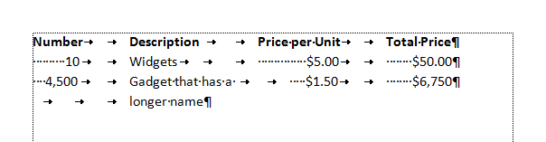
Making a lame table with tabs and spaces.
Information in a grid is tabular data (from which the tab key takes its name), but tabular data should go in a table. That’s what they’re for! Tab keys are left over from typewriters, when there was no other way to create a data grid. Designers are also guilty of creating grids with tabs, because table tools are relative newcomers to page layout software.
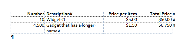
Use a table to arrange tabular information.
Tables are also the only professional way to make forms, which brings us to our next common mistake:
Formatting Mistake #4: Using Typewriter Techniques to Make Forms
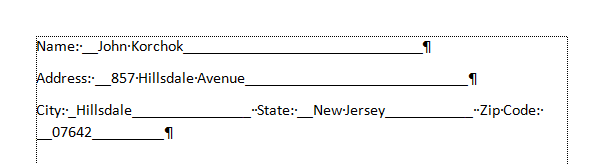
Word, especially Windows versions, is loaded with excellent form-creation tools. But you’d never know it from the forms I almost invariably see created in that program. The common approach is to type a text heading, then dozens of underscores to indicate where the form-filler is to enter their data. This could pass for forms that are printed out and filled with a a pencil. You know, like people used to do 50 years ago:
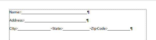
Typewriter-style Form
Open the Word “form” on your computer and try filling it in. As you type, the underscores remain, trailing after your text. Type a couple of line of text: the left side of the filled portion falls underneath the heading, not to its right. The professional term for this is “a dog’s breakfast”.
The form falls apart when filled.
For forms that are filled on a computer, you need a much more robust method. Create a table with a cell for the heading and a separate cell for the filled-in area. If the form will only be filled out on the computer, you don’t need any horizontal rules to guide your text. The computer does that for you. If the form is intended to be dual purpose computer or hand-filled, add a thin border to the bottom of the filled-in cell. No other border are necessary or desirable. All of a sudden you have a form that is neat before and after filling, easy to read, even, dare we say, good-looking!
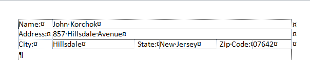
The right way to make a form: with a table.
Here’s a comparison of a table form and a typewriter-style form when filled with longer text:
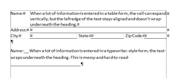
Inserting long text
Formatting Mistake #5: Local Formatting Instead of Styles
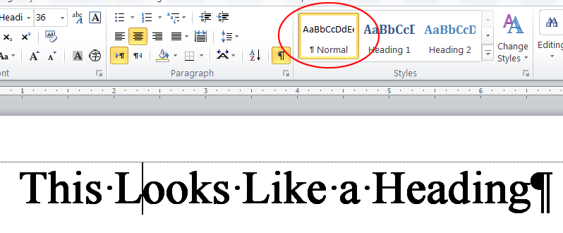
Another giveaway of the Word amateur is when you click on different types of text and heading, but the Style always says Normal. This means the creator of the document made no use of Styles. Perhaps they think they are saving time, but the opposite is true. Repurposing or updating an unstyled document takes almost as long as creating it in the first place. Plus, useful Word features like a Table of Contents or the Navigation Pane don’t work well without using styles.
Using local formatting to imitate true styles.
After taking just a few minutes to create some basic styles everything about document creation and revisions is much faster. Styles are a true productivity booster. If you’re not using them, either you are wasting a lot of time, or you’re making someone else fritter away hours of their work day. Styles ensure your documents have a consistent, professional appearance. Updating their appearance in the future takes only a few minutes. It’s what the pros do!
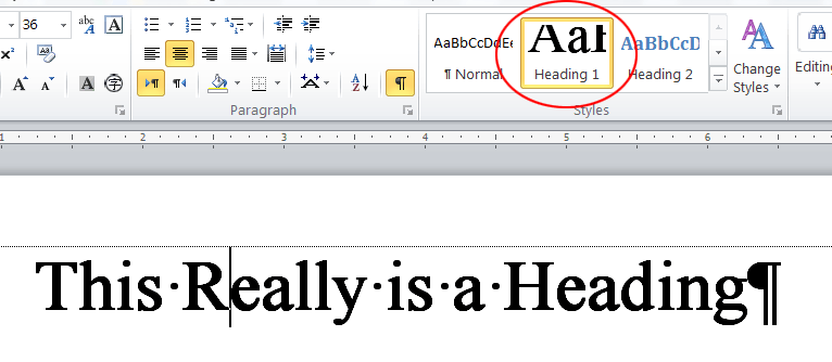
A Heading Style applied.
We’re Word professionals! Brandwares will create technically perfect templates and documents for your company. For bullet-proof files, contact me at production@brandwares.com.


I agree with all of your points.
For #4 I would add, restricting yourself to the exact layout of the original paper form. On paper forms, you can “scrunch” you handwriting to fit long text into a small box, but with e-forms the user can’t. So you may have to change the layout of the form to allow for the expected extra space required.
When designing e-forms early on you have to decide if the forms are intended to be kept primarily in e-form or do you expect to fill them out online then print them most of the time (Hint: save a tree and a buck, try to aim for e-forms!)
Designing e-forms also includes NOT limiting yourself to single page size. You touch on this idea with your example of the long “name” text. But it is more important “notes” type fields. So design the form either using Headers/footers to carry over unique identifying info in case the form is printed (like a customer/user name, form ID number and form title, page number x of y, date/time printed). So do you want to put the repeating info in a repeating table heading? Or do you want to use a document Header?