For branded documents, you want to have a unique table style. Microsoft Office programs include a pile of table styles that are auto-created by the software, but they all have that generic MS look. It’s possible to create custom styles in Excel and Word for both Windows and Mac using the program interface. But if you’re using PowerPopint, you can still create custom table styles. You just have to hack some XML!
First we have to cover how Office programs create custom tables. It’s not a simple subject, but understanding this will also help you if you’re trying to create custom table styles in Word for Windows or Excel, which actually have tools to do this in the respective programs.
Let’s start by making one thing clear: table styles do not format the font choice or size contained in the tables. Yes, I know the Word and Excel table style tools have font formatting dropdowns, yes I know Microsoft help files say that font styling is included in table styles. The truth is that font styling in a table style is limited to setting bold or italic attributes, font color and whether the table component uses the Headings or Body font as specced in the Font Theme. For typeface and size, alignment and weight/italic controls, read my post on Default Table Text
I find that it’s easier to format Office tables if I imagine that table formatting has layers. The base layer is any overall formatting that applies to the table as a whole. Then, we build layers on top of that base formatting that looks after the Header Row, probably the most common feature applied to tables. We follow this with the Total Row, the bottom one. Next, the First and Last Columns. Once these outer areas are formatted, we add layers for Even and Odd Row Banding and then Even and Odd Column Banding. Finally, we can spec special formatting for the cells in the 4 corners. This sequence moves from the general to the particular and also from the most common to the rarest formatting.
This sequence is how the table style dialogs in Word for Windows and Excel present table elements. It’s similar to the order in which we enter the information in an XML custom table style. If you follow this order, you’ll get a custom style in much less time than if, for instance, you try to start with the even and odd rows.
Word’s custom table styles are stored in the styles.xml file. This is in the word folder of an unzipped file. The comparable file for PowerPoint is called tableStyles.xml in the ppt folder. The XML is similar in concept, but the differences mean you can’t copy and paste from one program to another. If you’re not sure where to find these files, please read XML Hacking:An Introduction. If you’re editing on a Mac, you should also read XML Hacking: Editing in OS X
Below is a typical PowerPoint table style. I’ve broken the listing into 4 pieces so it fits on the page. Copy and paste them together into one listing, or download it as a zipped text file:
That's a big pile of XML to throw at you. Let's break it down, first, the section that sets parameters for the whole table. Think of this like a layer cake, with the WholeTbl section being the first layer. Then later attributes are superimposed on top of it.
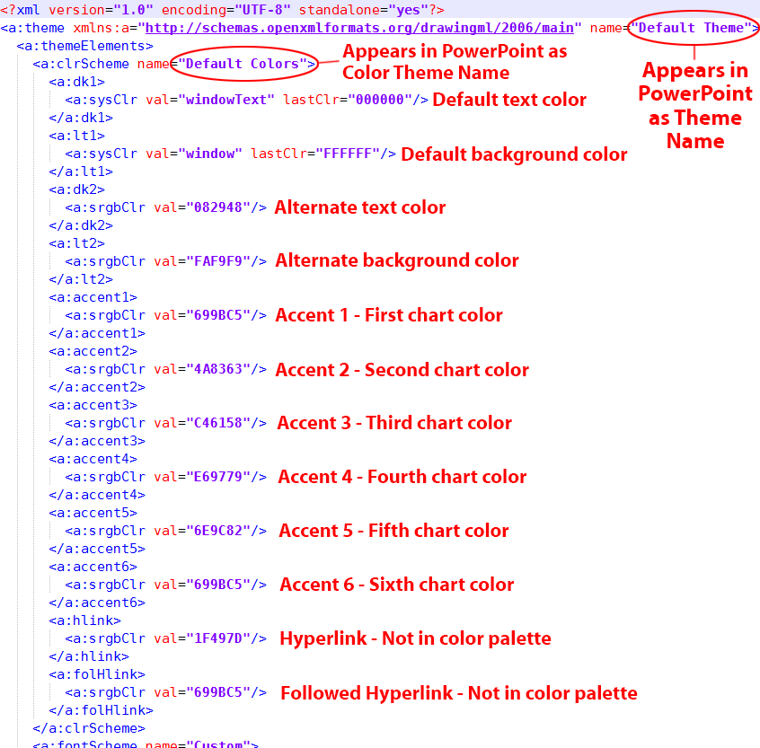
Line 2 is the container tag that holds individual table styles. The last part of the tag includes the def tag that sets which table style will be used as the default. Paste in the GUID of your custom style here to make it the automatic style in a template or presentation.
From line 3 to 8, we set the font characteristics that we can: idx="minor" means the font will be the theme body font. The actual font used is set in the theme, not here. Line 5 sets a dummy font color, in this case the Office preset color Black. Then in line 8, the actual color is set to the dark1 theme color.
Line 10 begins formatting the default borders. Beginning at line 12, the left border is set to w=0, meaning it has a 0 thickness and does not display. If it did display, the color setting in line 14 would set it to bg1, or the first background color, normally white in most themes. The following sections for right, top and bottom borders are identical.
By contrast, look at line 40 for Inside Horizontal borders (the ones between each cell. Here the weight is set w=114300. The measurement units are EMUs or English Metric Unit, a made-up measurement system that allows easy conversion between English and Metric systems. At 914400 EMUs per inch, it means the line weight is 1/8 of an inch, unusually thick borders for a table.
Then, starting on line 55, are the fill settings for default cells. Line 57 set them to an RGB color value, since this is a tint not found in the theme. The color notation is hexadecimal, just as on an HTML page.
Custom Table Style Layers
Next up is the section for the odd and even-numbered horizontal bands:
In XML, an empty or unused attribute closes itself, as does the final object in a chain of references. Line 64 shows <a:tcBdr/ > with a slash right after the name. The slash closes the border attribute, indicating that adding odd-number row formatting doesn't include a change to the borders. On the other hand, the fill is active, using the Accent 6 color from the theme. Accent 6 closes itself because it's the final item of information in defining the fill.
Compare lines 72 to 76 (even-numbered rows) with 63 to 71 (odd-numbered rows). No format was set for even-numbered horizontal rows, so applying this attribute in Office will have no effect on the table appearance.
Next up are banded columns. This is similar to the banded row section: odd-numbered rows are defined, but not even-numbered. The fill color is a hexadecimal RGB, value, since this color is not in the theme:
This contains sections for font, border and fill parameters. As with the whole table section, font formatting is limited to speccing which theme font and color to use. No borders are assigned and the fill color is an RGB gray. Here are the remaining parameters for the First (leftmost) Column, the the last (bottom) row and first (top) row. In the Office interface, the top-most row is referred to as the Header Row and the bottom-most as the Total Row.
Custom Table Styles - Color Models
Here are the different ways you can spec color. Use the same syntax for fonts, borders and fills:
<a:schemeClr>: These access the Theme Colors. For the 2 pairs of light and dark colors that form the first 4 in a theme, you may see them variously as lt1, dk1, lt2 and dk2, or bg1, tx1, bg2 and tx2. Be careful with using the last 4, because Office Open XML allows mapping other colors to bg and tx. The safer choices are lt and dk. These are followed by the 6 accent colors: accent1 through accent6. Finally hlink and folHlink designate the hyperlink and followed hyperlink colors. Examples are <a:schemeClr val="lt1"/> or <a:schemeClr val="accent2"/>.
<a:srgbClr>: Sometimes you need colors that are not in the theme. This color model uses hexadecimal colors, exactly the same as used in HTML. <a:srgbClr val="F5F9FD"/> is one example.
<a:scrgbClr>: This is also RGB, but uses percentages instead of hexadecimal: <a:scrgbClr r="50%" g="50%" b="50%"/>.
<a:hslClr>: If you need to use HSL (Hue, Saturation and Luminance), this is the model for you. Try <a:hslClr hue="14400000" sat="100%" lum="50%"/>.
<a:prstClr>: These are a limited range of named colors that were used in early versions of Microsoft Office. They're just here for legacy file format support, but you'll see them used in some XML sample listings. An example would be <a:prstClr val="black"/>.
<a:sysClr>: This model allows you to use operating system colors. Beware, you'll get different results in OS X then in Windows, and users can customize their system colors as well. <a:sysClr val="windowText"/>.
Clearly, when you edit this XML by hand, you'll need to be familiar with the custom color theme used in the file and its hex values. Read my post on this subject: XML Hacking: Color Themes Next time we'll take a look at how table styles connect with the Office program interface to give the user access to these features
As always, if this seems too daunting, Brandwares is here to create custom table styles for you. Contact me at production@brandwares.com.
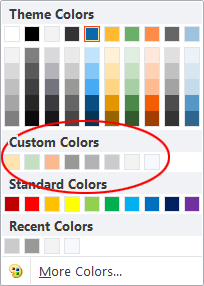
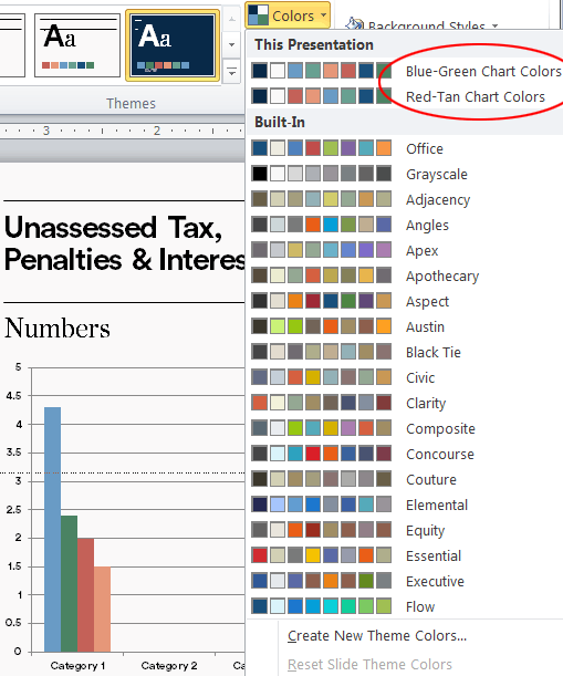
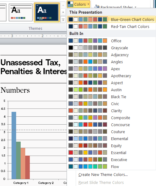
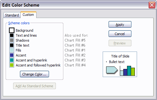
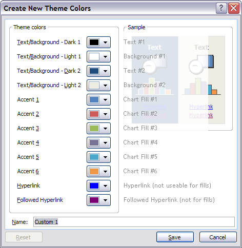
In my last post, I looked at adding extra color themes to PowerPoint masters. But any color theme can only hold a maximum of 10 colors (not counting the hyperlink colors, which are not available in the color picker). The solution is to add Custom Colors to the theme.
Fortunately, most desktop versions of Office programs beginning with 2007 have a hidden capacity to display up to 50 additional colors. These form a new row below the theme colors and above the stock Microsoft row. These extra colors are not supported in PowerPoint 2008 or 2011 for OS X. While these versions will open a file with more colors, the colors do not get added to the color picker. Here’s what the color picker in every other variety of Word or PowerPoint looks like after adding additional colors:
Custom Colors in Office
Custom colors do not appear in PowerPoint for iOS, PowerPoint for Android or PowerPoint for the web. The web version of Office is also used in SharePoint, so SharePoint users won’t see them. You must be using PowerPoint for Windows or for Mac to see them.
OOXML Basics
If you’re new to XML hacking, be sure to read my Introduction to the subject first. If you’re editing on a Mac, there are some other considerations covered in this article. I should also clarify: a Color Theme or a Font Theme are only sub-parts of a Theme as saved by PowerPoint. A PowerPoint Theme file contains the entire presentation, including masters, layouts, and full theme files. It’s this full theme file that we need to edit. Custom colors never appear in a Color Theme file.
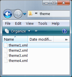
As with the extra color themes we looked at last time, custom colors are added to the XML theme files found in ppt>theme. I mentioned in the last article, presentations almost always include a default Office theme as a fallback and this theme is always last in the list. So in a presentation with 1 color theme, there will be a theme1.xml and a theme2.xml inside the theme folder. Ignore theme2.xml and customize only theme1.xml.
Setting Custom Colors
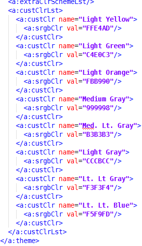
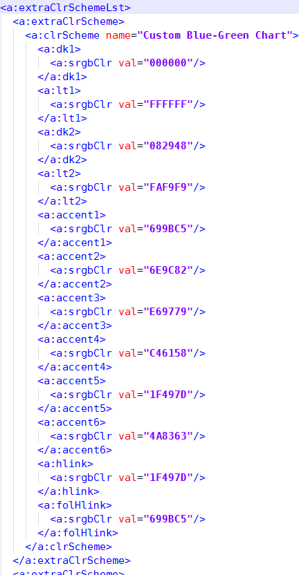
These colors are the last category in a theme file, so it’s easy to find. As before, we expand the PowerPoint file (really a zip archive with a different file ending), open ppt/theme, open theme1.xml in a text editor and reflow the text to be humanly readable. Then scroll all the way down to the end. An unmodified file will only display the <a:extraClrSchemeLst/> self-closing tag. To add more colors, we add a new branch to the tree. Below <a:extraClrSchemeLst/>, we type a new entry: <a:custClrLst>. This is followed by our additional color definitions and the closing tag </a:custClrLst>. Here’s what a list of custom colors as seen in the screenshot above would look like in XML:
A nice feature here is that, unlike color themes, you can actually supply a name for the color. This is followed a hexadecimal RGB color value, as used in web design. This list has only 8 colors, but there is room for up to 50 in the color picker. If you read the last article about color themes, you’ll soon realize that each theme file can have a different set of additional colors that goes with it as well. The combination of themes and custom colors gives you 18 colors per theme to play with, almost enough for the most color-crazed designer!
Custom colors can be added to the theme1.xml file in Word and Excel using exactly the same syntax. The colors appear in the color picker as expected in Word but are partially ignored in Excel. In Excel, these colors display for almost all objects on the Insert tab: Text Boxes, Shapes, SmartArt, Charts, WordArt, etc. But if you’re seeking to format worksheet text, cell fills or borders, they do not show. (Thanks to reader Kaz for pointing this out.)
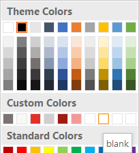
Custom Colors in Columns
By default, the colors appear in 5 rows of 10 colors each. Some designers prefer to display the colors in columns instead of rows. To work around this, add your colors to form the top row of your columns. Then complete the row of 10 with dummy colors that have a value of FFFFFF and blank as a name:
Another limitation is that if you save a presentation as a Theme (*.thmx) file, custom colors in the presentation don’t get added to the Theme file. You’ll have edit a saved Theme file to add the custom colors to it, then they can be applied to another file. Or you can save the original presentation as a Presentation (*.pptx, *.pptm) or Template (*.potx, *.potm) to preserve the Custom Colors.
By extension, this also means that to add custom colors to Word by applying a PowerPoint Theme file, you must edit the Theme file to add the custom colors. Or course, you can hack the Word document or template to get them. The file name in Word will be the same: theme1.xml, but it is to be found in the word/themes folder instead of ppt/themes. As with PowerPoint, custom colors are added to the very end of the theme.xml part.
If you have added custom colors, then duplicate the slide master, the custom colors will also be duplicated (each slide master has a separate theme file as well). But if your first slide master has custom colors and you simply create a second slide master, the second master will not include the custom colors in it’s theme.
Unlike theme colors, custom colors are not automatically applied to charts. Automatic chart coloring in PowerPoint, Excel and Word is limited to 6 settable colors (see this post for chart coloring details). After that, the host program starts generating automatic variants based on the theme. However, for the detail-oriented among us, manual recoloring of data series with custom colors is very convenient and miles above the previous technique, inputting RGB values from text.
I’ve written a lot about PowerPoint, but the additional colors can be used anywhere in Word as well. In Excel, you get partial access. Most objects on the Insert tab can have custom colors applied, like AutoShapes and SmartArt. Custom colors cannot be used for worksheet formatting. Cell and font coloring won’t use use them, they just don’t appear in the color picker for those objects.
We’re here to do this for you, if you prefer! Please contact me at production@brandwares.com. Next time, I’ll tackle formatting custom table formats in XML. This is a complex subject, so it will take at least 2 posts. Stay tuned!
This article presents some new ways to use color themes. To find out more about how color themes work in PowerPoint and other Office programs, please read this companion article as well: Great Color Themes – Brandwares Best Practices.
The simplest way to give a presentation variety through different topics is to apply new color themes. If you ever worked with pre-2007 versions of PowerPoint, you may remember that you could have unlimited numbers of Color Schemes (as they were called), that you could easily apply to groups of slides to give them visual cohesion with one another.
With the 2007 XML version of Office, that simplicity went away. Instead, a master slide could have only 1 Color Theme. Applying a Color Theme to a single slide now applies it to the master and every slide based on that master. For most presentations, it’s all or nothing with new colors. Fortunately, I figured out a workaround that brings back much of the color flexibility of earlier versions. Vari-colored sections are back!
There’s still a limit of 1 theme per master, so now we have to create additional master for every different theme we want to use. Typically these themes will be closely related, with only 1 or 2 colors varying per theme. Sometimes the colors stay the same, but only change position in the theme. I’ll get into how you use that later.
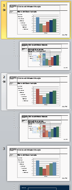
This screen shot shows the Master Slide (the larger one at top) followed by its Slide Layouts below. To add more Color Themes, we begin by copying the Master Slide. The copies of the Master don’t have to duplicate all the slide masters. If different colors are only needed for a chart, we’ll just attach one chart slide layout to the new master slide.
Then we create new color themes, attaching one to each master. After this, you could save the template and make a perfectly good presentation. To get the different color theme, you reapply layouts from different masters and the colors come along for the ride. However, it’s a non-intuitive way to apply colors. To create a better user interface, we need to hack some XML!
3 Slide Masters in 1 presentation, showing the color theme attached to each.
To begin, review the instructions in my previous post about opening Office files in a text editor. If you’re editing in OS X, there are operating system issues you need to watch out for. I cover them in XML Hacking: Editing in OS X. The files we’re going to modify are in the ppt>theme folder. When open it, you see 4 files:
A presentation with 3 masters always has 4 themes, unless you take precautions.
By default, PowerPoint always saves its Office themes as the last in the list. The way around this is to create a new, blank presentation, then create color and font themes before saving for the first time. If you save first, the default Office color and font themes will be saved into your template in last place. You can always ignore the last file in the themes folder. We’re only going to edit the first 3. When you open up Theme1.xml and expand it to readable form, the first part of the theme looks like this:
Theme names that appear in PowerPoint, plus the color associations.
The editing were’ going to do occurs at the bottom of each theme, so let’s scroll down. The screen cap below shows the end of an unedited theme. The part we’re going to expand is the extraClrSchemeLst stub.
First we split <a:extraClrSchemeLst/> into opening and closing tags: <a:extraClrSchemeLst> and </a:extraClrSchemeLst>. Then we can insert color themes between them. When we’re editing the Custom theme that is applied to slides by default, we can color themes for the other themes 2 and 3. Here’s the first extra color theme: I just opened theme2.xml to get the values for this.
The first Extra theme takes values from theme2.xml.
Then add the color scheme from theme3.xml and save. Theme1.xml is complete.
Now open theme2.xml and add extra color themes from theme1.xml and theme3.xml. Finally add the colors from theme1.xml and theme2.xml to theme3.xml. Phew! Now every theme contains every color theme. Zip all the xml files back into a presentation and let’s see how this improves the user experience in PowerPoint. After opening the file and moving to a chart that is based on the default master and theme, we can click on Design:Colors and the extra color themes show right at the top of the list:
The extra color themes added to the master are shown circled.
Selecting an alternate color theme instantly recolors the chart on the selected slide:
An alternate theme is selected and the chart changes colors.
Thanks for reading. Next time I’ll discuss how to add even more custom colors when they won’t all fit into a color theme. If XML hacking isn’t your thing, we can do it for you. Contact me at production@brandwares.com.
Let’s start hacking some XML with a simple project: setting the default table text size. This article assumes you have read the introduction and have a suitable text editor installed. Mac users should also read XML Hacking: Editing in OS X.
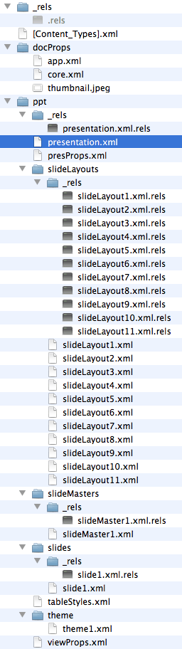
When you insert a new table in PowerPoint, the default table text size is 18 points. Using XML hacking, we can set this to whatever point size the designer prefers. You can also set the text to appear in all caps. Following the previous post’s instructions, add .zip to the file ending and unzip the file. Look for the ppt folder and open it:
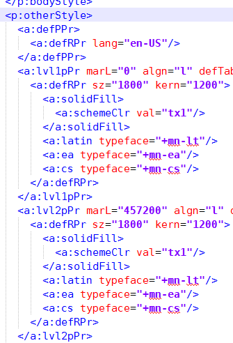
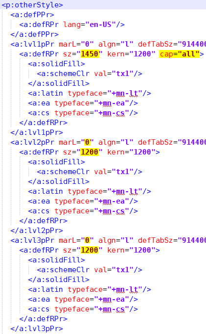
In the ppt folder is another folder called slideMasters. If your sample presentation is typical, it has only one Slide Master, so you won’t be surprised to find that typically slideMasters contains only one file, called slideMaster1.xml. Open this file in your text editor and reformat the XML to make it readable (XML Tools>Pretty Print in NotePad++, or Markup>Tidy>Reflow in BBEdit). Scroll down to near the end, looking for a tag called <p:otherStyle>. This is the section that formats default text in miscellaneous objects, like tables:
Default Table Text Levels
Within the otherStyle section, the 4th line starts with <a:lvl1pPr. Then the 14th line begins with <a:lvl2pPr. Each of these 10-line sections formats a different text level, with the 4th line starting the first and the 14th beginning the second level. A handy, if terse, reference to all the parameters is shown here. Not all of these are actually used in the context of a table. As one example, there are a:spcBef and a:spcAft for setting space before and after, but this is ignored by PowerPoint in a table. PowerPoint pays attention to the font size, the left margin, line spacing, alignment and whether it’s all-caps, small caps, bold and/or italic.
The font size is set by this line: <a:defRPr sz="1800" kern="1200">. sz=1800 is the font size in hundredths of a point, so 1800 gives us the default 18-point size. Since this is the first level that might well be used for table headings, you could set it to something like 1450 to get a 14.5 point result.
Since this first level can be used for headings, let’s make it all-caps while we’re at it. Edit the line to read <a:defRPr sz="1450" kern="1200" cap="all">. Done! (Please note, this can be used for headings, but the user must still use the Home>Increase List Level command to set the actual level of text for each section of the table. In PowerPoint 2016 for Mac, the command is called Indent More.)
Now proceed to the second level and set its point size. Something like <a:defRPr sz="1200" kern="1200">
Other useful attributes for <a:defRPr> include cap="small" for small caps, b="1" for bold and i="1" for italics. In addition, spc="400" adds enough tracking to make 10pt text have about 1 character width between each pair. This latter parameter can be positive for wider spacing or negative to crunch text together.
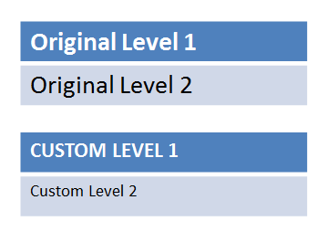
Scroll down a little further: you’ll notice that there are 9 levels, though in a table you’ll probably only use the first 2 or 3. In typical Microsoft style, each level is indented further than the preceding one. Compare level 1 with level 2:
<a:lvl1pPr marL="0"
<a:lvl2pPr marL="457200"
marL is the left margin. The units of measurement here are EMUs: English Metric Units. This is an invented measurement system that allows easy conversion between English and Metric. suffice it to say that 457200 EMUs is 1/2". When I modify this section, I set all 9 levels to marL="0". I also set all lower levels to the same point size as the lowest designed level, level 2 in our example. That way, if a user keeps changing to a lower text level, the formatting remains the same.
Text alignment can also be set using the algn parameter. The useful settings are l (left), r (right), ctr (centered), just (justified), and dist (text is widespaced to evenly fill cell width). Of course, if you’re setting these, marL should be set to 0. The simplest way to experiment with these parameters is to set the styles in the main text placeholder of the Slide Master (the larger slide at the top of the slide master list). Then unzip the presentation, open ppt/slideMasters/slideMaster1.xml and examine the <p:bodyStyle> section. The <p:otherStyle> section uses exactly the same syntax, so if you need bullets or unusual spacing in a table, you can set up <p:otherStyle> to do it.
Here’s what the final file should look like, with the changes highlighted:
What You Can’t Do
Each level definition includes references for Latin (a:latin), East Asian (a:ea) and Complex Script (a:cs) fonts. In similar Style parts like bodyStyle, you can replace +mn-lt with the name of a font so set that level in a non-theme font. But in the otherStyle part, PowerPoint completely ignores these entries, so much so that you can delete the three lines and PowerPoint will open the file without raising an XML error. This indicates that the program doesn’t even try to read those values. You also can’t specify different colors for different text levels in this XML part.
Fortunately, you can set fonts and colors for parts of the table in the custom table style, a completely different XML part from the otherStyle section of the slide master. For more about table styles, please see the articles linked to below.
This gets asked a lot, but the answer is no: you cannot set vertical cell/row alignment or cell margins in default taxt table text or a table style. It would have been possible given the OOXML spec, Microsoft just didn’t bother.
Preview the Effects
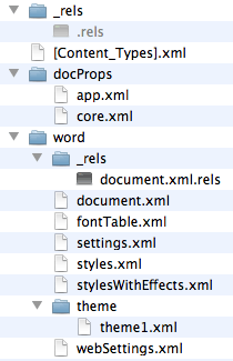
When you’re finished editing, save and close the file. In a folder window where you can see all the unzipped files, select the folders _rels, docProps and ppt, plus [Content_Types].xml:
Zip them into a file that ends with the same file ending as the original presentation, usually .pptx. Open in PowerPoint, insert a table and test your new default font sizes. Please note, assigning these styles makes them available to the whole table, but to access them you still need to use Increase List Level, same as in an ordinary text placeholder. Unfortunately, there’s no way to automatically assign <a:lvl1pPr> to table headings and <a:lvl2pPr> to the body of the table, which would be cool and helpful.
In the otherStyle section, you can also set linespacing, space before and after, tabs and several other text attributes. Some of these have little effect in a table. In a Word table, adding space before or after has a similar effect as changing the top or bottom cell margin. Not so in PowerPoint. Space before and after in a PowerPoint table has no effect on the cell height. For complete coverage of all parameters you can set in the otherStyle section, please read my articles about setting Textbox Styles: XML Hacking: Text Box Styles and XML Hacking: Styled Text Boxes Complete. The syntax is exactly the same.
With the introduction of Office 2007, Microsoft changed the basic file format that underlies Word, PowerPoint and Excel. Instead of the proprietary and mostly undocumented format that ruled from Office 97 to Office 2003, Microsoft made a smart decision and switched to XML. This is tagged text, similar in structure and concept to HTML code with which you may already be familiar.
XML opens up a world of possibilities for automated document construction, but that’s a topic for another day. The everyday relevance for you and I is that if a Word or PowerPoint file isn’t doing what you need it to do and there are no tools in the program for the job, we can now dive in a edit the file ourselves. If you’re a point-and-click user, this is probably not thrilling. But if you’re a hacker at heart, a midnight coder or just a curious tinkerer, you can do some cool stuff.
The main tool you’re going to need is a text editor. While you can get away for a while with Notepad or TextEdit, those simple text editors don’t quite have the tools that get the job done efficiently. On Mac, I use BBEdit and on Windows I reach for Notepad++. BBEdit is reasonably-priced shareware and Notepad++ is freeware. They have a similar style of operation, so if you’re a cross-platform hacker it’s easy to switch between them. Notepad++ uses a plugin system, so you can add tools. For this job, you’re definitely going to want the free XML plugin. To install that, choose Plugins>Plugins Admin, scroll down the list to XML Tools, select it and click on Next. While you’re installing, aAnother very useful NotePad++ plugin is Compare.
The macOS requires somewhat more care with handling expanded Office files, or they won’t open after being rezipped. Please see this article for the best procedure on a Mac. The rest of this article mentions Windows methods, but the XML file structure is the same on both platforms.
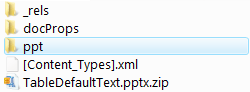
Word, Excel and PowerPoint files in the new format are actually simple Zip files with a different file ending. Getting into them couldn’t be easier: if you’re using Windows, add .zip to the end of the file (a copy of the file, if it’s anything important). You’ll get a warning from your OS, but you know what you’re doing! Now unzip it. Out pop several folders of XML, plus a top-level file or two.
Inside a simple Word file. The document text is stored in document.xml
Select one of the files and open it in your text editor. All the files have been linearized to minimize file size. This is where your XML tools come into play. In Notepad++, choose Plugins>XML Tools>Pretty Print (XML Only – with line breaks). Now you have a nicely indented, easy-to-read page to edit. When you’re done, it’s not necessary to re-linearize. Word, PowerPoint or Excel will do that for you later.
For people using Window’s built-in zip utility, there is an easy mistake to watch out for. By default, unzipping a file in Windows creates a new folder named for the file being expanded. If, when you’re re-assembling the file, you include this top-level folder, PowerPoint will raise an error about unreadable content in the presentation. To avoid this, first open the folder that Windows created. Select the _rels, docProps and ppt folders, plus the [Content_Types].xml file, then create a zip file from them.
As an alternative to unzipping/rezipping files in Windows, download the free 7-Zip utility. After installing, set your text editor as the 7-Zip editor. Then right-click on the Office file you want to edit and choose 7-Zip>Open Archive. A window opens showing the OOXML folders and files. Find the file you want to edit, right-click and choose Edit. Edit only 1 file at a time in 7-Zip, closing your text editor and updating the file each time. Otherwise, some or your changes may be lost.
XML hacking is useful for Excel or Word when you want to add additional color themes, lock graphics, or when you need to rescue a corrupt document. But it really shines with PowerPoint, allowing you to create custom table formats, extra custom colors that don’t fit into a theme, setting the default text size for tables and text boxes, and more. This technique separates the PowerPoint pros from the wannabes.
In my next post, I’ll get into the specifics of some cool XML hacking Office tricks. In the mean time, check out text editors and XML tools so you’re ready to hack!
A plain vanilla PowerPoint file: more complex than Word.
Specifying fonts for electronic documents creates more hassle for clients and users than designing for print or web. This is because desktop applications need to have the font installed on each computer creating the documents. The cost can be high and installation by the client’s I.T. department is usually required. But these are technical hurdles that can be overcome if the client buys into a perceived necessity to have a different look than the competition.
There are 2 inter-related problems that crop up next: font families and cross-platform use. Font families are grouping of fonts that are linked so the user can switch between regular, italic and bold variants by clicking on attribute buttons. This is different from standard usage in the design world, where single fonts predominate. Designers are used to switching to a bold or italic look by picking a different font from the font menu, rather than by clicking on a bold or italic button. I’ve previously discussed font family issues here.
Same font, same document, different platform. The small-foundry font displays and prints with tighter linespacing on a Mac (at right).
Today I’m focussing on the awful things that can happen when font families are specced for use with both Windows and Mac OS X. Surprisingly, it is not easy or simple to create families that work well on both platforms. The most popular software used by independent font designers doesn’t do this correctly, though we have filed numerous bug reports with the company. The net result is that if you spec a font from a small foundry that is going to be used on both Mac and Windows, it’s very likely not going to work. It’s not universal, there are some very skilled individual font jockeys who have the knowledge and skill to do it right. But you’re only going to find out the hard way, by buying the font and trying to use it.
Let me clarify, these fonts will work fine on either Windows or Mac. We can set up a template to make it work for either platform. You only see the anomalies when you move a document from one platform to the other.
Brandwares can provide fonts for your client’s project. Our service includes speccing the correct family groupings and supporting installation and troubleshooting. This includes working with the foundry to create correct families for cross-platform fonts.
I also encourage designers to ask your client the Mac/Windows question sooner rather than later. Call the foundry and ask if they can test on both platforms. I’ve known type designers who only own a Mac and don’t have any way of testing on Windows. When files are going to be used on both, speccing fonts from a large foundry is a good solution. They use different software and we have never seen a bad Mac/Windows family from one of the big companies. But the most practical solution is to stick with the wide variety of fonts that come free with Microsoft Office. They are high-quality faces, already installed and FREE! Your client appreciates a bargain, too!
Testing Light and Regular font families from a small foundry. Windows on the left, OS X on the right. Yes, they’re supposed to be the same. No, they’re not.
Corporate users in marketing and sales departments frequently need to produce complex documents. Proposals and RFQ/RFPs fit into this category. Modular documents make it easier to produce these files, but Microsoft Word is is not modular by nature.
Users need to add and remove sections of the document to increase the relevance to the potential buyer. If you’ve used Microsoft Word for more than a few minutes, you’ve noticed that its documents are not modular in the least. Each section in a document is dependent on information from other sections. Even the trained Word users find it difficult to remove a Word section or set of pages without trashing the whole file.
The wrong path: Trying to use PowerPoint for Modular Documents
For some clients, this leads them down the wrong road. They notice that PowerPoint has great page modularity. You can remove slides, move them around and add new ones without having any effect on the existing ones. So they request that their proposal template be formatted in PowerPoint. Genius brainwave? NOT!
PowerPoint is missing so many long-document functions that this is a terrible solution. What you gain in modularity, you more than lose in productivity. PowerPoint is missing typestyles, automatic tables of contents, page margins, end notes, table styles, cross-referencing, bookmarks and much more. Users can get around all of these by spending more time manually formatting, but isn’t that what the client was trying to avoid in the first place?
There are 2 alternatives for modular documents. Both are better than the PowerPoint “solution”. One is Microsoft Publisher, and the other is good old Word, used in a slightly different way.
Microsoft Publisher for Modular Documents
First, I’ll cover Publisher, because it’s less well known and deserves to be used more. Microsoft Publisher is included with many versions of Office, so it’s likely your client already has it installed. It follows many Microsoft conventions, so the learning curve is not too steep. Publisher is a full-fledged desktop publisher program with an interface similar to Adobe PageMaker, if you’ve been around that long.
Unlike Word, Publisher uses CMYK and Pantone colors, does color separations, has measurements to 1/1000″ and, most germane to our discussion, has Master Pages! This latter feature makes it easy to create a modular document. All pages are completely independent of one another. No section or page breaks to foul up formatting. No pictures anchored to text that move around. The main catch with Publisher is that people don’t know it’s there, so they have to do some learning.
2024 Update: Microsoft has announced that they’re retiring Microsoft Publisher. After October 2026, Publisher will no longer be included with Microsoft 365. This is unfortunate, as Publisher can do things that Word cannot.
There is another way that’s still better than PowerPoint for proposals. Word!
Using Word for Modular Documents
Word is useable for modular documents as long as you know about Master Documents. A Master Document is like a super file that links a number of Word documents. Simply put, you create separate Word files for each section of your long document. Then you use a Master Document to link them for printing. The sub-documents can be edited, moved and deleted with ease. Your client gets flexibility in document structure and only has to learn one new thing!
Word has had this feature for a long time, but it got a bad reputation. This was because users would assemble Master Documents and then try to maintain the large assembly as one entity. Almost inevitably, corruption of the Master Document would ensue and users would have to start over. So what’s changed?
Over the years, Word has gotten more stable. The Master Document feature doesn’t get corrupted as easily. But the deepest secret is that you create a Master Document to print the files, then you throw it away! Trying to preserve it by editing it is what creates the problems, so don’t try to preserve it. A Master Document is a temporary device used only at output time. Remember that and you will never have a problem.
We can help your client with Master Documents. We write tutorials that cover every step of creation, assembly, printing and follow-up. We also write macros that create instant Master Documents from a folder full of sequenced Word files. This is much easier than toiling away with manual formatting in PowerPoint. Give us a call to solve your modular document challenges, or email me at production@brandwares.com.
As I write this, our clients have a mix of Office versions deployed. Some corporations are still using Office 2003, while many others have taken the Office 2007-2010 plunge and been “Ribbonized”. The most difficult are the companies that have a mix of both. This platform mix is most challenging when PowerPoint is the target program. This is because of the different way masters and layouts are used.
PowerPoint has 2 layout mechanisms: the master and the layout. Masters are customizable pages that contain graphics and text that are in common to all slides. Layouts are arrangements of text and graphic placeholders that are superimposed on the master to make the final slides. PowerPoint 2003 opened up new possibilities for presentation design by adding multiple masters. Instead of just 1 master each for slides and titles, you could now create different masters for different purposes. This made it much easier to create a presentation with varying sections and special-purpose slide designs.
Masters and Layouts in PowerPoint 2003
In PowerPoint 2003, you access the masters using the View>Master>Slide Master command. Masters display in a sidebar, where you can create rename, duplicate and create masters. You can create a slide master or a slide/title master pair, but a title master cannot exist on its own. The primary difference between a slide and a title master is that the slide master has a multi-level text placeholder, while a title master has a subtitle placeholder with only one level of text.
There are 2 problems in PowerPoint 2003, though. First, Microsoft’s user interface design for accessing these masters is counter-intuitive and hard to use. And second, slide layouts are still closed to customization. This lack of customization means that multiple master slides are often necessary to create all the slide designs that may be needed.
Masters and Layouts in PowerPoint 2007/2010/2013/2016
When Office 2007 came out, the program that was most improved was PowerPoint. In addition to long-missed features like tracking/kerning and a more discoverable user interface, Microsoft had finally made slide layouts customizable.
To access masters and layouts in PowerPoint 2007-2010, click on the View tab of the Ribbon. Then click on Slide Master in the Presentation Views group. The master is the larger thumbnail at the top. The layouts are the 11 automatically generated slides below it. Not all of these are useful. The layouts you will probably reuse are the Title Slide, Title and Content and Section Header layouts, immediately under the master. The Title Only and Blank layouts at positions 6 and 7 are also widely used.
The shift in emphasis from masters in PPT03 to layouts in PPT07 means that creating a presentation template for PowerPoint 2003 is very different from later versions. In PPT03, all customization has to be packed into the masters. In PPT07, masters become much less relevant, with most customizations built into the layouts. Multiple master slides are only necessary to use a different Color Theme, since each Master and its Layouts can only use one color theme at a time. This is a change from 2003, where each slide could have a different Color Scheme applied.
As far as support goes, a PowerPoint 2003 presentation with multiple masters will almost always require an extra tutorial. This must explain masters, layouts and their application, because Microsoft’s interface is so bad. PowerPoint 2007 usually needs only a sample presentation that shows how the different layouts are used.
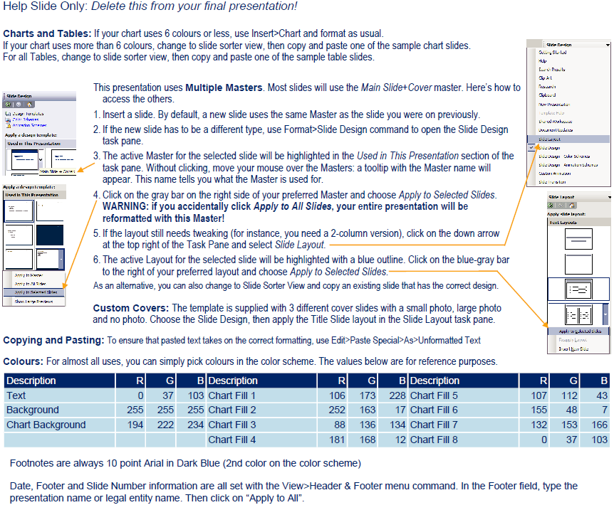
Content from a typical tutorial slide. Multiple Master presentations in PowerPoint 2003 need this information to make them useable.
The scenario that will having you tearing out your hair is the “blended family of Office versions” client who has both Office 2003 and 2007 users. These clients often believe Microsoft’s hype about 100% cross-compatibility between Office versions. PowerPoint is not totally compatible. Masters, slide layouts, charting and color palettes are all different. Behind the scenes, Microsoft has implemented eye-rolling kludges to simulate compatibility. Let me repeat: PowerPoint is not totally compatible!
In fact, the only program where we will not upgrade an older 2003 file to a newer version is PowerPoint. Instead, we rebuild it. If you’re creating a presentation that uses palette-switching to create sections with different color schemes, there is no other possible workflow. It’s the only way to guarantee it’s going to work correctly for the long term.
The best scenario is when the client is using PowerPoint 2007 or better. Compared to earlier versions, the new PowerPoint is a delight to work with and finally offers the capabilities that designers have been assuming were there all along.
Love it or hate it, but Microsoft has made decisions on how you should work with office software. Working within their limitations, your users can have productive careers and get things done. Ignore the limits and you are sentencing your users to hours of formatting hell. A prime example is Office charts
Office charts should have 6 colors maximum. The is a rule made by Microsoft. The exception to this rule is charts in Excel 2003 and earlier, which can have a maximum of 56 colors (see my previous posts for the details on Excel 2003). The following applies to Microsoft Word, but it’s more often a problem in PowerPoint.
If you design charts with more than 6 colors, you are forcing your users to either:
copy, paste and reformat a sample chart into the one they want, or
manually enter the colors for the series above 6 from a reference table of RGB values.
Neither of these could be considered a PowerPoint “Standard Operating Procedures”. Both workarounds are slow and error-prone.
Office Charts in Office 2003 for Windows or 2004 for Mac
PowerPoint 2003 Some color palette slots are used for as many as 3 functions. This makes it tricky to design a color sequence that works for all purposes.
PowerPoint only has code in place to automatically assign 6 palette colors to charts. In PowerPoint 2007 and higher, these are 6 distinct colors that are only used for charts and object fills. In PowerPoint 2003 and earlier, the chart colors are taken from the 8-color palette that is used for other elements as well. This has consequences you have not considered. Here’s how it works:
PowerPoint 2003 and earlier have color palettes with 8 colors maximum. In order, the colors are used for Backgrounds, Text and lines, Shadows, Title text, Fills, Accent, Accent and Hyperlink and finally Accent and followed hyperlink. Applying the recommended color position to a presentation element will mean that that element can be automatically updated if the palette is changed. This is a handy way to create color-coded sections in a presentation.
However, the same colors are used for Office charts. The colors are assigned in this order: Chart Color #1 is always taken from the Fill position. CC#2 is Accent, CC#3 is Accent and hyperlink, CC#4 is Accent and followed hyperlink, CC#5 is Shadows and CC#6 is Title text. Therefore, if you have designed a series of chart colors that is different from the code colors used the the presentation, you must give your users one of two headaches:
User headache number 1: You assign the color palette positions to create an automatically-filled chart, then manually assign all other presentation elements with RGB colors. This means new charts look swell, but color-coded sections cannot be easily updated. In fact, the colors of the entire presentation are must be updated manually element by element. Slow!
User headache number 2: You assign the color palette positions to the correct elements i.e., Title text is filled from the Title text palette position. New charts come in with goofy colors and each series must be manually reassigned from RGB values.
For PowerPoint 2003 and earlier, Microsoft has decided you only need 8 colors for everything. Designing with more colors does not make it a better design. It just makes it harder to use.
Office Charts in Office 2007/2010/2013/2016 for Windows or 2008/2011/2016 for Mac
For PowerPoint 2007 and later, Microsoft has decided you only need 12 colors for the presentation. Fortunately, now there is separation between color functions, with 2 colors for backgrounds, 2 for text, 6 for charts and fills and 2 specifically for hyperlinks. But you still only get 6 automatic chart colors. And in Office charts as in so many Office features, if it isn’t automatic, it’s a time-waster. So the advice still holds that speccing more colors is really imposing lower productivity on your users.
Charts apply this sequence in a predictable way. In a standard column chart, the leftmost column is color #1, with each extra column getting the next color in the sequence. Stacked columns display color #1 as the bottom layer and pie charts apply color #1 to the first pie segment, and by default this pie segment has its left border at 0 degrees, pointing straight up. If you design the presentation with this in mind, implementation is easy for the user.
In Office 2007 and later, there is one potential workaround that gives users access to 10 additional colors. It’s the Custom Color XML hack. This hack adds colors to the color picker in Windows and in Office 2016 for Mac. These colors cannot fill charts automatically and they will not show in the Office 2008 or 2011 for Mac color picker. However, it’s still a less cumbersome workaround than the 2 kludges I mentioned at the start of this article.
Are these limitation fair? No. Are Microsoft’s choices well considered? Not really. Are you going to change the way PowerPoint works by ignoring its limitations? Sadly, the answer is also no.
My recommendation is to incorporate a little Zen into your attitude, accept that PowerPoint (particularly the 2003 and earlier versions) is a deeply flawed and limited program. Then go and create some great Office chart designs with 6 colors or less that are easy to use.
Users create charts in Excel and import them to Word and PowerPoint. Reports frequently require charts. Put these together and you’ll see that when a client asks for a report template, you should also be giving them a compatible Excel template for the report charts they will need.
These charting templates do not have to be complex. Defining a default font and color palette is usually sufficient. The actual steps differ between Excel 2003 and Excel 2007/2010/2013/2016, so make sure you ask your client what version they are using.
The first step with any program is to design the color palette. Excel uses the colors in the order they are entered. In a bar chart, the colors are used left to right as each data series is added. Pie and doughnut charts always start with left edge of the first segment at the 12 o’clock position and proceed clockwise from there. Go with the flow and enter palette colors in the order you want them to appear by default. There is only 1 palette sequence active, so all report charts in your design should use the same color order, or you’ll drive your users crazy.
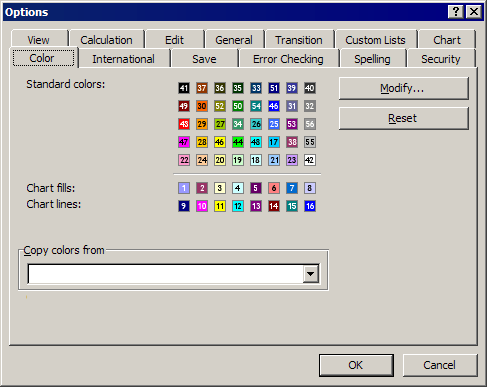
Report Charts in Excel 2003
The numbers show the order used in Excel 2003 charts.
If your client is using Excel 2003 or earlier, open a spreadsheet in that version, use the Tools>Options command and choose the Color tab. For each color in the “Chart fills” row, start at the left, click on a color, then click on the Modify button. Choose the Custom tab and enter the RGB values. Click on OK, then choose the next Color fill patch to the right and repeat.
Occasionally Office 2003 clients will insist on more than 6 chart colors. In that case, keep filling palette spaces with custom colors using the order shown in the illustration. This will give you up to 56 custom data series that will automatically be filled correctly. Be forewarned, when your client upgrades to a later version of Office, they will, in effect, be back to 6 chart colors. Later versions of Excel do not allow this extended palette.
As a final step, choose Format>Style, ensure the Normal style is selected and click on the Modify button. On the Font tab, set the font to the desired typeface, size and weight to match the Word templates into which these will be inserted. OK out and save the file as a template with an “.xlt” file ending. You’re done!
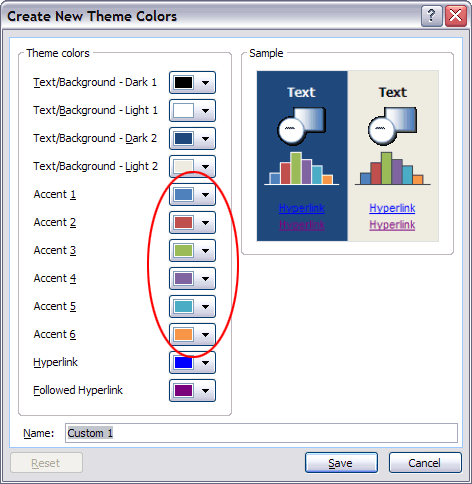
Report Charts in Excel 2007/2010/2013/2016
Circled: the 6 colors that will automatically color Excel 2007-2016 charts.
For clients on Excel 2007 or later, the palette system works differently, and not for the better. Users have lost the capability to set 56 chart colors, now you can only preset 6! The Office 2007/10/13/16 Theme Color dialog displays slots for 6 Accent Colors. Set these with RGB values in the sequence they are t appear in the report charts. If report charts use more than 6 colors, Excel’s default behavior is to color the additional series with automatically generated tints of these 6. To get more custom colors, users must enter them manually. In real life, they’re probably not going to do this. First they have to turn off the automatic series fill, then they have to look up the colors they are supposed to use (where is that tutorial again?), then they have to enter the RGB values. It’s just not a realistic workflow for end users on a deadline.
One alternative is to create a sample chart with manually filled extra data series. This looks good for a client sign-off, but in actual production, the user has to find the sample chart, copy and paste it to their presentation and then change the chart type and data to match what they are trying to show. Again, most users are unlikely to go to this trouble, especially if time is tight.
Finally, if you’re up to a little XML hacking, you can add up to 10 custom colors to the Windows color picker by using my tutorial XML Hacking: Custom Colors. While these colors are not used automatically in chart fills, it’s a simpler process to fill a series by clicking on a custom color than looking up an RGB value.
If possible, it may be best to try talking your client out of using more than 6 colors for charts. The lower expectations will make everyone happier and the end-users would thank you, if they knew who you were.
To wrap up this template, click on the Page Layout tab of the Ribbon, look for the Themes group and click on the down-pointing arrowhead beside Fonts. Click on Create new theme fonts… at the bottom of the list. Set the fonts for both Heading and Body and click on OK. Save the file as an Excel Template with an “.xltx” ending and distribute with the report templates.
An alternative workflow is to save the themes from the Word or PowerPoint file that accompanies the Excel template, then apply those themes to the Excel worksheet. Or course, you still have to apply the same thought process in arranging the colors to create charts that automatically have the right color sequence. It helps that charts created directly in Word or PowerPoint follow the same logic and color order.
Report Charts in Excel 2008, 2011 or 2016 for Mac
In Mac versions of Office, you’ll have to create the Color Theme in PowerPoint, then import it to Excel. Unfortunately, while you can use the Custom Color XML hack to add custom colors to a color theme, you can’t preview them in Office 2008 or 2011.
For the font theme, you can use my tutorial XML Hacking: Font Themes and apply the resulting theme to your Excel template.
Free Control Control Add-in for Word for Mac
Subscribe to the Best Practices blog and get a free copy of our new Control Control add-in. This is the easiest way to create the same modern form controls that are in Word for Windows. Enter your real email and hit Subscribe in the right-hand column of this page. You’ll receive the add-in and installation instructions within 3 days.