The vast majority of presentations are created using the default templates that comes with Microsoft PowerPoint. All Microsoft-compatible PowerPoint templates have a uniform structure, and the result is that you can copy and paste slides between any deck and the paste works as expected: the content comes across perfectly, and the formatting is updated.
But in almost all corporate presentations with custom templates, this no longer works. Slides pasted from Microsoft-based presentations always need to be reformatted manually, because the custom template haven’t been created to be Microsoft-compatible.
It doesn’t have to be this way. Here’s how to create custom templates that will be both Microsoft-compatible and have a look and feel that is brand-compatible with the organization.
What’s in a Microsoft-Compatible PowerPoint Template?
Most designers create presentation templates incorrectly for the purpose of importing of slides created with Microsoft templates. Almost universal infractions include deleting or renaming the default slide layouts, and deleting or adding placeholders on whatever default slide layouts are left. Less common methods that designers use to wreck templates include deleting all placeholders on the master slide, and deleting all default layouts, then trying to replace them
To understand why these actions could cause problems, we need to understand the PowerPoint file structure. All new blank PowerPoint files contain the following:
1 Master Slide (in Slide Master view, the larger slide at the very top of the left-hand thumbnail list). The parent to all the layouts, to which the slide layouts are children. All text formatting is inherited from this slide. Deleting placeholders here will cripple the template.
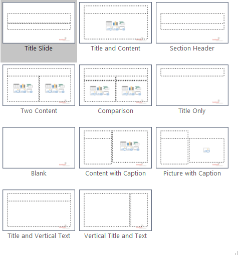
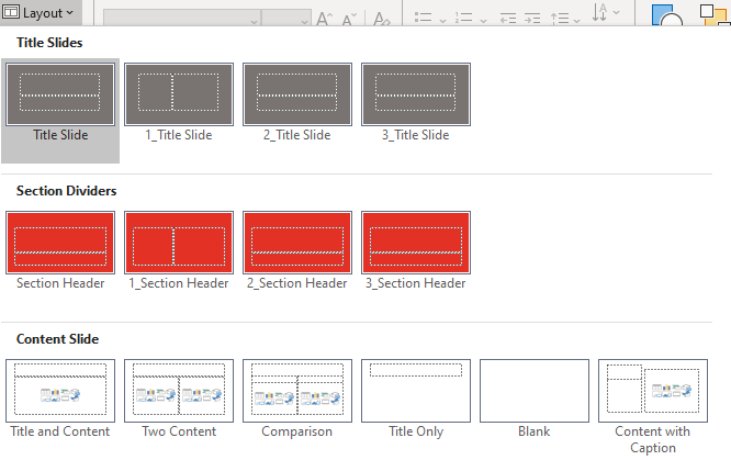
11 default slide layouts, which inherit the formatting set in the master slide. These 11 comprise:
Title Slide, for the presentation title.
Title and Content, for the bulk of the presentation content.
Section Header, to divide the deck into relevant sections.
Two Content, with 2 content areas.
Comparison, similar to Two Content, but each content area also has a corresponding heading placeholder.
Title Only, displaying only a Title field, with the rest of the slide blank.
Blank, with not even a Title field.
Content with Caption, a little-used layout the includes a Title, Text and Content placeholder.
Picture with Caption, similar to Content with Caption, but with a Picture placeholder replacing the Content one.
Title and Vertical Text This layout is intended for Asian language use and is only displayed as a choice if your operating system has an Asian language set up.
Vertical Title and Text Similar to the previous layout, only visible on computers with Asian language input enabled in the operating system.
Each of these layouts has a specific layout type, set in XML and not alterable in the program interface. You can create the correct placeholder types by generating a new, blank PowerPoint file. Each of these layouts contains placeholders for the date and slide number, plus a footer field. All but 1 have a title placeholder.
Here’s the second line of a default Microsoft layout. In this example, obj is the XML type for a Title and Content layout:
If a slide layout has been created by the user from the Insert Layout command, that layout will not have a type. Instead, the second line of the XML will include userDrawn=”1″:
PowerPoint reads the userDrawn property and will not treat your layout as a default layout no matter what you do to it. It will never be Microsoft-compatible.
If you have deleted a default slide layout, you can restore it by creating a new blank presentation, then copying and pasting the layout under the slide master of the deck to be repaired. You can also restore a default layout by running this VBA:
Sub RestoreLayout()
  With ActivePresentation.Slides
    .Add(.Count + 1, ppLayoutObject).Delete
  End With
End Sub
The example above restores a deleted Title and Content layout. Just change ppLayoutObject to the type you need from this list:
Layout Type
VBA Parameter
Title Slide
ppLayoutTitle
Title and Content
ppLayoutObject
Section Header
ppLayoutSectionHeader
Two Content
ppLayoutTwoObjects
Comparison
ppLayoutComparison
Title Only
ppLayoutTitleOnly
Blank
ppLayoutBlank
Content with Caption
ppLayoutContentWithCaption
Picture with Caption
ppLayoutPictureWithCaption
Title and Vertical Text
ppLayoutVerticalText
Vertical Title and Text
ppLayoutVerticalTitleAndText
Here are the recommendations that Microsoft should have published with the release of PowerPoint 2007: All new PowerPoint templates should include all default slide layouts and placeholders. That would have saved so much grief! Every file would be a Microsoft-compatible PowerPoint template or theme.
Please note, I am not suggesting that you restrict your design to only these layouts and placeholders. As long as you have the default layouts with the default placeholders, the rest of the master slide view can be filled with all kinds of special-purpose layouts with any number of placeholders. Just remember, whatever you create today must be supported in the future, if the slides are to remain paste-compatible. For more details, please see my article about best practices for reusing old (legacy) slides: Legacy Slides – Best Practices
I’m adding a plea for sanity on behalf of users everwhere: restraint in slide layout numbers is best for your client’s users. Too many layouts and they just don’t know which one to pick! Don’t confuse them more than they already are. Consider a limit of 25 layouts maximum.
We have years of expertise in this area and can assess your template for Microsoft compatibility, or create a template or theme for you that will work seamlessly with decks based on Microsoft templates. We’re here to help! Contact me at production@brandwares.com.
Unlike PowerPoint, Microsoft Word has a utility to create custom Word table styles. You might think this makes life a lot easier, but you would be wrong. The Word utility has quirks and bugs, and Word tables don’t work the same way as PowerPoint’s. Using the Table Style dialog is not intuitive. To get a Word table style to work exactly to the way it should, you may have to hack the OOXML.
To start, let’s clarify that a table style is one of 4 styles that you can create in Word. The others are paragraph, character and list styles. A well-constructed table style does not need to have paragraph styles applied to it later. That’s because it already contains paragraph styles, though these don’t have the conventional names that you’re familiar with. Here’s how to get the best possible results.
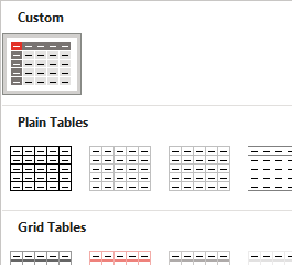
Start with a similar table style
The first step in creating a custom table style is to insert a table, so the Table Design tab appears. By default, a new table will use the Table Grid style, which is very plain. If your final table style requires design options like a distinctive first column or a total Row, Table Grid is a poor place to start. It doesn’t include any of those options, and adding them back in is difficult. Switch the style to a Microsoft default that already has similar features.
Next, expand the table style gallery dropdown again and select New Table Style at the bottom. This ensures that your table style will appear in a new Custom row right at the top of the styles gallery. By contrast, starting with Modify Table Style lumps your style in with all the Microsoft defaults.
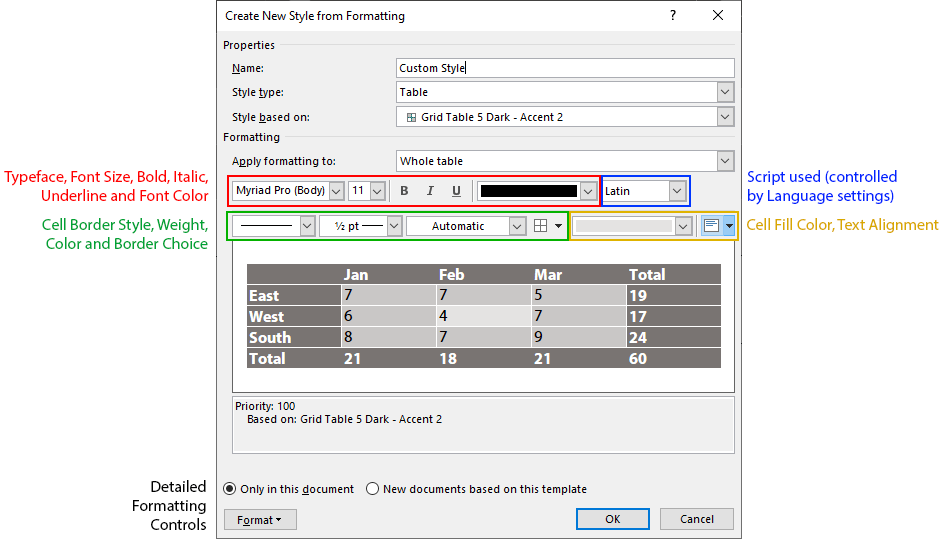
Base the new style on the chosen one
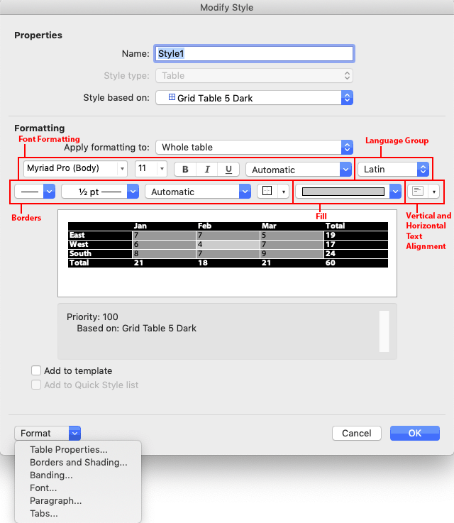
When you choose Table Design>Table Styles>New Table Style, Word sets the Style based on dropdown to Table Normal, not the style you chose. If you originally chose Grid Table 5 Dark, then set Style based on to the Grid Table 5 Dark. (Current versions of Word for Mac have a display bug whereby choosing a different table style does not update the preview in the dialog. Choose the style, OK out, then choose Modify Table Style to see a corrected preview.)
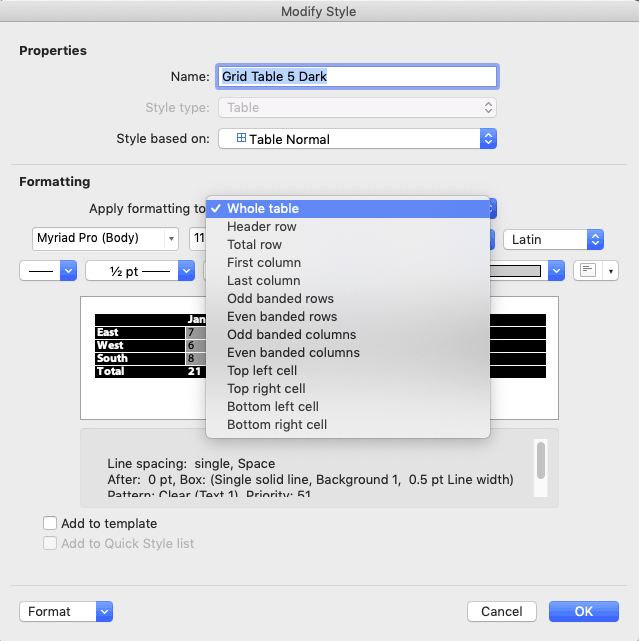
Start with Whole table
Start with the Whole table choice in the Apply formatting to dropdown. This is the default cell formatting that will appear when no other Table Style Options are applied. The formatting controls are condensed, here’s a breakdown of which control does what:
If the formatting control you need doesn’t appear in the dialog, use the Format dropdown in the lower left corner to access more of them.
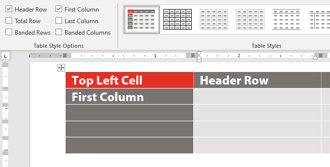
Move on to Header row
After you’ve set the default cell style, choose Header row from the Apply formatting to dropdown. This is where the dialog gets buggy. Many of the controls will retain their value from whatever table part you were previously editing! The controls will sometimes, but not always, display the values used in the new table part you have just selected (in this case, Header row)! So it’s up to you to keep track of what the correct values are for the table part you’re formatting, and apply each in turn.
Format each table part in order
Because of the dialog display inconsistencies, it’s easiest to format each table part in the order they show in the Apply formatting to dropdown.
As you format each table part, Word creates, in effect, a separate paragraph style for each table part. But you don’t apply these styles by choosing a style name. Instead, you check a box in the Table Style Options group of the Table Design tab. Checking the Header Row option automatically applies the Header Row style to the top row of the selected table. When you’re creating a table style for a client, this means many design options can be included in one table style, and you don’t have to include elaborate instructions about which style to manually apply to which table part.
What about the corner cells?
The last 4 items on the Apply formatting to dropdown are to format the top left, top right, bottom left and bottom right corner cells. But there is no Table Style Option to turn these on and off directly. The way Word handles this is that if both the Header Row and First Column options are checked, then the formatting for the top left corner cell is turned on. This formatting can be different from either the header row or the first column. Header Row plus Last Column will turn on the upper right cell. You get the idea.
FWIW, PowerPoint table styles can also have corner cell formatting and the cell formatting is applied in the same way, by using pairs of style options.
Word Table Style Quirks
There are some oddities about Word table styles, and a few bugs. One oddity is that table text is based on the Normal style in relationship to Word’s Default Text settings. If Normal has been set to any color other than Automatic, applying different text colors to different table parts will have no effect. The text will remain the color set for Normal. You then have to apply new paragraph styles to the table parts after creating the table.
Another weird result of the dependency on Normal is that Word expects to have the default line spacing for your version of Word. As I write, Word 365’s default Normal style has a Line spacing of Multiple at 1.08 with Space After of 8 points. In a table style, this gets automatically reinterpreted as Single with 0 before and after. Centered vertical spacing then works as expected. If you change the Normal line spacing to a larger or smaller value, text that is nominally vertically centered will actually sit higher or lower in the cell. If you add 12pt after, the table text will jump from being vertically centered to having 12 pt after, a huge difference. Microsoft doesn’t publish any of this information. Surprise!
This is one of the reasons why Word experts recommend that Normal style should stay as is and not be actually used in a document unless the default formatting matches the needs of the design. Better to format all text as Body Text style and give that style the custom color and line spacing.
But what if you’re given a template that already has a non-standard Normal, and the client asks for a table style? All is not lost. Table styles can still work as designed if you are using Word for Windows (sorry, Mac people). The trick here is to set the document text defaults to the same values as the revised Normal style. (Thanks to MVP Stefan Blom for this tip.) Here’s how to do this:
With the document or template open in Word, click on the Styles pane dialog opener below the Quick Styles gallery, or press Alt + Ctrl + Shift + s at the same time. The Style pane opens.
Click on the Manage Style button at the bottom.
Select the Set Defaults tab.
Set the defaults to the same values as Normal style: same font, size, color and paragraph settings. OK out.
You’ll know you got it right when you insert a table in the new style and it automatically has the correct styling for header row, first column and the other table style options. It is no longer necessary to apply text styles to the table, you can simply turn the Table Design>Table Style Options on and off to affect the related table area.
Word Table Style Bugs
Lousy User Interface Design
In the table style dialog, color dropdowns remain set at the color last chosen, even if that was for a different table part. The dropdown should update to the color currently in use for the table part that has been selected. This is just common-sense UI design.
The interface for setting border styles is pretty bad. It’s almost impossible to set one color for vertical borders and a different one for horizontal borders. All borders switch to the last selected color. But we can fix this with an OOXML hack (see below).
Defective Override Capabilities
Subsequent parts can’t always override the XML of earlier parts. As an example, set the Whole table to have internal vertical rules. Then set the first column to have no rule on the right. This should make the vertical rule separating the first column from the second column disappear, but it doesn’t. The rule has to be manually removed after the table is created.
Non-Functional OOXML Tags
The Paragraph Properties (w:pPr) element for each table part has a pStyle attribute that is supposed to set the paragraph style for that part. It does nothing. As mentioned above, the style is always derived from Normal style.
Format the Word table style options in order.
Start by formatting the Whole table section with the defaults for cell in the middle of the preview. Most of the time, this will include the font size and color, and the table background color and any rules that are to appear if banded rows are turned off. If you can’t get the formatting you need from the few controls on the dialog, click on the Format dropdown to find detailed access to Table Properties, Borders and Shading, Banding, Font and Paragraph attributes. Under Windows, you’ll also see a Text Effects choice, which is of dubious value in a table.
Then move on to Header Row formatting, the next item on the Apply formatting to dropdown. Format each item on that dropdown until you have set all the properties you need. After you get all formatting set, apply the custom style to the sample table you created at the beginning. Then use Modify Table Style for any tweaks required.
Word Table Style Hacks
Default style formatting is hardcoded in Word. So the styles that get stored in a Word file are only styles that have been modified or newly created in the document. All of the style exceptions and new style definitions are stored in the word/styles.xml part. Here’s the OOXML for a full table style. First, the section that formats the whole table. Pr stands for Property. tbl is Table, tc is Table Cell, p is Paragraph and r is Run (any length of text less that a paragraph).
(Above) The w:rPr section sets the default text while w:tblPr sets the borders. This table is transparent when all design options are turned off, so there is no fill. Note the entries for w:insideH and w:insideV. I had to hack this XML to get different colors for the inside horizontal and inside vertical borders.
(Below) Next is the formatting for the header row. w:rPr sets the text as bold and white, while w:tcPr sets the cell borders to nothing and the fill to Accent 2.
(Above) The previous section formats the Total Row, removing the borders. There’s another hack here: the w:shd illustrates how to set the fill as No Color, with both w:color and w:fill set to auto.
(Below) Next up is the First Column formatting. w:pPr sets the text flush right, w:rPr makes it bold and w:tcPr removes the borders and keeps the fill No Color. Oddly, while w:insideH successfully overrides the internal horizontal rules set in the Whole Table section, neither w:right nor w:insideV are able to remove the internal vertical rule to the right of the column. This works as expected in a PowerPoint table style, but is broken in Word.
(Above) The right-most table column is formatted with no borders and no fill.
(Below) If your design includes banded columns, the table style will include a section like this. There is just a definition for odd columns: even columns would be formatted with the defaults from the Whole Table section. If the First Column option is turned off, odd columns start at the left-most column. If First Column is turned on, all columns shift and the column just to the right of the first column takes on odd column formatting.
(Below) Formatting for the 4 corner cells. These are only activated when both options that affect the cell are turned on. As an example, if the table has both a Header Row and a First Column, then the nwCell formatting is turned on. In the formatting for nwCell below, the text becomes flush right when both options are used.
If you base your Word table styles on a table other than Table Normal, that table style will be included in styles.xml. If that table style includes formatting that you don’t want to included in your table style, then delete the section in the style it’s based on. As an example, this style was based on Grid Table 3, which includes a last column and a total row. To remove all last column and total row formatting from your style, delete the corresponding XML sections in both your custom style and in the style on which it’s based. You’ll know when you’re succesful when turning the Last Column and Total Row Design Options on and off in Word has no visual effect on a sample table.
Too complicated? Shoot me a message and we’ll create custom Word table styles for your document or template.
I don’t actually know much, but I have search engine expertise. I’ve answered thousands of question for users on various online fora, and I’m constantly amazed by the vast number of queries that could be answered by a simple Google search. My takeaway is that people just don’t know how to use search engines to their best advantage.
Search Engine Expertise – The Mandatory Word
When a search must include a particular word or phrase, put it in double quotes, if you’re using Google. For Bing and most other engines, add a plus sign before. Here’s a search that must include Word in the results:
Google - "Word" VBA typestyle
Bing and others - +Word VBA typestyle
Search Engine Expertise – The Excluded Word
You’re looking for Word VBA information, but you get pages of useless Excel stuff. For all search engines, add a minus sign before the word you don’t want:
VBA -Excel tables
Search Engine Expertise – The Special Site
You know that you saw an answer on a particular web site, but it was a long time ago and you can’t remember where. Type your search terms, then type site:, then the site URL. No space between site: and the URL:
"edit mode of header/footer" site:answers.microsoft.com
Searching Phrases Instead of Words
Put the phrase between double quotes. The following shows results about the top of the page that don’t refer to the header and footer:
Word top part of page -"header and footer"
A Practical Example
Do you use Office for Mac? It’s hard to find relevant information, since the Mac version is still quite different from Office for Windows. Just add “for Mac” to your search terms and watch as hundreds of pages of useless Windows pages disappear. This can save you hours of time!
Using just these 4 tips, you’ll find relevant information much more quickly. You may have even more specific requirements. Check out the Advanced Search page for your preferred engine, you may find some techniques that will make your day more efficient:
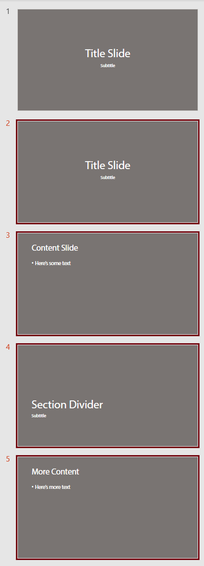
One of my areas of expertise is to do presentation assessments for designers, finding any potential problems in their work before sending their file to their client. Something I see fairly often is multiple slide masters in a template or theme, where they are used as an organizational tool. Typically, one master will be for title slides, another for section headers, and so on. This is a poor practice, but it goes on because designers never have to actually use the files they create. If they did, the problem would soon become evident. Here’s a typical example:
Multiple Slide Masters – How They Work
If I asked you “How does PowerPoint know which slide master to use when there is more than one?”, what would your answer be?
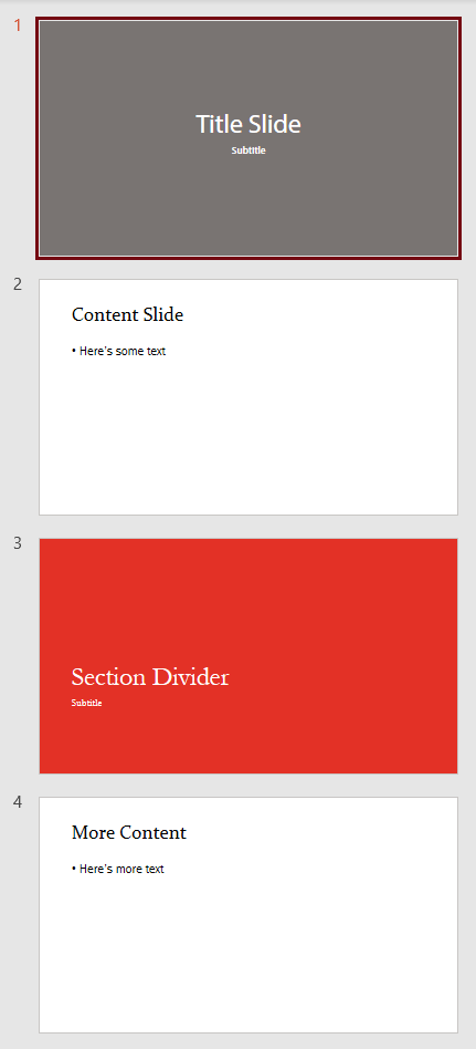
Well, I’ve done the research, so I can let you know. When you paste slides into a presentation, PowerPoint looks at the slide immediately preceding the paste position and uses the slide master for that slide. If there are no slides in the presentation, then PowerPoint uses the first slide master. This has major consequences for the format of the pasted slides. If the slide master of the preceding slide has only title layouts, only the pasted title slides will find their rightful layout. All the rest of the slides will bring their old layout with them. So now the slide master for titles has a whole bunch of non-title layouts. Oops. So much for your organizational scheme. Following are the original slides, followed by what they look like when pasted after slides based on different masters:
4 slides based on 3 slide mastersPasted after slide based on first masterPasted after slide based on second masterPasted after slide based on third master
If the pasted slides are from legacy presentations, where the intention was to update them to the new look, you get a total fail. Not only do they not update, they’ve ruined the new deck with added old layouts. The next time the user adds a new slide and tries to find a layout in that slide master, they get a psychedelic soup of designs.
But wait! It gets worse! For some bizarre reason, designers have a bad habit of deleting all the placeholders on the slide master, then building the design in the layouts. Ouch! The placeholders on the slide master are parents to the child placeholders on the layouts. They are the source for font and paragraph formatting in layout placeholders, as well as the default placeholder positioning. When you paste slides so they use that blank slide master, formatting goes haywire. The slide layouts that get imported with the pasted slide have no source to tell them how to display content. PowerPoint makes a guess and always guesses wrong. Bold text becomes regular, font sizes changes, pictures disappear. It’s a nightmare, and one that designers just don’t understand, can’t explain to their clients, and have no idea how to fix.
A Better Approach
The simplest is to just use a single slide master. In 99% of presentations, one slide master is all you need. That slide master should be formatted as closely as possible to look like a typical content slide. Then for layouts that have different formatting, right-click on the layout background and choose Format background. In the Format Background task pane, check the option for Hide background graphics. Then place the alternate graphics on that layout.
About the default placeholders: keep them! Deleting the default placeholders does nothing helpful and can cause problems. If someone pastes a slide with a footer and your layout doesn’t have a footer placeholder, the footer text will reposition itself, often at the very left edge of the slide, because the content has been orphaned. If your design doesn’t include a footer, move the placeholder off the bottom of the layout! This makes a pasted footer simply disappear instead of looking weird.
Multiple Slide Masters – When and How to Use Them
You can use multiple slide masters for organization of slide types as long as each slide master is identical. An easy way to ensure this is to create all your slide layouts under a single slide master. Then duplicate that slide master and delete the layouts not needed. So you might end up with 2 identical slide masters, one that has all the title and section divider slides, then another that has all the content slides. As long as the slide masters are the same, mixing and matching will not create any problems.
There are other viable uses for for multiple slide masters. One is when a presentation requires multiple color themes. Some organizations have divisions that use code colors: a key color that is used only in that group. Under the slide master, create the complete set of layouts needed for the presentation. Set the code color in Accent 1 if it’s a predominant element of the client branding. If it’s a subtle design change, Accent 6 is better. Get the client to sign off, so the design is not going to need a lot of future revisions. Then copy and paste the slide master for each code color required. Finally, revise the color theme for each slide master, changing only the accent color. Following this method, every slide master has every layout. The worst that can happen is someone pastes in the wrong place and the code color is off. Easily fixed.
The other time you need multiple masters when a client has rolled out a new template, then realizes they need to handle legacy slides. Then you create a second slide master with layouts that match the new look but have a layout structure that is compatible with the old decks. At the beginning of the deck create 2 sample slides, one based on the new slide master and another based on the legacy slide master. Place a notice to the user just off the edge of the slide master for the first slide: “New slides only! Don’t paste old slides!” and on the second “Paste old slides here! No new ones!”. Then users are less likely to paste slides in the wrong spot and get weird results.
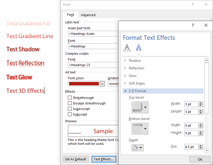
The Best Practice is to NOT use Text Effects in Office. Ever.
That could have been my shortest article ever, but I guess I should explain the reasons. I’m referring to the graduated fills and lines, the glows, reflections, shadows and 3-D effects you can add to text. In the past these effects have caused some problems with ordinary shapes, but with text, they’re a disaster.
Clearly, it’s not enough for most users that these effects are visually hideous. That just a natural result of the low value we assign to arts education. In many years of working with competent graphic artists, I’ve never been asked to create any template that uses these effects. Designers understand the need for restraint, users don’t. And so we get the appalling appearance of most Word and PowerPoint documents.
But the functional problem with these effects is how they affect PDFs created from Word, PowerPoint and Excel. Microsoft has no clue how to export true PostScript of the fancy effects. So they adopt a simplistic approach: flatten them to graphics. Unfortunately, this means the text vanishes, leaving behind only a pretty picture. Well, not even that. All kinds of PDF functions are impaired: Text to speech is impossible, accessibility goes right out the window, reimporting the PDF to Office is brain-dead.
I tested PDFs created in 3 ways: saving to PDF in Office, printing to Acrobat and printing to the Microsoft Print to PDF print driver that comes with Windows 10. When saving to PDF, all text with applied effects was flattened. When printing to either Acrobat or Microsoft Print to PDF, Gradient Fills, Gradient Lines and 3D Effects were flattened, while Shadows, Reflections and Glows remained as live text.
The moral is clear: when the client asks for Text Effects, just say NO!
Back at the dawn of time, when PowerPoint was first being programmed, a fateful and incorrect decision was made. Placeholder content would always appear in front of static content, regardless of how placeholders and other content were stacked on the layout. This has led to countless bald designers, from them tearing out their hair because there’s no way to place logos over photos.
The Locked Graphics Workaround
One way to circumvent this design flaw is to place a picture placeholder on the layout as usual. Then create a sample slide from it. Place the logo over the photo and lock its position in the XML. Here’s my article on how to do that: OOXML Hacking: Locking Graphics. This allows the user to replace the photo while keeping the logo in front.
The disadvantage is that you can’t create a new slide from the layout. Instead, the user must copy and paste the sample slide to create another one.
The Background Picture Fill Workaround
If the photo is a full-screen photo, there’s another method. This time, don’t place a picture placeholder on the layout. Instead, just place the logo there. In use, the user right-clicks on the background and chooses Format Background. On the Format Background task pane, choose Picture or texture fill, then click on the File button and choose the background photo. The logo will stay on top.
The disadvantage to this technique is you have to include instructions to the end user, who may never have used a picture fill previously. My thanks to Jaakko Tuomivaara of Supergroup Studios in the UK for this tip.
The Holey Placeholder Workaround
For simple logos, or logos contained in a simple shape like a circle or square, create a logo-shaped hole in the placeholder. Here’s a Windows-only version.
On the layout, create the picture placeholder.
Insert the logo as an EMF vector file, then ungroup it twice, confirming with PowerPoint that you want to do this. This changes it from a placed picture to a set of vectors embedded on the layout.
With the logo parts selected, hold the Shift key and click on the placeholder.
Fill the background, or a shape placed behind the logo hole, with the logo color.
If the logo is in a shape, you can use similar steps on both Windows and macOS computers. Using Mac command names: Place the logo over the placeholder, then draw a Shape exactly the same size as the logo, placed over the logo precisely. Select the shape and the placeholder, then use Shape Format>Merge Shapes>Fragment, then delete the shape to reveal the logo-sized hole in the placeholder. For some reason, Merge Shapes>Subtract works differently on a Mac, deleting both the shape and the placeholder, but Fragment still get the job done. Thanks to Ute Simon for suggesting this method in the comments.
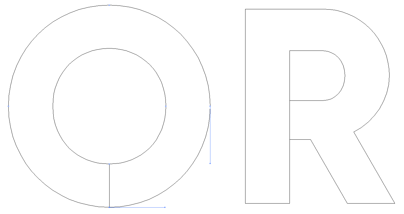
A variation on this that can be more detailed is to place a copy of the logo above the placeholder. Then, shape-by-shape, use the logo over the placeholder with the Combine variant of Merge Shapes to knock holes in the placeholder. Then add colored shapes below the placeholder to “fill” the holes. If you have compound shapes (like the letter O or A), you’ll have to release the compound shapes, then connect the inner shape with the outer one. Here’s what the end result looks like in Illustrator.
Outside line connected to inside to simulate a compound shape
Logos Over Photos: The Placeholder Picture Fill Workaround
This works with any size photo, it doesn’t have to be full-frame like the previous hack. No copy and paste, no instructions required. I heard about this one from Joshua Finto (Make It So Studio in Austin, TX).
On the layout, insert a picture placeholder to hold the photo. Then add another placeholder on top, sized to exactly the same size as the logo. I use Online Image placeholders because they are rarely used, using a common placeholder type risks content being placed in it if you change layout types. Remove bullets, if there are any, and type a space character so no placeholder text appears.
In the Format Picture task pane, click on Picture or texture fill, then on the File button and fill the placeholder with the logo. Create a slide, place a photo and voila! The logo appears over top of the photo! After creating this, it’s wise to lock the placeholder in XML on that layout, to prevent distortion by the user playing with it. OOXML Hacking: Locking Graphics. EMF, SVG and transparent PNGs are all good logo formats for this application.
Microsoft maintains Feedback forums to collect feedback from users. I’ve created a suggestion there that the placeholder/shape stacking order on the layout should be respected on slides. Please add your vote here: Placeholders Should Not Pop to the Front. Perhaps we can persuade Microsoft to fix the mistake so we don’t need these time-wasting workarounds.
Thanks to my readers who have added some useful suggestions! Please read the comments for additional ideas and tips.
Groups of workers usually use the same templates. But it can be time-consuming to keep everyone updated when templates are installed separately on each desktop. Instead, you can implement shared workgroup templates with a feature already built into Office.
Shared Workgroup Templates – Multiple Uses
Every desktop version of Office, Mac and Windows, includes a Workgroup templates option that allows you to set a network share as a templates folder. Templates on this share are instantly available to all users, making updates and revisions a breeze. Automatically, everyone in the office is using the same version. As long as template names remain identical, then old Word documents automatically attach themselves to the new template.
While you can only set the Workgroup Templates location in Word, once you make the change there, it also applies to PowerPoint and Excel.
The Workgroup templates network share can serve more that just templates. With some additional subfolders, it can be a source for Document Themes, including custom SuperThemes, it can hold collection of Font and Color themes. These additional files don’t show in the File>New dialog. Theme files display under the Themes dropdown, theme colors under the Colors dropdown and theme fonts under the Fonts dropdown.
Shared Workgroup Templates – Setup
To set up shared workgroup templates, first create the network location and ensure it’s accessible to all in the office without a signin. Each computer should connect to the share automatically on restart, so users don’t have to remember to manually connect before creating a new document. Create subfolders with the following names for othe file types you want to support. Document Themes for themes, with subfolders for Theme Colors and Theme Fonts. All versions of Office expect exactly the same file structure.
If the office uses Group Policies to install and configure software, you can use that feature to add the Workgroup Template location to each user installation. If you’re using “sneakernet” for configuration, here’s how to do it manually. All Office suites use a setting in Word to set the location for all the other programs
Office 2010, 2013, 2016 and 2019 for Windows
In Word, choose File>Options>Advanced.
Scroll down to the General section of Advanced and click on the File Locations… button.
Select the Workgroup templates line, then click on the Modify button.
In the dialog that opens, enter the path to the network share in the Folder name field, or use the window controls to navigate to the folder. Select the folder and click on OK. OK all the way out and close Word
Office 2007 for Windows
In Word, click on the Office button, then on Word Options, then on Advanced..
Scroll down to the General section of Advanced and click on the File Locations… button.
Select the Workgroup templates line, then click on the Modify button.
In the dialog that opens, enter the path to the network share in the Folder name field, or use the window controls to navigate to the folder. Select the folder and click on OK. OK all the way out and close Word.
Office 2003 and earlier for Windows
In Word, choose Tools>Options and click on the File Locations tab.
Select the Workgroup templates line, then click on the Modify button.
In the dialog that opens, enter the path to the network share in the Folder name field, or use the window controls to navigate to the folder. Select the folder and click on OK. OK all the way out and close Word.
Office 2016 and 2019 for Mac
In Word, choose Word>Preferences>File Locations.
Select the Workgroup templates line, then click on the Modify button.
In the dialog that opens, use the window controls to navigate to the folder. Select the folder and click on Open. OK out and close Word
Office 2011 and earlier for Mac
In Word, choose Word>Preferences>File Locations.
Select the Workgroup templates line, then click on the Modify button.
In the dialog that opens, use the window controls to navigate to the folder. Select the folder and click on Choose. OK out and close Word
Shared Workgroup Templates in Use
Here’s how to access Workgroup templates in Office programs
Office 2016 and 2019 for Windows
Choose File>New.
Click on Custom.
Click on Workgroup Templates, select a template, then click on Create.
Office 2013 for Windows
Choose FILE>New.
Click on SHARED.
Click on a template.
Office 2010 for Windows
Choose File>New>My Templates.
On the Personal Templates tab, select a template, then click on OK. This tab also shows local templates on the user’s computer.
Office 2007 for Windows
Click on the Office button, then on New.
Click on My templates…
Select the My Templates tab. Workgroup templates are displayed along with local templates in the same pane.
Office 2003 and earlier for Windows
Click on File>New. The New Document pane opens at the side of the window.
On the New Document pane, click on On my computer…
Select a template from the General pane and click on OK. This pane shows a mix of local and workgroup templates.
Office 2016 and 2019 for Mac
Choose File>New from Template…. The Document Gallery opens
In the upper left corner, click on the Work link. This link only appears when you have a Workgroup Templates location set in Preferences.
Select a template, then click on Create.
Office 2011 for Mac
Choose File>New from Template. The Document Gallery opens.
Click on Workgroup Templates in the left-hand TEMPLATES list..
Select a template and click on Choose.
Office 2008 for Mac
Choose File>Project Gallery. The Project Gallery opens.
Click on My Templates in the left-hand Category list..
Select a template and click on Open. This window will show a mix of Workgroup and local templates.
Shared Workgroup Templates – Shortcomings
In addition to templates and themes, a local templates folder also serves custom Chart and SmartArt templates. Neither of these formats is supported by Workgroup Templates, so those templates must still be installed locally on each user’s computer.
Legacy Slides – Making It Work the Way You Think It Should Work
Here’s an all-too-common scenario. An organization has a library of presentations built up over the years, full of valuable content. Time passes and a branding update becomes inevitable, to keep the corporate look contemporary. A designer is hired, a new template created and distributed. Users create new decks and start pasting in old slides. Chaos ensues: the formatting is all f***ed up! It could be something minor, like regular text changing to bold. But much more often, old formatting gets pasted in, and in Slide Master view you start seeing unwanted layouts, often with names preceded by numbers like 1_Title and Content. What went wrong?
PowerPoint has several requirements for pasting to work as expected. When you paste in old slides, and you want them to map to your new slide layouts, they must meet all 5 of these criteria:
The slide layout name must be the same. This can be set in Slide Master view.
The slide layout type (as set in XML) must be the same. If you copy an existing Title Slide layout, it will retain the layout type. But if you delete all Title Slide layouts, then realize you made a mistake, you’re in trouble. It’s possible to recreate a built-in slide layout by running a VBA macro:
Sub RestoreLayout()
  With ActivePresentation.Slides
    .Add(.Count + 1, ppLayoutObject).Delete
  End With
End Sub
The number of placeholders must be the same. When there is a different number of placeholders on the slide being pasted, PowerPoint goes mental and will reassign content randomly.
The types of placeholders must be the same. If a user is pasting a Microsoft-compatible Title and Content slide, PowerPoint is looking for:
1 Title, 1 Content, 1 Date, 1 Footer and 1 Page Number placeholder. No more, no less. If your old template layout has only a Title and Content placeholder, your new template must have the same.
For corresponding placeholders in the old and new layouts, the idx number must match. Title placeholders don’t have idx numbers, because there is only one of them on a slide at a time. The idx numbers tell PowerPoint which placeholder should receive information from a particular placeholder in the old layout. This allows you to have several of the same type of placeholder on a layout and still have PowerPoint map content correctly among them.
This simplest way to guarantee that all these criteria will be met is to not create a template from a brand new file. Instead, reformat the old template to the new branding, taking care not to delete or rename any layouts (you can add new ones), and not to add or delete any placeholders on the existing layouts.
Legacy Slides – Another Possible Hiccup
An additional wrinkle can appear if an embedded image is included, perhaps for a logo. Then the XML will include a line line this:
<a:blip r:embed="rId2">
rId numbers are used by the _rels file that corresponds with the layout to tell PowerPoint where to find the logo. If the rId number is wrong, PowerPoint will show an empty box with the text The picture could not be displayed. Of course, you could just replace the image if you see this error during file construction.
Static pictures, graphics, text boxes and shapes placed on the layout make no difference to layout mapping. Add them, remove them, they won’t stop PowerPoint finding the correct layout.
If a pasted slide does not meet all of the above criteria, PowerPoint imports the slide layout from the old deck, prepending it’s name with 1_, if it’s the first time it’s importing that layout. Very quickly, the client’s deck is polluted with multiple spurious slide layouts. When face with choices like Title and Content, 1_Title and Content, 2_Title and Content, 3_Title and Content, the user will simply give up trying to decide which one to use. Branding goes down the drain.
After 3 pastes from “designer” decks, this is what your client is struggling with:
For maximum legacy compatibility, new templates you create for a client should include the slide layouts and placeholders of previous templates they have commissioned. Often it’s feasible to segregate these using different slide masters, one for each previous template they have used. Each slide master includes exactly the same layouts and placeholders used in a previous version, but with the branding updated to the new look. Then in the receiving template, the user is instructed to paste immediately after a slide based on an earlier version. This method can reduce the user’s pain of having to follow your shiny new template.
In a workflow where PowerPoint files are converted to Google Slides and back, none of the above will work. The XML created by Google is a mess and pasted slides will inevitably bring their non-standard Google layouts with them. There is no fix for this other than a custom VBA conversion macro.
We have years of expertise in this area and can either assess your template for legacy slide compatibility or create a template or theme for you that will work seamlessly with your old files. We’re here to help! Contact me at production@brandwares.com.
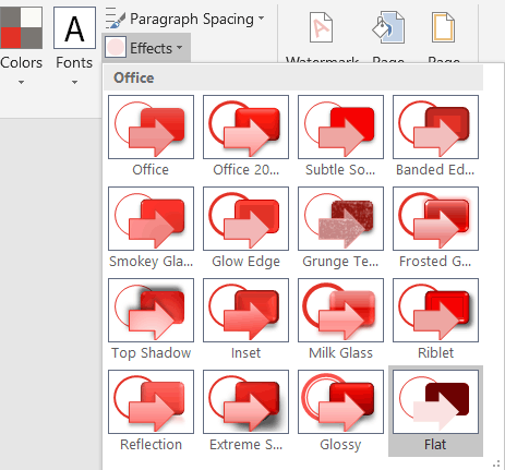
I’m writing an article or two about Office Effects Themes and how you can modify them. As an example, I created the Brandwares Flat Theme, which will be of use to designers as is. This theme file gets rid of the bulgy 3-D shapes, glows and hokey shadows of the standard Microsoft themes and relies only on tints, shades and outline variations. You can use this example in 2 ways: as a theme file that you can modify and send as your own, and as an Effects Theme file that can be installed in Office for Windows to provide access to flat shapes in all other themes.
Here you can download the Flat Theme. It’s also available on our Downloads page. After downloading, you can open it in PowerPoint, create new font and color themes, apply them, then resave as a new theme. The flat shapes will travel with the theme and be automatically applied to any deck that uses the theme. If you’re an Office for Mac user, you’ll have to create a font theme using this article: XML Hacking: Font Themes.
The Flat Theme – Specs
There are 7 variants in each row of the the Shape Styles dialog, each showing the dk1 color as a background plus the 6 Accent colors. The first 2 rows feature a 0.5pt outline on the shape in a darker variant of the accent color, with the first row showing a white shape background and the second row the relevant accent color.
The third row is the one I choose most of the time: a flat shape with no outline.
The fourth row has a 50% screened-back background color with black text.
The fills for the 5th and 6th rows are 2 progressively darker shades of the accent colors. The 5th row shows a 50% shade of the color, while the 6th is a two-layer multiplier fill with a 50% shade overlaying a 50% tint. I’ve written at length about effects themes and their construction in my book about OOXML Hacking.
Users of Office 2016 for Windows and for Mac will see an additional group of Presets below the theme shape styles. Except for the stroke weight in row 2, these fills are generated automatically by the program and cannot be modified by XML.
The Flat Theme – Installing as Effects Theme
You can also use the Flat Theme as a new effects theme in Windows versions of Excel, PowerPoint or Word (Office for Mac will display effects themes embedded in a theme or template, but there is no support in the program interface for applying a different effects theme). Then it will appear in the Theme Effects dropdown of Office for Windows along with the standard Microsoft themes. Here are the steps to do that:
Download the Flat Theme from the link above and unzip it.
Change the file name from BrandwaresFlatShapes.thmx to Flat.eftx. The first part of the name can be something other than Flat, but the ending must be .eftx. No other change to the theme file is needed.
Close all Office programs.
Copy the file to the same folder as the Microsoft Theme Effects files: