When you choose fonts for Office, it takes a different approach than selecting typefaces for an InDesign document. One obvious difference is that you only need to install the font for a design document on the computer where it’s being created. Using the same font in an Office program will require the font to be installed on every computer using the document. Clearly, this is a much more costly solution. Aside from that, let’s look at the pitfalls of choosing fonts for Office templates.
Choosing Fonts for Office – Fake News
Most of what you see on the internet comparing font formats is wrong. Almost all modern professional fonts are OpenType format. There is PostScript-flavor OpenType, favored by Adobe and ending with .OTF And there is TrueType-flavor OpenType, Microsoft’s choice, ending with .TTF. It’s the continued use of the .TTF file ending that has misled many into thinking that they’re old-fashioned TrueType fonts. They’re not.
To verify this in macOS, open FontBook and examine a font with a .TTF ending. Make sure choose View>Show Font Info. Now look at the Kind parameter. Old-fashioned TrueType fonts would say TrueType here, but more likely you’re seeing OpenType TrueType.
In Windows, if you right-click on any file ending in .TTF and choose Properties, Type of file is reported as TrueType font file (.TTF). But this is illustrative of Windows’ relatively brain-dead design rather than any real information about the font.
Confirming this in Windows requires a few more steps. Start by opening the C:\Windows\Fonts folder. Set the View menu to Details. Now right-click in the row that displays the categories like Name, Font Style, etc. A list of avilable categories display. Choose Font Type. Now you can see that almost all the fonts are OpenType. You’ll only see TrueType if you’ve installed some old fonts from the 90s.
Choosing Fonts for Office – Designer Vanity
Designers from different geographic areas spec fonts differently. As one example, Toronto designers tend to focus on the practicalities of electronic document distribution. As a result, they will often choose Arial or Times New Roman for the user-filled portion of a template. By contrast, designers from New York focus on creating a distinct visual appearance. They choose unusual designer fonts. This creates logistical problems for their clients. They must spend money licensing for all workstations and then take time to install the fonts for each user.
Test fonts from small foundries to licensing a lot of copies. I’ve written about this issue before: Cross-platform Fonts from Small Foundries: Beware! In a mixed Windows/OS X environment, a poor quality font will not display correctly in documents that move between Mac and PC. One typical symptom is Italic text that displays as Roman or Bold when viewed on a different OS, or some similar weight/style mixup.
Choosing Fonts for Office – Collaboration
If the client uses Office documents for collaboration (Don’t know? You should be asking these questions!), you should seriously reconsider a “designer-y” font choice. When the documents arrive at your client’s client, that computer will not have the fonts and the document appearance will change drastically. Unlike web pages, Office documents do not have a font fallback setting. There is no practical way to preset which font will be substituted when the original is missing.
I know what you’re going to say next: “What about if we embed the fonts?” Here are several reasons why that might not work.
Embedding does not work at all in Office 2011 or earlier for Mac. Users of these versions can neither embed fonts, nor can they view fonts that have been embedded in Windows.
Embedding doesn’t work in Word or Excel for Mac, in both the 2016 and 2019 versions. PowerPoint 2016 for Mac users must have at least version 16.11 to view embedded fonts. The 2016 retail version (as opposed to the Office 365 subscriber version) cannot embed fonts in PowerPoint. Mac users must have at least Office 2019 retail or Office 365 version 16.17 to save embedded fonts in a PowerPoint file.
Many typefaces have restrictive embedding permissions. So even if you can embed the font and your client can see it, they will not be able to edit the document using the embedded font. You can get around this if you contact the foundry and request a version with Editable or Installable permissions. Expect to pay a surcharge for this. Some foundries charge a lot for this service, because they’re concerned about losing sales to possible piracy.
Choosing Fonts for Office – Font Families
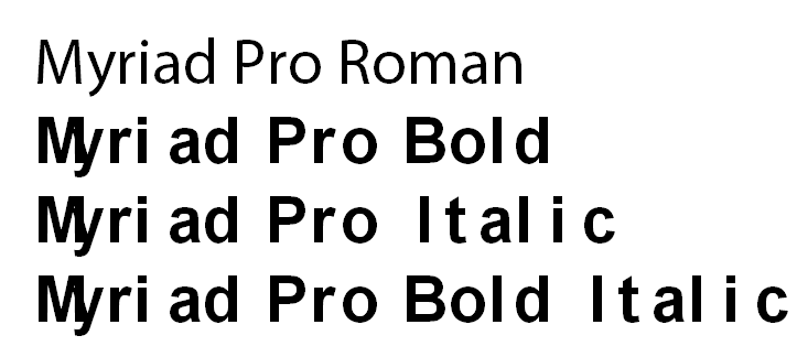
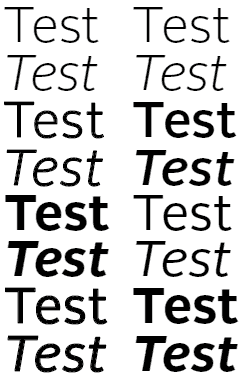
Designers are used to Single versions of fonts. The is where each font variant appears as a separate entry in the font list in Office. If you want to change to bold or italic, you select a different font from the list. Office doesn’t usually work this way and Office users are not used to this method.
When all four faces in a font family are installed, using the bold and italic buttons has the intended effect of switching fonts.
Instead, Office users are familiar with Family fonts. This is where where a group of (usually 4) fonts is linked. To get bold or Italic variants, they click on the Bold or Italic buttons, leaving the font name the same. The foundry usually creates the font families, though there are some type utilities available that let you make a family out of single fonts. As I mentioned earlier, Microsoft hasn’t figured out how to consistently display an .OTF font family correctly. Symptoms vary but are along the lines of you choose Bold and you get Bold Italic, or a similar variant. The wrong font is shown and printed. Typocially this will manifest when moving a Windows-created document to macOS or vice versa.
If the font is not set up as a family-style font, then using the bold and italic buttons fakes the look with stroking and/or slanting the roman. The result is a disastrous visual effect.
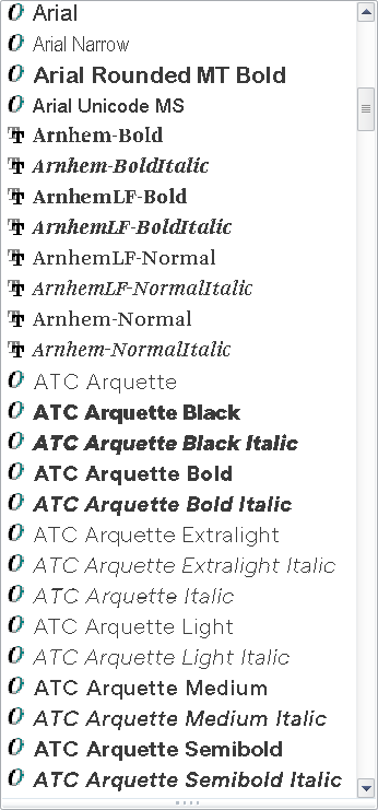
In macOS, it’s not obvious when you are using single versus family fonts. MacOS creates family groupings on the fly. In Windows, it’s easy: install the fonts, then look at the font menu in an Office program. A font family will only have one entry for the family, while singles will list every font variant. In this screen shot, the Arials are families. Arnhem and ATC Arquette are collections of single fonts:
The Arials are families, while Arnhem and ATC Arquette are singles.
The logical conclusion to the font family approach is that your client should almost never be licensing just one or two typefaces. If four family members are not installed, Office will fake them by stroking the font for bold and slanting it for italic. As you might guess, this looks ghastly and completely off-brand.
The exceptions to this rule are:
If the document is a fillable form in Word or Excel. Those documents are typically locked so the user can’t change the font or its attributes.
The the font is used only for Headings. These are usually bold and stay that way, so there is less chance of a user applying attributes.
In either of these 2 situations, you should be able to get away with licensing a single typeface instead of a complete family.
A font family with all 4 members installed. The bold and italic button work as expected.Here is a family-style font with only the Roman installed. Using the bold or italic buttons gets you this dreadful look, plus an out-of-memory warning from Office.
If your design calls for an unusual mix of weights, like Light and Demibold instead of Regular and Bold, contact the foundry to request a custom family. There is normally a small charge for this service. However, if the licensing deal is large enough, the foundry may waive this.
Choosing Fonts for Office – 2 Solutions
To sum up, for each different font used in your design, your client should be licensing a complete family of 4 typefaces in TrueType or Truetype-flavored OpenType.
Brandwares is a font reseller and we’ve been speccing type for Office for years. If you choose us to create your templates, we can also source your client fonts in the correct format and family. This service includes free tech support. We’ll help your client with any installation or usage issues and communicate with the foundry, if necessary.
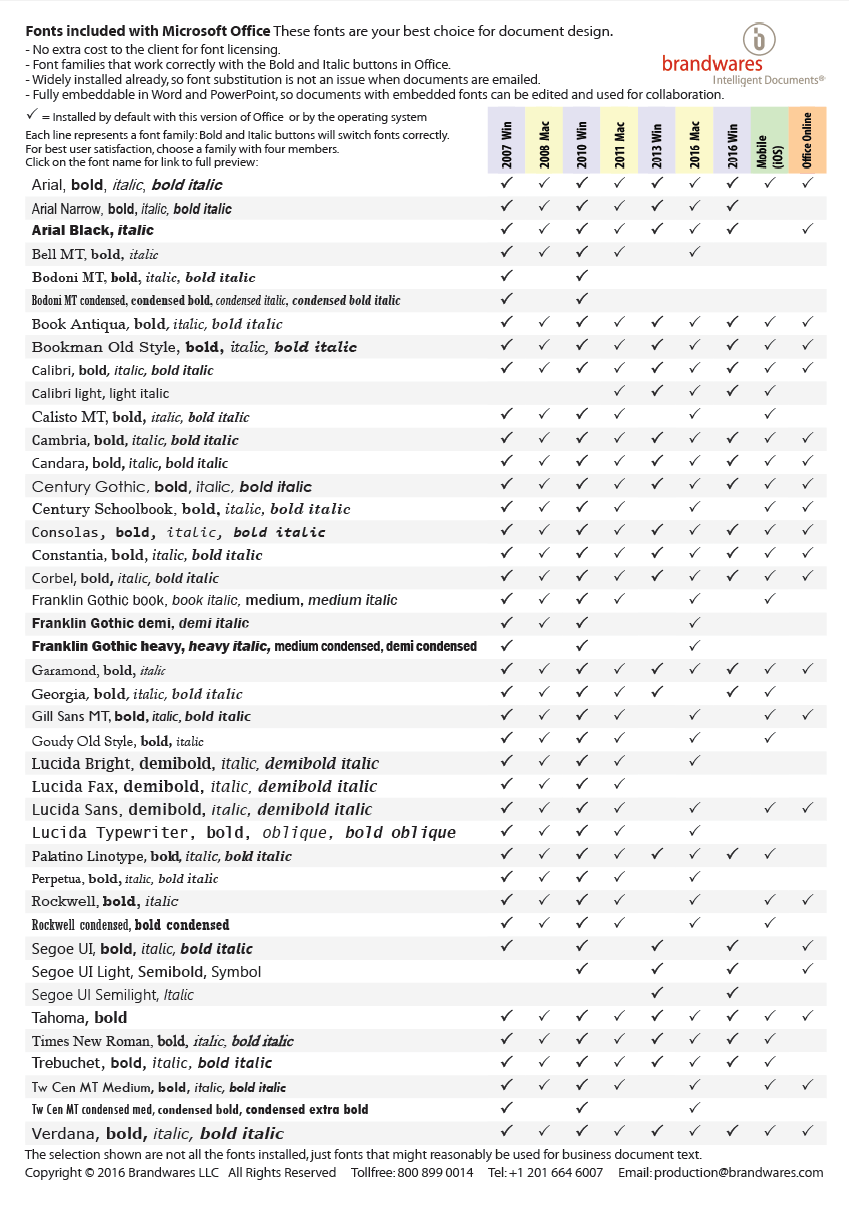
Working on your own? A simple way to eliminate all these issues is to design with the fonts that are already installed by Office. There are many faces more interesting than Arial and Times New Roman in this collection. The fonts that come with Office don’t require any additional licensing fee. They are already installed and they have relaxed embedding permissions to make collaboration easy. They are all high-quality typefaces licensed from major foundries like Monotype. Here is a list of the families that are useful for business communications (we left out Comic Sans!). For maximum compatibility among all versions of Office, use a font that is checked in every column.
Click to view larger image
This list is available as a free PDF that shows character listings for every font by clicking on the font name. Email me to get a copy: production@brandwares.com
It’s a challenge to create the absolute best quality logos for client files in Microsoft Office. Most artists choose bitmap formats for logos, usually JPEG format. Apparently this is some kind of received wisdom from artist to artist, because JPEG format is close to the worst possible format for logos. But I’ve already covered this subject in JPEG Logos? Fail! back in 2013.
Brandwares has used indexed-color PNG format for most line art (a term for non-photographic art that is mostly flat color areas). Most logos qualify as line art. But there are a couple of disadvantages to using any type of bitmap format for branding information.
With Office files, Microsoft is determined to foist image “compression” on us. I put compression in quotes because Microsoft’s solution is really downsampling by another name. Whatever the name, the results are blurry and absolutely do not reinforce the brand. All bitmap files will be downsampled unless the user chooses only a single file. You can’t protect the company logo, even with XML hacking. Let’s face it, sooner or later, bitmap logos will look like mush.
The other persistent problem with bitmap formats is what happens when you create a PDF from a document. Acrobat’s default settings assume you want to create a small file to post on a web page. This was a serious problem 20 years ago. So, once again, a software company’s helpful authoritarianism leads to default settings that cream the logos in any Office file.
Vector Formats for Best Quality Logos
For many years, we at Brandwares were aware that a vector format was a potential way out of this. Vector formats are naturals for line art, because they easily handle geometric shapes with simple coloring. But there are relatively few vector formats from which to choose, and the available formats didn’t seem up to the job.
One grandaddy of vector formats is the EPS file. Well-known to designers, the EPS doesn’t get great support in Office programs. Printing them at high resolution requires PostScript support from the printer, which is dicey in most business offices. Office programs can’t ungroup them, so adding theme color support in an Office file is out of the question.
CGM was an early contender, and is still used in technical applications. But it never got support in common file formats. SVG is making inroads on the web, but Office is only beginning to support the format.
Let’s be honest, Microsoft offers the best support to the formats it invents. For vector graphics, that is WMF and EMF. WMF is a 16-bit format that was invented in the ’90s. In practice, it’s not too useful today. All too often, WMF files do not render the inside curve of shapes like O or D. In addition, Adobe Illustrator’s WMF export is horrendous, turning every curve into a series of angled straight lines. Corel Draw does a better export, but the format is limited by its 16-bit capacity.
The format we’re left with is EMF (Enhanced MetaFile). Brandwares has developed a method to create the highest quality EMF files possible. Whatever you do, do not use EMFs exported by Adobe Illustrator! Illustrator’s curve accuracy goes down the toilet when it exports as EMF. Here’s what you’ll get, versus the type we produce:
EMF from Adobe Illustrator: wonky curves!EMF from Brandwares
We create robust logos with a tiny file size and razor sharpness at any resolution and transparent backgrounds and they will never get downsampled by Office or Acrobat!
Best Quality Logos In Use
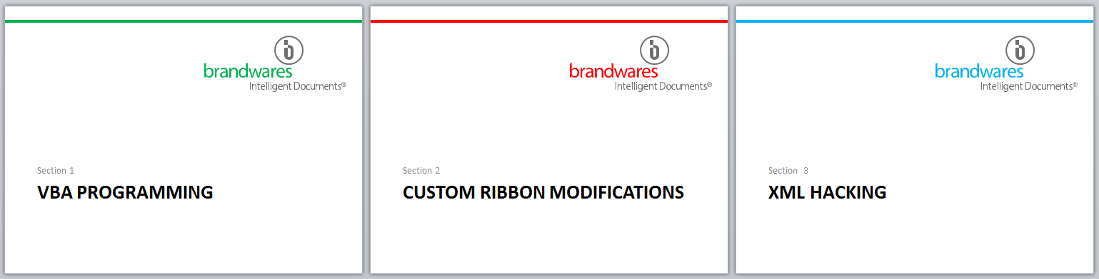
Once we’ve placed our EMF logos in your presentation, they can be ungrouped in Windows versions of PowerPoint, then you can key part or all of it to a theme color. If your presentation contains multiple color themes, changing theme colors will change the keyed logo element automatically. This can be a slick trick for presentations with different sections in different code colors. If you’re working with a Mac, let us know and we can ungroup and key the logo parts for you.
The layout for these slides is identical. Each uses a different color theme that varies one code color.
Transparency is not supported in most EMF exports, but by importing and ungrouping the logo, you can add transparency back in. In PowerPoint, choose Drawing Tools>Shape Fill>More Fill Colors…, then set the Transparency slider. This works the other way around from Illustrator, but the units are the same. If the Illustrator file used 40% Opacity, set 60% Transparency in PowerPoint.
From L to R: each character has 10% more transparency. You can’t get this by adding transparency in Illustrator, you must re-create it in Office.
EMF are not a great candidate for objects like disclaimers. Each letter includes one or 2 complex curves, so a paragraph of text will be much larger that the same disclaimer rendered as an indexed-color PNG or even a JPEG of the same text. But for logos, they’re pretty great. You get the same small file size and pin-sharp appearance regardless of how much you enlarge it. Applying image compression or printing to a low-res PDF leaves EMF logos in pristine condition. It’s by far easiest way to create the best quality logos for Microsoft Office.
PowerPoint was built so that a completely new users could build a presentation without knowing anything about the program. A quick look at the typical presentations out there will quickly confirm how little most users know about the program. But there is a design, an internal workflow that was built into the software. Creating a file that uses this workflow will make your templates and themes easier to use. Users will be able to build presentations faster and suffer fewer WTF moments. The deck will simply work better when you use these PowerPoint construction best practices.
Your New Mantra: Theme>Master>Layouts>Slides
This is the order in which you should approach PowerPoint construction. The best practice is Theme>Master>Layouts>Slides. First, create a Theme. Then apply that to a Master Slide, then format the Slide Layouts. Then last of all, make the Slides. The best presentations follow this order. The worst decks are created by trying to reverse the order. A surprising number of people start with the Slides, then try and fix the Layouts on which they’re based. Finally they end up at the Master and never quite discover the Theme. These are the problem decks that I get called on to repair, since they just don’t work anymore.
PowerPoint Construction Best Practices: The Theme
The basic design building block of all Office programs is the Theme. Themes nominally have 3 components: the Font theme, the Color theme and the Effects theme. However Effect themes are not editable in the program interface. All a designer can do is choose one of the presets, and the presets available change with each version of Office. Since effects are only used with tacky effects like 3D lozenges and shadows, most designers will simply ignore the Effects theme. If I’m able, I’ll apply the Office 2010 Couture effect theme, which has minimal gimmicks.
That leaves the Font and Color Themes. Color themes in Mac versions of Office are editable in PowerPoint. To create custom Font themes, Mac users must build them manually in a Text Editor. No need to get nervous about coding, they’re very simple files that you can create in TextEdit. I covered the technique in this article: XML Hacking: Font Themes. To create a Color theme that will work the best for your client, please read Office Charts: 6 Colors Maximum! This article is important because the order of colors in a theme determines the automatic color order of charts.
You don’t have to use a custom theme, but you also can’t have a theme-free file. If you don’t customize, your template will use the default Office theme. Then users will start to use the theme fonts and colors, because they’re obvious in the interface. And then your client’s presentations will be off-brand. Is that what you want? I didn’t think so…
A clear advantage of using a theme is that applying a new custom theme instantly updates the appearance of legacy documents. This feature alone takes most of the pain out of brand updates, but the underlying templates must have been built with theme application in mind.
I have Themes in my Theme!?
As usual for Microsoft, they use the same word in two different senses, just to make sure you get confused. In PowerPoint, a Theme and a Template can both contain an entire presentation in addition to the Color, Font and Effects Theme parts. By contrast, if you save a Theme from Word or Excel for Windows, the Theme file contains only the Color, Font and Effects parts, but no content or pages. So when you’re talking Themes with an expert, you need to make it clear whether you’re talking about a Font or Color Theme subfile, a Word or Excel style Theme that combines the Colors, Fonts and Effects, or a PowerPoint theme that includes all of the above plus Masters and Layouts.
PowerPoint Construction Best Practices: The Master
In PowerPoint, when you choose View>Slide Master, you’ll see a list of thumbnails at the side of your screen. The larger thumbnail at the top is the Slide Master (outlined in red):
The slide master never appears in a presentation. For this reason, some designers falsely conclude it is unnecessary and make a mess of it by ignoring it, deleting all placeholders, or otherwise mistreating it. The clients of these designers live in PowerPoint hell, with layouts and slides that just don’t work the way they should. It’s a shame that a designer who doesn’t know what they’re doing can’t spend a few dollars to bring in a professional to assist them.
A critical function in PowerPoint templates and themes is Inheritance. Inheritance is what we use when we create a typestyle, then apply that style to text. The text is said to inherit the characteristics of the style. The style is the parent and the text is the child.
The Slide Master inherits the fonts and colors of the Theme. Then the Slide Layouts inherit their formatting from the Slide Master, and finally the Slide inherit their formatting from the Layouts. The Slide Master is a crucial link in the chain. Ignoring it or formatting it incorrectly will cause inheritance problems in the rest of the presentation.
The correct way to format the Slide Master is to include as much formatting as possible that can carry over to the Layouts. Leave all placeholders in place, do not delete any. Perhaps you don’t think users will need a date or footer field, but deleting them will create problems for the users that actually do need them. You will also create problems in the future, when today’s decks become tomorrow’s legacy presentations that need to be updated with a new theme.
Analyze the design sample slides for where bulleting is needed and where it isn’t. A default Microsoft design uses bullets for every text level, but your template will be more useful if it includes a mix of bulleted and non-bulleted levels. The bullet scheme you apply on the Slide Master is automatically inherited by all the slide layouts.
On most presentations, there is a company logo that appears on most or all slides. Include that logo on the Slide Master (Of course, that logo is an indexed-color PNG right? You’re not still using JPEGs for logos, are you?). Important: Don’t touch a Slide Layout until the Slide Master is complete!
PowerPoint Construction – The Layouts
When the Slide Master is complete, then and only then, move on to the Slide Layouts. Why? Because editing the Layouts breaks the inheritance from the Master of the edited feature. As one example, if you create a unique bullet setup on a Layout, then go to the Master and create the same setup, the edited Layout will remain out of sync. Subsequent changes to the bullets on the master will never show on the Layout, because you broke the inheritance. Any changes to the Slide Master also have be duplicated on the Layout. Even though the bullets are identical, you created twice as much work by editing the Layout before the Master.
I’ve seen some designers who delete everything on the Master so they can create Layouts that differ from each other. This, too, is a mistake. The Slide Master should be formatted to look like a typical or common slide in the presentation. Then, for any layout that has different graphics or background color, right-click on the Layout, choose Format Background and turn off the background graphics with the Hide background graphics option. This leaves the placeholders in place and they still get their formatting from the Master. Then create a different color background and/or include different graphics. Presto, a different appearance, while maintaining inheritance from the Master.
I really don’t like the Layout titles that Microsoft has assigned. First, there is the Title slide, then you have Title and Content. Except the word Title refers to 2 different things. The first layout is for the title of the presentation, which could just as easily be called the Cover slide, while the second refers to the Title placeholder on the slide layout. Most of the layouts have titles, why do only some include Title in the layout name?. I’d love to fix this, but then I would create another problem:
People will make presentations with your template. Someday those decks will be “legacy content” that needs to be updated with the next template that will inevitable follow yours. When those presentations are updated, PowerPoint will find a Cover layout in the old file and a Title layout in the new one. PowerPoint doesn’t know these are intended to be the same layout. So instead of replaced Cover with Title, it keeps both. The old deck now has a new Title layout, but it doesn’t get applied to the title slide, because that is linked to the Cover layout. The user screams. Why didn’t all the slides update with the new theme? Well, it’s your fault, because you thought you were more clever than Microsoft and you changed the layout name. For more information about creating templates and themes that work with legacy slides, please see my article Legacy Slides – Best Practices
You can also create custom layouts in Slide Master view. Start by duplicating an existing Layout or creating a new one. Then choose the Insert Placeholder command to add an all-purpose Content placeholder, or one of several types of content-specific placeholders. You can add many placeholders to a layout, it’s a very flexible system. However, there is a potential problem if you do this to try to replace deleted default layouts.
The default layout name alone is not enough. We’ve worked on templates where the designer deleted all the default layouts, then inserted new layouts using the default names. Unfortunately, PowerPoint sees all created layouts as the custom layout type. You can call it Title Slide, but it does not have the Title Slide layout type, it has the Custom layout type. So when a user pastes in a legacy title slide, it will not map correctly to the layout called Title Slide. Instead, it will bring in its old slide layout, inheriting what it can from the Slide Master. The resulting slide usually looks close to the design intent, but not exactly, and your presentation now has an extra layout called 1_Title Slide, which will confuse users.
The best practice for widest compatibility is to leave all default layouts in place with their original names. The vast majority of decks out there have been created with Microsoft templates supplied with Office. Keeping the default layouts ensures perfect copy and paste operations from such presentations. For more information about creating Microsoft-compatible templates and themes, please refer to my post Microsoft-Compatible PowerPoint Templates – Best Practices. The only 2 layouts we commonly delete are Title and Vertical Text and Vertical Title and Text. These are intended for use with Asian languages, so we leave them in for world-wide companies that might need Far Eastern text but delete them for smaller and local clients. Just remember: if you keep the layout, keep the name. New titles for new layouts only!
The layout type is not visible anywhere in the user interface. We find the layout type by running a tiny macro that displays the layout type for each slide:
Sub GetLayoutTypes()
  Dim SlideObj As Slide
  For Each SlideObj In ActivePresentation.Slides
  MsgBox SlideObj.Layout
  Next SlideObj
End Sub
The output is the numeric slide type, which you can look up on this Microsoft page: PpSlideLayout Enumeration (PowerPoint)
PowerPoint Construction – Custom Slide Layouts
A question that comes up frequently is whether to use Picture or Content placeholders for a photo slide layout. These 2 types of placeholders act differently, so the choice depends on what kind of action is most suitable. When you insert a picture into a content placeholder, the placeholder fits itself to the photo proportions. If the photo has a small physical size, the Content placeholder shrinks to fit the photo. The photo’s aspect ratio is always preserved.
By contrast, a Picture placeholder stays the same size. Placed photos are enlarged or reduced to fit the placeholder, and are automatically cropped to make the photo fit the aspect ratio of the placeholder. Knowing this, we can state that where a particular layout is locked down, you should use a Picture placeholder. An example might be a photo page where there is an exact 1/4″ gap between photos on all 4 sides. A Picture placeholder will maintain this layout:
Picture placeholders are better for rigid or exact layouts.
If the slide contains a single picture and the entire picture must show in its original proportions, a Content placeholder is more suitable:
A flexible layout when the entire photo must show is better with a Content placeholder.
Placeholder Content Rotation and How to Avoid It
I’ve repaired lots of presentation that show these symptoms: in a series of placeholders on a custom layout, you’ll enter text or content. You switch to a different layout, then switch back, but now the content is in different placeholders than you used originally. What’s happening? Sometimes, there was a lazy designer who, while editing a layout, copied and pasted formatted placeholders rather than using Slide Master>Insert Placeholder. While they were saving themselves a few minutes, they were sentencing their users to much more time rearranging slides after switching layouts.
The reason is that PowerPoint keeps track of each placeholder by its ID number in the XML. Most of the time, when you copy and paste placeholders on a layout, PowerPoint assigns a new ID number. But occasionally, it fails and the shapes have duplicate ID numbers. The result is a slide with placeholders that PowerPoint can’t tell apart. When it has to assign a piece of content to the duplicated placeholders, the result is random placement of the graphic or text.
To be fair, you can also get a similar effect when switching between layouts that have different numbers of placeholders. If the first layout has 10 placeholders and the second has only 2, PowerPoint will place the first 2 items in the right place. The remaining 8 items will still be in placeholders, but since there is no layout information, they’re plunked wherever PowerPoint wants to put them. When you reapply the original layout, all placeholders will pop back into place, with each kind of placeholder going where that type is on the layout. Unfortunately, during this process, PowerPoint re-writes the ID numbers and some pieces end up in a different order. The effect is less chaotic than lazy designer syndrome.
You can minimize this problem when designing the template or theme. Create each placeholder on each custom layout in the order in which they are to be filled. For feft-to-right languages, this will usually be from the upper left corner to the bottom right, either in rows from top to bottom, or columns from left to right. Assuming that the source slide and destination slide have layouts that follow this, the content will be placed in order from top left to bottom right.
PowerPoint Construction – The Slides
Now you’re finally ready to make slides, or hand the template off to your users so they can get creative. And this is the place where a well-constructed template or theme can either save your users time, while a sloppy one will keep them working ’til midnight. Do it right and the slides will be easy to produce, and they’ll work the way they’re supposed to. Just follow your mantra: Theme>Master>Layouts>Slides and all else will be bliss!
Brandwares employees collectively have decades of PowerPoint construction knowledge, and we’re for hire! Contact me at production@brandwares.com with details of your project.
Multiple color themes in the same PowerPoint template are useful for companies with several divisions or for presenters who need color-coded sections. Here are 3 ways to add that capability to your presentations.
Multiple Color Themes: Using Super Themes in PowerPoint
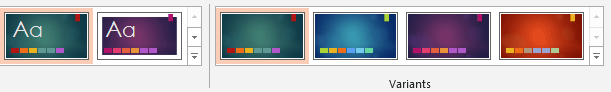
PowerPoint 2013 and 2016 for Windows and Mac all feature a new theme format developed by Microsoft: the Super Theme:
Super Theme Color Variants
The user sees a preview of the color palette that will be used, then picks the variant they want to use. It’s an elegant, attractive interface and makes the design variants plainly visible on the Ribbon. Super Themes also allow the inclusion of size variants, so that resizing a deck doesn’t distort the logos.
Brandwares now creates custom Super Themes, so we can make these for you. However, the technique is tricky, so if you’re an independent designer without the budget for professional assistance, you’ll have to find another way. Fortunately, there are other methods to add multiple color themes.
Multiple Color Themes: Hacking XML
This technique works to add multiple color themes to PowerPoint. You can also add them to Word and Excel files, but those programs will simply ignore them. These extra color themes will travel with a theme saved from such a Word or Excel file, but you already knew that PowerPoint is the program to use for creating theme files. To hack the XML, start by reading XML Hacking: An Introduction. If you’re using a Mac, you should also read XML Hacking: Editing in OS X.
Now, expand your Office file to see the XML. Open the ppt folder, then open the theme folder inside that. PowerPoint saves every theme that’s ever been applied to the presentation, starting with theme1.xml, so you’ll have to check the theme name in each variant to get the right one. If you’re trying this with Word or Excel, look in word\theme or xl\theme respectively, where you will find only one theme1.xml file.
Format the XML to be readable, then go right to the bottom of the listing, where you’ll find the self-closing stub called <a:extraClrSchemeLst/>. First, open up the stub:
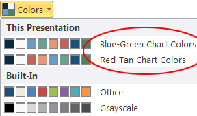
The syntax is exactly the same as for the clrScheme listing that every theme includes as its main color theme, so you can simply copy and paste the whole block of XML. The theme file can hold any number of extra color schemes. When you are using the final file, you can change the theme colors by choosing View>Slide Master>Colors in PowerPoint (actual menu names change in different versions of Office).
Clicking on the Colors dropdown shows the extra color themes.
When you choose a new color theme, all elements keyed to the color theme will change throughout the presentation.
Multiple Color Themes: Multiple Masters (PowerPoint only)
For Word and Excel, a document can have only one color theme applied at a time, and that theme affects all pages in the file. PowerPoint allows more flexibility, since it can have multiple master slides and each of those master slides has its own color theme. This means that different parts of a PowerPoint file can have different color themes. This is often used to color-code different sections of a presentation.
In its most basic form, this is the simplest technique. No XML hacking required:
In PowerPoint, choose View>Slide Master to view the masters.
Right-click on the Slide Master (the larger slide at the top of the left-hand display) and choose Duplicate Slide Master. The new master is added below the slide layouts for the first master. (In Windows versions, right-click and check that each Master has the Preserve Master attribute checked, or they’ll vanish later.)
Select the new master, then choose Color>Customize Colors.
Revise the color theme, or apply a color theme you created earlier. OK out.
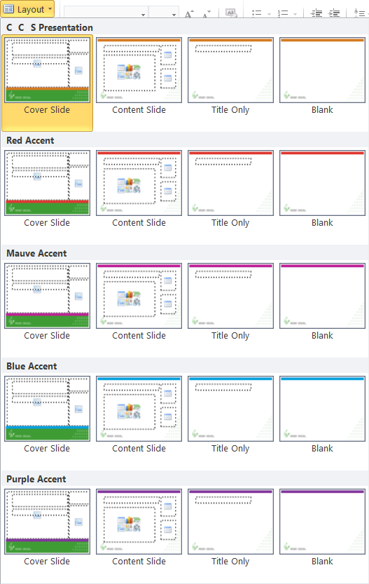
Repeat the steps above for each different color theme you need to include. In the program interface, the user will see a group of slide layouts for each slide master. Here is a presentation where only one colors changes in each color theme:
Each master has its own color theme and slide layouts.
While this is the simplest method to use, it’s not self-evident to all users that you change color themes by choosing a different set of slide layouts. So you’ll probably have to include at least an explanatory note with the template when you distribute it. But what if you want a premium solution for a high-end client? Read on…
Multiple Color Themes: XML Hacked Multiple Masters (PowerPoint only)
A solution that is simpler to use is to combine techniques 2 and 3. Create multiple masters, each with a different color theme. This will create a theme#.xml file in ppt/theme. Open all the theme#.xml file and copy the clrScheme for each to an extraClrScheme tag in all the others. So if you have 3 masters and color themes, copy the clrScheme tag for theme1.xml to an extraClrScheme tag in theme2.xml and theme3.xml. Then copy the clrScheme from theme2.xml to extraClrScheme tags in theme1.xml and theme3.xml.
The result is that it doesn’t matter so much which master you choose, you can change the color theme later. Of course, changing the color theme affects all slides based on the same master. This is an easy-to-use method for providing presentation with sections in different colors.
My thanks to Timothy Rylatt for his assistance with fact checking and corrections in this article.
Brandwares employees are world experts in PowerPoint template and theme creation. Send me a line at production@brandwares.com for assistance with your project.
Locking graphics in Office documents must be #1 on most designers’ wish lists, judging by the number of requests we get. While Word and Excel already do a fairly good job of locking, they can still benefit from this technique. PowerPoint remains wide open. If you can see it, you can move, resize or delete it. Placing items on the Slide Master or Layouts helps, but this is minimal protection against a savvy user. Your users love to be “creative”, so how can we protect the brand from their enthusiasm?
Fortunately, it’s possible to provide protection for important logos and maintain slide layout integrity by editing the template XML. But this power comes with a responsibility to design the protection carefully. It can be a very thin line between a deck that is protected and one that is unusable. If you decide to protect your presentation, it is incumbent on you to test it repeatedly to ensure your users can still get work done with it.
Locking takes place mostly in the Slide Master and Layouts. A minimal approach is best, as each additional locked item will create more feedback from your users with the potential to increase tech support costs. On the Slide Master, you will probably only lock a company logo.
Locking Graphics: Logos
Start by placing a logo on the Slide Master. Of course, you’re not using a JPEG file, because you already know that’s the worst format for line art. If you still think JPEGs for logos are a good idea, please read JPEG Logos? Fail! and Logo Production Secrets. After the logo is in place, expand the presentation to view the XML. Open ppt\slideMasters\slideMaster1.xml. All the placeholder coding comes first, so scroll down about halfway until you see XML that looks like this:
Test this out by re-zipping the files and opening in PowerPoint. Try to select the logo. noSelect=”1″ has the effect of making it unselectable, so the user can’t do anything creative with it, even if they open the master.
This is a super-simple technique, but it has a potential down side. Many add-ins and VBA macros work on a presentation by going through every shape on a slide until it finds the one it needs to revise. The noSelect tag can play havoc with code like that and possibly cause the programming to fail for no apparent reason. So here’s a more professional lock that has the same effect, but won’t disrupt any add-ins:
Different graphic objects use a slightly different syntax. The noSelect=”1″ parameter remains the same, but you have to expand a tag and add a new line to include it. For all AutoShapes except lines, the default XML will resemble the following:
Placeholders are the boxes on slide layouts that can hold different types of content. The layouts are found in ppt\slideLayouts. They are numbered in the order that they appear in the left-hand list of layouts in Slide Master view. By default slideLayout1.xml is the Title slide. The XML tag is <p:sp> instead of <p:pic>, but otherwise the syntax is the same for locking. Placeholders do not inherit the lock parameters, so locking a placeholder on the master doesn’t affect the layouts and locked placeholders on the layouts have no effect on the slide placeholders.
You can see what other parameters are possible for the spLocks tag at Datypic’s a:spLocks page. There are options here to prevent grouping the image, rotating, moving or resizing it, changing it’s aspect ratio and several other less useful options. Let’s use some of the other parameters to lock down the shape. Here is the start of a Title placeholder:
Don’t expect that slides based on this will still have unmoveable placeholders. The lock parameters are not included when a slide is created from a layout. This locking ensures only that the layout remains the same, so when a slide is reset, it will always return to the correct format.
If the placeholders must remain in place on the slides, then you must first create the slide, then edit the XML before distributing the deck. For this, look in ppt/slides. The files are numbered in the order they appear in the presentation, so slide1.xml is usually the title. Here is the XML for a locked title placeholder:
When the user clicks on this, all the adjustment handles have a diagonal through them and the user is unable to change the shape size or position:
Locking Graphics: Other Objects
By default, the picture and placeholders already include a p:locks or sp:locks tag, which is where we add the locking information. But what if you insert a text box on a layout for a legal disclaimer and want to make it ineditable? The text box XML initially looks like this:
To lock this, we need to expand the <p:cNvSpPr txBox=”1″/> tag. In case it’s not obvious, to expand a closed tag, you must first delete the slash at the end that closes it. Then you create a new closing tag and put the <a:spLocks>> information between the two. The noTextEdit parameter should mean the text can’t be edited, and to a limited extent it does that. A single click on text box text does not put it in edit mode, as would normally happen. But if you double-click, you can still edit the text. So this parameter on its own is not enough to do the job, it will only provide a little discouragement.
Change the 1 to a 0. Re-open the file in PowerPoint and group the table with other shapes. Easy!
Unlocking Graphics: Design Ideas
PowerPoint users who can’t afford a graphic designer love the Design Ideas feature in PowerPoint. As I write this, this feature is only available in Microsoft 365, the subscription version of Office. Microsoft uses AI technology to present the user with designs that Microsoft thinks are relevant to your content. Any company with branding guidelines should turn this feature off for their users.
Many Design Ideas have shapes that are locked in the XML. When Microsoft locks a shape, they throw the kitchen sink at it:
Some of those locks don’t even make sense for most shapes, like noChangeArrowheads. The only lock they don’t apply is noSelect, avoiding the macro problem I mentioned earlier. To turn the lock shape into something you can copy, paste and revise, just delete all the attributes:
<a:spLocks />
Locking Graphics in Word and Excel
The principles are very similar to locking in PowerPoint. This can give you locked graphics and/or ineditable text boxes in both those programs without have to apply any document protection.
In Word, picture locks must be applied to the graphic frame that holds the picture, not the picture itself. This works:
After a few months of practical testing, some real-life limitations on shape locking have become evident. Adding the noChangeAspect=”1″ has the same effect as checking the Lock aspect ratio option on the Size pane of the Format Shape dialog. But just as when you check this option manually, clicking on the shape and dragging the adjust handles will still distort the shape. On top of this, I found this page on MSDN: 2.1.1255 Part 4 Section 5.1.2.1.34, spLocks (Shape Locks). The pages states that “Office ignores attributes noChangeArrowheads and noRot when applied to a shape. PowerPoint additionally ignores the attribute noAdjustHandles when applied to a shape and noChangeShapeType when the converting the shape to a freeform.” So a user can circumvent noChangeAspect by dragging on the handles and you can’t prevent the handles from displaying either. Office simply doesn’t implement Microsoft’s own spec completely. There’s nothing you can do about this. It should be noted, that the accuracy of Microsoft’s information is not the best. Their statement that Office ignores noRot=”1″ when applied to a shape is not true, you can successfully prevent rotation with this parameter. You really have to test everything to really know what works and what doesn’t.
Locking Graphics: The Designer’s Responsibility
Powerful? Yes. But with power comes responsibility. Company presentation templates need to be revised, but after you lock items in XML, those shapes can no longer be revised through the program interface. So it’s essential that if you use these techniques, that you document your changes when you send the file to your users. Using these methods secretly to get repeat business from captive clients is dishonest and is definitely not a best practice.
Brandwares knows every detail about shape locking and we can do all this for you. Email me with the details of your requirements at production@brandwares.com.
Font themes are one of the simpler theme elements in Open Office XML, but for some baffling reason, Mac Office users can’t create one. It’s odd enough that the only Mac program that can create a color theme is PowerPoint, but even it can’t provide an escape from Calibri and Arial! So I’m going to show you how to do it on your own.
Let’s start with a dead-simple font theme. Here’s the minimal file that Office will read:
Important Note: If you copy and paste this sample, you must change the non-breaking space characters to ordinary spaces. I need to use non-breaking spaces to format an HTML page, but Office will refuse to display your font theme if you don’t search and replace them with regular spaces.
You can create this in any text editor, including TextEdit in plain text mode (don’t try this with an rtf file). However, by default TextEdit will change the necessary straight quotes to smart quotes, producing a file that Office will not recognize. If you’re using TextEdit, make sure you visit both TextEdit>Preferences and Edit>Substitutions and turn off Smart Quotes in both locations. A better alternative is the free version of BBEdit. When you visit this link, click on the Download link to get the free version. If you do any significant amount of XML editing, the paid version of BBEdit is well worth the $50 price tag.
The most common font theme problem is using smart quotes (Hex 201C + 201D, Decimal 8220 + 8221) other than plain straight quotes (Hex 22, Decimal 34). But you can also ruin a font theme by using non-breaking spaces (Hex A0, Decimal 160) instead of regular spaces (Hex 20, Decimal 32). Even though a font theme is encoded in UTF-8, you should only use plain ASCII characters for the text. XML has a low tolerance for non-standard characters.
Now that you’re set up to edit, copy and paste the font theme file. The <a:latin> tag is the standard font for your theme. <a:majorFont> is for headings and <a:minorFont> for text. Fill in <a:ea> with a font that supports Chinese or Japanese (ea stands for East Asian), if you want to support those languages. The <a:cs> tag stands for complex scripts: Arabic, Thai, Hebrew and many more. For more detail on non-European language support in font themes, please see my article XML Hacking: Font Themes Complete. Or you can just leave those tags blank if you have a predictable user base that won’t require them.
A common mistake is to get too specific with the font name in font themes. The name is only the base font name as displayed in Powerpoint’s font menu. “Open Sans” will work, but “Open Sans Extrabold” will cause Word 2011 to display a blank space where the font theme should be, while Word 2016 will simply ignore the entire file.
Save the file as a text file with a .xml ending and give it the name you want to appear in the user interface. “Brandwares.xml” will appear in the Font Theme menu as Brandwares.
For Office 2016, 2019, 2021, 2024 and Microsoft 365 subscriptions, save this file to Users/YourUserName/Library/Group Containers/UBF8T346G9.Office/User Content/Themes/Theme Fonts. For Office 2011, save it to Users/YourUserName/Library/Application Support/Microsoft/Office/User Templates/My Themes/Theme Fonts. In current versions of OS X, the user Library is hidden by default. To open it, hold down the Option key, while clicking on the Go menu and choosing Library.
Once it’s correctly installed, it will show in PowerPoint’s Slide Master view under the Fonts dropdown. A new Custom group will appear at the top of the list, with your font theme in it. Once you apply it and a color theme to a presentation, you can save as a theme file and distribute that to your users, it will contain the font theme you just created. Happy hacking!
Font Themes – An Alternate Method
March 2017 edit: If you have any problems creating a font theme from scratch, here’s a workaround. Open an existing font theme that come with Office and edit the font names to the ones you want to use. These files are the verbose style discussed in this article: XML Hacking: Font Themes Complete. For most uses, you only need to set the a:latin font in the a:majorfont and a:minorfont sections. Here’s where you can find the Microsoft Font Themes:
Office 2011 for Mac – Open Applications/Microsoft Office 2011/Office/Media/Office Themes/Theme Fonts and copy any of the XML files.
Office 2016, 2019, 2021 or 2024 for Mac, or Microsoft 365 for Mac – Open Applications, then right-click on Microsoft PowerPoint and choose Show Package Contents. Open Contents/Resources/Office Themes/Theme Fonts and copy any of the XML files in there.
Here are the locations for 32-bit versions of Windows. If you’re using a 64-bit version of Windows, check the same path inside C:\Program Files (x86).
Office 2007 for Windows – Open C:\Program Files\Microsoft Office\Document Themes 12\Theme Fonts.
Office 2010 for Windows – Open C:\Program Files\Microsoft Office\Document Themes 14\Theme Fonts.
Office 2013 for Windows – Open C:\Program Files\Microsoft Office\root\Document Themes 15\Theme Fonts.
Office 2016, 2019, 2021 or 2024 for Windows, or Microsoft 365 for Windows – Open C:\Program Files\Microsoft Office\root\Document Themes 16\Theme Fonts.
Too complicated? We can help! Brandwares is a full service template creation service for all Office programs. Contact me at production@brandwares.com
Custom Table Styles are probably one of the more detailed hacks you’ll have to write. See the constructions details in my previous post. Besides the basic table format, there are 6 optional format layers you need to at least consider. In a minimal table style, you’ll need to include at least the Header Row, First Column and Banded Rows. Most users will expect to see these options. Total Rows, Last Columns and Banded Columns are less requested, you only need to include them if a design or client specifically requires them.
As mentioned in part 1, if you haven’t hacked XML before, please read XML Hacking: An Introduction. If you’re using a Mac, you should also read XML Hacking: Editing in OS X. In addition, an essential companion to this pair of articles is the post on setting Default Table Text, which is set in a different XML component..
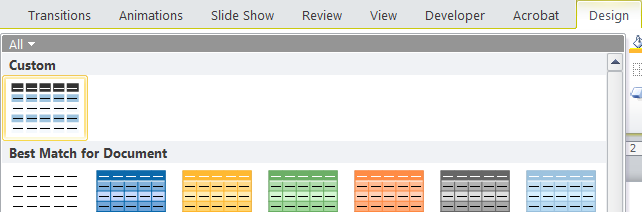
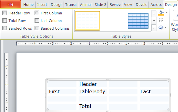
Let’s take a look at how our work appears in the PowerPoint interface. First, we’ll insert a plain vanilla table. By default this takes on colors and fonts from the current PowerPoint theme:
Next, we choose the Table Tools>Design tab, open the Table Styles gallery. Up at the top a new Custom section has appeared with our new custom table style:
Select the custom table style and the default table changes to match our design. This screen shot has all formatting options turned off, so effectively we are seeing the Whole Table formatting only.
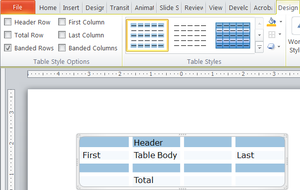
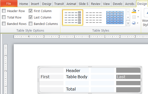
Table Style Options: Banded Rows and Header
Using the options panel in the upper left corner, we can add some of optional formatting layers we created in XML. First, let’s turn on banded rows. If you remember, we only formatted odd-numbered rows, so the banding only changes rows 1 and 3 in our example:
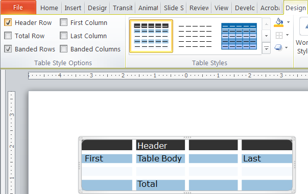
Next, we’ll leave banded rows on and also add the Header row. This row doesn’t count as part of the table body, so the banding moves down 1 row:
Table Style Options: First and Last Columns
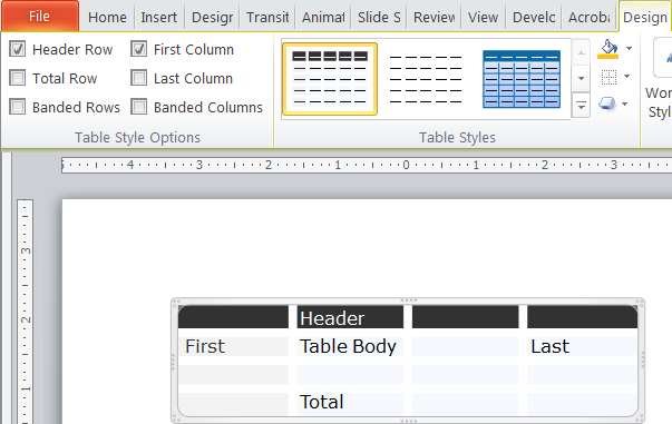
Next, we’ll turn off banded rows, leave the Header as is and add the first column:
Here’s the table with First and Last Columns checked:
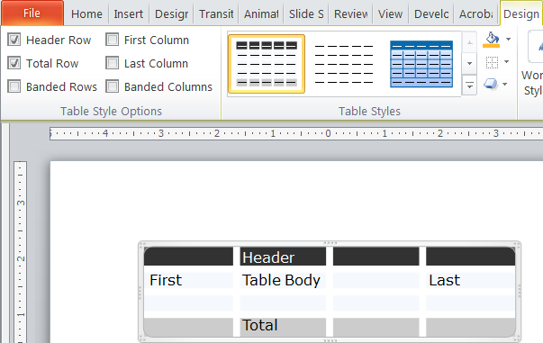
Table Style Options: Header and Total
And finally, Header and Total Rows:
As you can see, with some pre-planning, one table style can cover quite a few related table looks. The layer options for different features make the table useful for many different purposes and the options panel makes it fast and easy for users to try different combinations. This feature is a major advance over tables in PowerPoint 2003 and earlier, which were quite crude by comparison.Table styles a similar way in Word, PowerPoint and Excel. While Word and Excel include table style editors in their interface, PowerPoint needs to be hacked to create them. Sadly, the table style specs for the different parograms are dissferent, so it’s not possible to trasfer tables style OOXML among Word, Excel and PowerPoint.
Table Styles: What You Can’t Do
You cannot set vertical cell/row alignment or cell margins in default taxt table text or a table style. It would have been possible given the OOXML spec, but Microsoft just didn’t bother.
Of course, if the process is too complex, we’re here to help. The current price on a custom table style is US$120. Just email me production@brandwares.com
For branded documents, you want to have a unique table style. Microsoft Office programs include a pile of table styles that are auto-created by the software, but they all have that generic MS look. It’s possible to create custom styles in Excel and Word for both Windows and Mac using the program interface. But if you’re using PowerPopint, you can still create custom table styles. You just have to hack some XML!
First we have to cover how Office programs create custom tables. It’s not a simple subject, but understanding this will also help you if you’re trying to create custom table styles in Word for Windows or Excel, which actually have tools to do this in the respective programs.
Let’s start by making one thing clear: table styles do not format the font choice or size contained in the tables. Yes, I know the Word and Excel table style tools have font formatting dropdowns, yes I know Microsoft help files say that font styling is included in table styles. The truth is that font styling in a table style is limited to setting bold or italic attributes, font color and whether the table component uses the Headings or Body font as specced in the Font Theme. For typeface and size, alignment and weight/italic controls, read my post on Default Table Text
I find that it’s easier to format Office tables if I imagine that table formatting has layers. The base layer is any overall formatting that applies to the table as a whole. Then, we build layers on top of that base formatting that looks after the Header Row, probably the most common feature applied to tables. We follow this with the Total Row, the bottom one. Next, the First and Last Columns. Once these outer areas are formatted, we add layers for Even and Odd Row Banding and then Even and Odd Column Banding. Finally, we can spec special formatting for the cells in the 4 corners. This sequence moves from the general to the particular and also from the most common to the rarest formatting.
This sequence is how the table style dialogs in Word for Windows and Excel present table elements. It’s similar to the order in which we enter the information in an XML custom table style. If you follow this order, you’ll get a custom style in much less time than if, for instance, you try to start with the even and odd rows.
Word’s custom table styles are stored in the styles.xml file. This is in the word folder of an unzipped file. The comparable file for PowerPoint is called tableStyles.xml in the ppt folder. The XML is similar in concept, but the differences mean you can’t copy and paste from one program to another. If you’re not sure where to find these files, please read XML Hacking:An Introduction. If you’re editing on a Mac, you should also read XML Hacking: Editing in OS X
Below is a typical PowerPoint table style. I’ve broken the listing into 4 pieces so it fits on the page. Copy and paste them together into one listing, or download it as a zipped text file:
That's a big pile of XML to throw at you. Let's break it down, first, the section that sets parameters for the whole table. Think of this like a layer cake, with the WholeTbl section being the first layer. Then later attributes are superimposed on top of it.
Line 2 is the container tag that holds individual table styles. The last part of the tag includes the def tag that sets which table style will be used as the default. Paste in the GUID of your custom style here to make it the automatic style in a template or presentation.
From line 3 to 8, we set the font characteristics that we can: idx="minor" means the font will be the theme body font. The actual font used is set in the theme, not here. Line 5 sets a dummy font color, in this case the Office preset color Black. Then in line 8, the actual color is set to the dark1 theme color.
Line 10 begins formatting the default borders. Beginning at line 12, the left border is set to w=0, meaning it has a 0 thickness and does not display. If it did display, the color setting in line 14 would set it to bg1, or the first background color, normally white in most themes. The following sections for right, top and bottom borders are identical.
By contrast, look at line 40 for Inside Horizontal borders (the ones between each cell. Here the weight is set w=114300. The measurement units are EMUs or English Metric Unit, a made-up measurement system that allows easy conversion between English and Metric systems. At 914400 EMUs per inch, it means the line weight is 1/8 of an inch, unusually thick borders for a table.
Then, starting on line 55, are the fill settings for default cells. Line 57 set them to an RGB color value, since this is a tint not found in the theme. The color notation is hexadecimal, just as on an HTML page.
Custom Table Style Layers
Next up is the section for the odd and even-numbered horizontal bands:
In XML, an empty or unused attribute closes itself, as does the final object in a chain of references. Line 64 shows <a:tcBdr/ > with a slash right after the name. The slash closes the border attribute, indicating that adding odd-number row formatting doesn't include a change to the borders. On the other hand, the fill is active, using the Accent 6 color from the theme. Accent 6 closes itself because it's the final item of information in defining the fill.
Compare lines 72 to 76 (even-numbered rows) with 63 to 71 (odd-numbered rows). No format was set for even-numbered horizontal rows, so applying this attribute in Office will have no effect on the table appearance.
Next up are banded columns. This is similar to the banded row section: odd-numbered rows are defined, but not even-numbered. The fill color is a hexadecimal RGB, value, since this color is not in the theme:
This contains sections for font, border and fill parameters. As with the whole table section, font formatting is limited to speccing which theme font and color to use. No borders are assigned and the fill color is an RGB gray. Here are the remaining parameters for the First (leftmost) Column, the the last (bottom) row and first (top) row. In the Office interface, the top-most row is referred to as the Header Row and the bottom-most as the Total Row.
Custom Table Styles - Color Models
Here are the different ways you can spec color. Use the same syntax for fonts, borders and fills:
<a:schemeClr>: These access the Theme Colors. For the 2 pairs of light and dark colors that form the first 4 in a theme, you may see them variously as lt1, dk1, lt2 and dk2, or bg1, tx1, bg2 and tx2. Be careful with using the last 4, because Office Open XML allows mapping other colors to bg and tx. The safer choices are lt and dk. These are followed by the 6 accent colors: accent1 through accent6. Finally hlink and folHlink designate the hyperlink and followed hyperlink colors. Examples are <a:schemeClr val="lt1"/> or <a:schemeClr val="accent2"/>.
<a:srgbClr>: Sometimes you need colors that are not in the theme. This color model uses hexadecimal colors, exactly the same as used in HTML. <a:srgbClr val="F5F9FD"/> is one example.
<a:scrgbClr>: This is also RGB, but uses percentages instead of hexadecimal: <a:scrgbClr r="50%" g="50%" b="50%"/>.
<a:hslClr>: If you need to use HSL (Hue, Saturation and Luminance), this is the model for you. Try <a:hslClr hue="14400000" sat="100%" lum="50%"/>.
<a:prstClr>: These are a limited range of named colors that were used in early versions of Microsoft Office. They're just here for legacy file format support, but you'll see them used in some XML sample listings. An example would be <a:prstClr val="black"/>.
<a:sysClr>: This model allows you to use operating system colors. Beware, you'll get different results in OS X then in Windows, and users can customize their system colors as well. <a:sysClr val="windowText"/>.
Clearly, when you edit this XML by hand, you'll need to be familiar with the custom color theme used in the file and its hex values. Read my post on this subject: XML Hacking: Color Themes Next time we'll take a look at how table styles connect with the Office program interface to give the user access to these features
As always, if this seems too daunting, Brandwares is here to create custom table styles for you. Contact me at production@brandwares.com.
Specifying fonts for electronic documents creates more hassle for clients and users than designing for print or web. This is because desktop applications need to have the font installed on each computer creating the documents. The cost can be high and installation by the client’s I.T. department is usually required. But these are technical hurdles that can be overcome if the client buys into a perceived necessity to have a different look than the competition.
There are 2 inter-related problems that crop up next: font families and cross-platform use. Font families are grouping of fonts that are linked so the user can switch between regular, italic and bold variants by clicking on attribute buttons. This is different from standard usage in the design world, where single fonts predominate. Designers are used to switching to a bold or italic look by picking a different font from the font menu, rather than by clicking on a bold or italic button. I’ve previously discussed font family issues here.
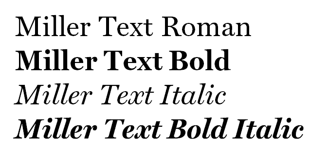
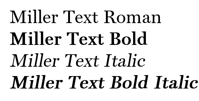
Same font, same document, different platform. The small-foundry font displays and prints with tighter linespacing on a Mac (at right).
Today I’m focussing on the awful things that can happen when font families are specced for use with both Windows and Mac OS X. Surprisingly, it is not easy or simple to create families that work well on both platforms. The most popular software used by independent font designers doesn’t do this correctly, though we have filed numerous bug reports with the company. The net result is that if you spec a font from a small foundry that is going to be used on both Mac and Windows, it’s very likely not going to work. It’s not universal, there are some very skilled individual font jockeys who have the knowledge and skill to do it right. But you’re only going to find out the hard way, by buying the font and trying to use it.
Let me clarify, these fonts will work fine on either Windows or Mac. We can set up a template to make it work for either platform. You only see the anomalies when you move a document from one platform to the other.
Brandwares can provide fonts for your client’s project. Our service includes speccing the correct family groupings and supporting installation and troubleshooting. This includes working with the foundry to create correct families for cross-platform fonts.
I also encourage designers to ask your client the Mac/Windows question sooner rather than later. Call the foundry and ask if they can test on both platforms. I’ve known type designers who only own a Mac and don’t have any way of testing on Windows. When files are going to be used on both, speccing fonts from a large foundry is a good solution. They use different software and we have never seen a bad Mac/Windows family from one of the big companies. But the most practical solution is to stick with the wide variety of fonts that come free with Microsoft Office. They are high-quality faces, already installed and FREE! Your client appreciates a bargain, too!
Testing Light and Regular font families from a small foundry. Windows on the left, OS X on the right. Yes, they’re supposed to be the same. No, they’re not.
Finally, the transition of 2 companies into 1 is complete. We began planning the merger more than a year ago. We started with rebranding WordLab to match Brandwares. With the completion of the process, all WordLab content has been folded into the Brandwares site. The aspect that has required the most detailed planning has been managing the SEO for both sites. Our goal was to ensure the summing of as much link juice as possible. I think we pulled it off. We’re getting more total hits now with one site than the 2 previous sites received separately.
Brandwares for Complete Workflows
Brandwares’ strengths have been in web development, especially math-intensive intranet applications for financial institutions. The angle that WordLab brings is a strong focus on desktop applications like Microsoft Office and Adobe Acrobat. Combined, our new company can create and support complete workflows. These provide strongly branded information from every major software group in a company. This unified approach gives our customers both higher office productivity and stronger brand identity in every communication. I look forward to helping your company achieve exactly those goals.
Free Control Control Add-in for Word for Mac
Subscribe to the Best Practices blog and get a free copy of our new Control Control add-in. This is the easiest way to create the same modern form controls that are in Word for Windows. Enter your real email and hit Subscribe in the right-hand column of this page. You’ll receive the add-in and installation instructions within 3 days.