Legacy Slides – Making It Work the Way You Think It Should Work
Here’s an all-too-common scenario. An organization has a library of presentations built up over the years, full of valuable content. Time passes and a branding update becomes inevitable, to keep the corporate look contemporary. A designer is hired, a new template created and distributed. Users create new decks and start pasting in old slides. Chaos ensues: the formatting is all f***ed up! It could be something minor, like regular text changing to bold. But much more often, old formatting gets pasted in, and in Slide Master view you start seeing unwanted layouts, often with names preceded by numbers like 1_Title and Content. What went wrong?
PowerPoint has several requirements for pasting to work as expected. When you paste in old slides, and you want them to map to your new slide layouts, they must meet all 5 of these criteria:
The slide layout name must be the same. This can be set in Slide Master view.
The slide layout type (as set in XML) must be the same. If you copy an existing Title Slide layout, it will retain the layout type. But if you delete all Title Slide layouts, then realize you made a mistake, you’re in trouble. It’s possible to recreate a built-in slide layout by running a VBA macro:
Sub RestoreLayout()
  With ActivePresentation.Slides
    .Add(.Count + 1, ppLayoutObject).Delete
  End With
End Sub
The number of placeholders must be the same. When there is a different number of placeholders on the slide being pasted, PowerPoint goes mental and will reassign content randomly.
The types of placeholders must be the same. If a user is pasting a Microsoft-compatible Title and Content slide, PowerPoint is looking for:
1 Title, 1 Content, 1 Date, 1 Footer and 1 Page Number placeholder. No more, no less. If your old template layout has only a Title and Content placeholder, your new template must have the same.
For corresponding placeholders in the old and new layouts, the idx number must match. Title placeholders don’t have idx numbers, because there is only one of them on a slide at a time. The idx numbers tell PowerPoint which placeholder should receive information from a particular placeholder in the old layout. This allows you to have several of the same type of placeholder on a layout and still have PowerPoint map content correctly among them.
This simplest way to guarantee that all these criteria will be met is to not create a template from a brand new file. Instead, reformat the old template to the new branding, taking care not to delete or rename any layouts (you can add new ones), and not to add or delete any placeholders on the existing layouts.
Legacy Slides – Another Possible Hiccup
An additional wrinkle can appear if an embedded image is included, perhaps for a logo. Then the XML will include a line line this:
<a:blip r:embed="rId2">
rId numbers are used by the _rels file that corresponds with the layout to tell PowerPoint where to find the logo. If the rId number is wrong, PowerPoint will show an empty box with the text The picture could not be displayed. Of course, you could just replace the image if you see this error during file construction.
Static pictures, graphics, text boxes and shapes placed on the layout make no difference to layout mapping. Add them, remove them, they won’t stop PowerPoint finding the correct layout.
If a pasted slide does not meet all of the above criteria, PowerPoint imports the slide layout from the old deck, prepending it’s name with 1_, if it’s the first time it’s importing that layout. Very quickly, the client’s deck is polluted with multiple spurious slide layouts. When face with choices like Title and Content, 1_Title and Content, 2_Title and Content, 3_Title and Content, the user will simply give up trying to decide which one to use. Branding goes down the drain.
After 3 pastes from “designer” decks, this is what your client is struggling with:
For maximum legacy compatibility, new templates you create for a client should include the slide layouts and placeholders of previous templates they have commissioned. Often it’s feasible to segregate these using different slide masters, one for each previous template they have used. Each slide master includes exactly the same layouts and placeholders used in a previous version, but with the branding updated to the new look. Then in the receiving template, the user is instructed to paste immediately after a slide based on an earlier version. This method can reduce the user’s pain of having to follow your shiny new template.
In a workflow where PowerPoint files are converted to Google Slides and back, none of the above will work. The XML created by Google is a mess and pasted slides will inevitably bring their non-standard Google layouts with them. There is no fix for this other than a custom VBA conversion macro.
We have years of expertise in this area and can either assess your template for legacy slide compatibility or create a template or theme for you that will work seamlessly with your old files. We’re here to help! Contact me at production@brandwares.com.
Please note: Microsoft has modified the nature of OLE links. It’s no longer possible to maintain relative OLE links (linked Excel and Word) in current versions of Office. The directions below will allow you to re-establish a broken link, but when you update the linked file, PowerPoint will write an abolute path. If you’re relinking other object types, like images, audio or video, this article will allow you to create permanent relative, semi-relative and absolute paths.
Someone sends you a presentation linked to an Excel file. The links don’t work and you can’t fix them without redoing them. Here’s how to fix broken PowerPoint links with a one minute of XML Hacking.
This article is really just for PowerPoint for Mac users. If you have the Windows version, you can fix broken links by choosing File>Info, then clicking on Edit Links to Files in the right-hand column under Related Documents. (Please note, the Edit Links option only appears if you actually have a link in the open presentation.) Word and Excel for Mac already have utilities to fix links.
If you haven’t hacked XML before, please read XML Hacking: An Introduction and XML Hacking: Editing in macOS. This article mentions Excel, which I’ve used as an example, but the same advice is true for Word files linked to PowerPoint. OLE Links to other formats, like PDF, are simply not supported on macOS.
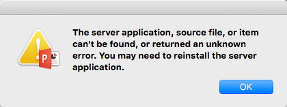
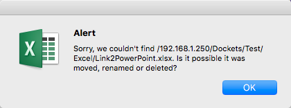
In Office, links to documents include the complete path. Of course, when you move those linked files to a new computer, the path is always different, so the links must be corrected. The symptoms of a broken link depends on the type of link that was created. If the file creator selected a workbook section or chart, then used Paste Special to paste in a link, you’ll see this message when you double-click on the Excel excerpt:
But the creator may have used Insert>Object instead, and chosen to link rather than embed the file. Then you’ll see this when you try to edit:
Then after dismissing that dialog, you’ll see the first one about the server error.
Fix Broken PowerPoint Links – The Steps
The issue is that a path is embedded in the PowerPoint file, and that path must be edited. Open the file in BBEdit.
The XML we need to change is associated with the slide(s) on which the Excel item is placed. So lets look. In the left-hand window, click on ppt. Then select slides then the _rels folder. Rels is short for relationships, and it’s the mechanism in every OOXML folder that tells PowerPoint where to find the objects in use.
The _rels folder has a .rels file for each slide in the presentation. Open the file for the slide containing the linked Excel. If the link was inserted using Paste Special, it will look like this (Pay attention to the third line and scroll all the way to the right. The path to be edited is in bold):
Since the Excel item was inserted on a Windows computer, the path uses backslashes instead of forward slashes. There are two path syntaxes that are acceptable. If both the file linked to and the presentation containing the link are in your User folder, you can use a relative path and the linked file will open up immediately. If the file linked to is on a network share or somewhere on your disk outside your user folder, you will have to use an absolute path and you will get a challenge from Office when you open the link.
Let’s do the relative path first. In this example, the Excel file is in my user Documents folder and the PowerPoint is in my user Downloads folder. So I edit:
In Unix/DOS speak, the 2 dots mean “go up one level”, out of the Downloads folder where the presentation is into the main user folder. Then the slashes lead you down into the Documents folder and subfolders to the Excel location. Once you set a relative path, you must leave the PowerPoint file in the same folder. Moving it will break the path.
Fix Broken PowerPoint Links – The Best Relative Path
For a linked file that you know will be moved from desktop to desktop, the best strategy is to place both files in the same folder. Then use this path:
Target="file:///Link2PowerPoint.xlsx"
Now even if you move it back to Windows, the linked Excel file will open as expected. As I noted above, when you open or update the linked Excel (or Word) file, PowerPoint will replace your relative path with an absolute one. This only happens with OLE links. For picture, audio, video and other file types, the relative link will remain unless you manually update.
Fix Broken PowerPoint Links – Absolute Paths
If the file to be linked to is on another disk, use an absolute path. With an absolute path, you can move the PowerPoint file anywhere on your computer or to other machines and it will still be able to find the linked file. Here’s what an absolute path looks like:
Important! A macOS absolute path must begin with Volumes, followed by a slash and the name of the disk. If your network is set up for different operating systems, you’ll probably use an IP address instead, as shown in the original file path. Consult with your IT department.
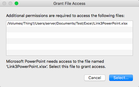
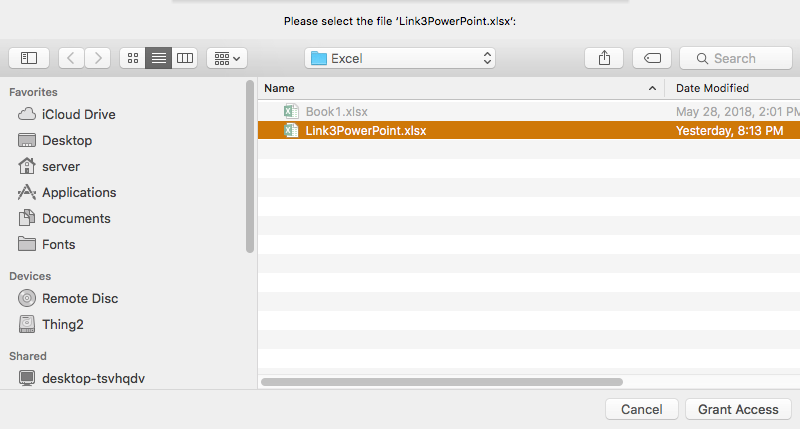
Office 2016 for Mac applications are sandboxed applications, so when you first open an Office file linked with an absolute path, you’ll see a warning:
Click on Select…, then you’ll see:
Select the correct file if it isn’t already selected, then click on Grant Access. Now double-click on the linked Excel item to edit and you’ll see this again:
OK, that’s something of a hassle, but the good thing is that you won’t see those warnings again as long as the linked file says in the same place with the same name. You also only get warned once per placed file, even if there are multiple uses of that file in your presentation.
Linked files are a huge benefit when you have a data source that is constantly being updated. Using them means your presentation can always be up to date. Now that you know how to fix the links, you have a very useful new tool.
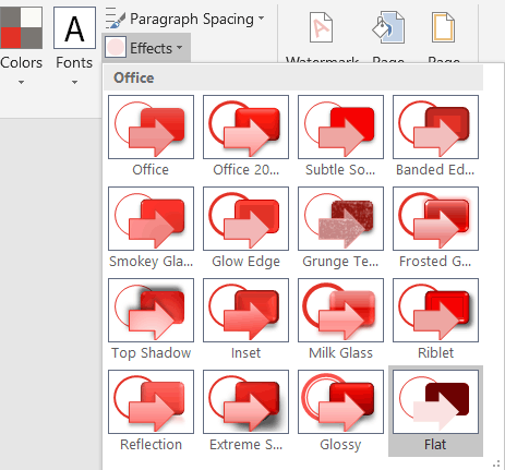
I’m writing an article or two about Office Effects Themes and how you can modify them. As an example, I created the Brandwares Flat Theme, which will be of use to designers as is. This theme file gets rid of the bulgy 3-D shapes, glows and hokey shadows of the standard Microsoft themes and relies only on tints, shades and outline variations. You can use this example in 2 ways: as a theme file that you can modify and send as your own, and as an Effects Theme file that can be installed in Office for Windows to provide access to flat shapes in all other themes.
Here you can download the Flat Theme. It’s also available on our Downloads page. After downloading, you can open it in PowerPoint, create new font and color themes, apply them, then resave as a new theme. The flat shapes will travel with the theme and be automatically applied to any deck that uses the theme. If you’re an Office for Mac user, you’ll have to create a font theme using this article: XML Hacking: Font Themes.
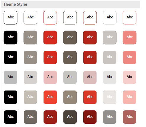
The Flat Theme – Specs
There are 7 variants in each row of the the Shape Styles dialog, each showing the dk1 color as a background plus the 6 Accent colors. The first 2 rows feature a 0.5pt outline on the shape in a darker variant of the accent color, with the first row showing a white shape background and the second row the relevant accent color.
The third row is the one I choose most of the time: a flat shape with no outline.
The fourth row has a 50% screened-back background color with black text.
The fills for the 5th and 6th rows are 2 progressively darker shades of the accent colors. The 5th row shows a 50% shade of the color, while the 6th is a two-layer multiplier fill with a 50% shade overlaying a 50% tint. I’ve written at length about effects themes and their construction in my book about OOXML Hacking.
Users of Office 2016 for Windows and for Mac will see an additional group of Presets below the theme shape styles. Except for the stroke weight in row 2, these fills are generated automatically by the program and cannot be modified by XML.
The Flat Theme – Installing as Effects Theme
You can also use the Flat Theme as a new effects theme in Windows versions of Excel, PowerPoint or Word (Office for Mac will display effects themes embedded in a theme or template, but there is no support in the program interface for applying a different effects theme). Then it will appear in the Theme Effects dropdown of Office for Windows along with the standard Microsoft themes. Here are the steps to do that:
Download the Flat Theme from the link above and unzip it.
Change the file name from BrandwaresFlatShapes.thmx to Flat.eftx. The first part of the name can be something other than Flat, but the ending must be .eftx. No other change to the theme file is needed.
Close all Office programs.
Copy the file to the same folder as the Microsoft Theme Effects files:
It can be a bewildering subject, figuring out which video formats are going to work in a presentation. It’s doubly difficult when a presentation is designed on one computer, then played on another. I can’t count the number of seminars I’ve observed where the presenter is humming and hawing about the video: “Well it worked in rehearsal…” Even Microsoft’s web site has inaccurate information about choosing a video format, so what’s a user to do?
Fortunately, we’ve done lots of research and testing on the subject. I’m focusing here on the use of video in PowerPoint and Keynote presentations to find what works reliably. But I make one assumption: that you are using current versions of the software and operating system. In Windows, you should be on Windows 7 or better and be using Office 2010 or better. In macOS, I regard El Capitan (10.11) as a minimum, running at least Keynote 6 and/or Office 2016 for Mac. You may be able to get away with less, but the degree of uncertainty and need for testing goes up.
Video Formats – Containers
The main reason why there is so much confusion around video formats is that each video has at least 2 types of format. One is the Container format and is denoted by the file ending of the video. MP4, MPG and MOV are Container formats. Most people refer to the container format, but most can hold a variety of video and audio streams that be differently encoded. An analogy might be a Word document that can contain a variety of languages. A .docx file ending doesn’t tell you if it’s an English text!
Video Formats – Codecs
The second format is the encoding, referred to as the Codec (short for Compression/Decompression). H.264 or MPEG-2 are both video codecs, but there are also audio codecs like MP3 and AAC. To ensure a video plays reliably in any given context, you have to have both the right container and codec formats. This is the source of the common complaint “Well, I used an .MP4 file, but it didn’t work.” The codec was wrong.
It’s not such a big issue when all computers in a company are one operating system. If you’re only using Windows, slap in a WMV file, it will work. Usually. But when a company has mixed operating systems, or when you’re designing one one operating system for use on another, you have to be much more selective.
So here’s my recommendation: stick with MP4 for a container format with H.264 for a codec. It is supported by most software, plus HTML5. An MPG container with the MPEG-2 codec is also reliable for desktop software. Using either of these 2 format combinations, the video will play in Keynote or PowerPoint in macOS and PowerPoint in Windows. Always.
But how do you tell what codec is used in a given file? The MP4 or MPG file ending gives nothing away.
Video Formats – Finding the Codec
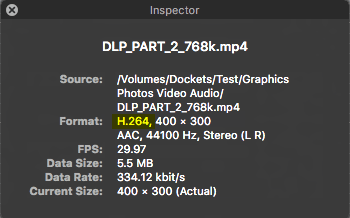
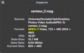
In macOS, open the video file in QuickTime Player, then choose Window>Show Movie Inspector. The video and audio codecs will display beside the Format heading. Here’s what you’ll see with a usable MP4 or MPG file:
macOS – MP4 + H.264macOS – MPG + MPEG-2
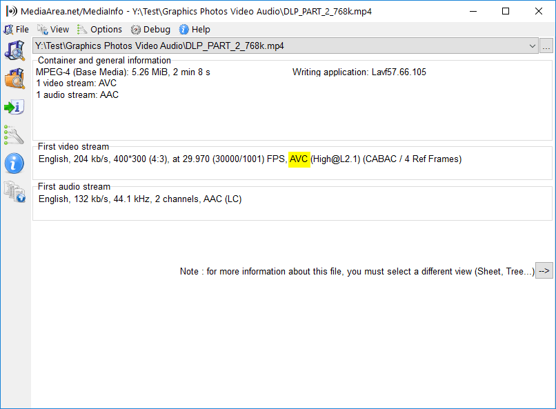
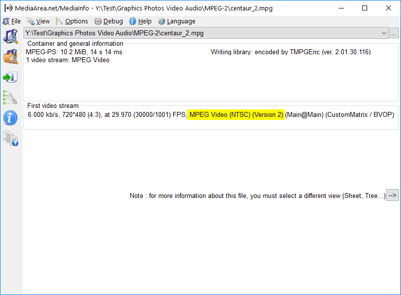
Windows users must install third-party software. You can use the VLC video player for this, but I prefer MediaInfo, which is focused on simply providing information. One note: MediaInfo shows the H.264 codec as AVC. These shots show the video format highlighted in yellow:
Windows – MP4 + H.264 Windows – MPG + MPEG-2
Let’s hear what your experiences are with video in cross-platform presentations. Victories and horror-shows are both entertaining, I look forward to reading your comments.
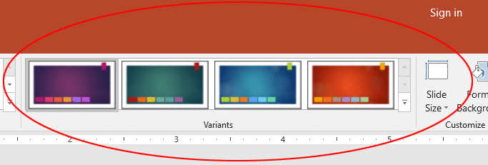
SuperThemes are a Microsoft-created theme format that includes more than one theme in the same file. You see them in action when you use a Microsoft theme in PowerPoint 2013 for Windows and PowerPoint 2016 for Windows and Mac. Opening a SuperTheme lights up the Design tab>Variants Gallery with design choices, like this selection used in Microsoft’s Ion Boardroom SuperTheme:
SuperThemes have 2 signficant advantages:
The design variants show right up front on the Ribbon, so users immediately see what alternate looks are available to them.
Including size variants ensure that the brand is never distorted by the user changing the slide size. The user can choose a slide size that completely fills any monitor, but the logos and artwork always remain at the aspect ratio you have set. No more graphic distortion
SuperThemes have been around for several years, but Microsoft has never released the specifications for creating them. Brandwares got to work on the problem and has reversed engineered the format. When I originally wrote this, we were the only company in the world that could create custom SuperThemes for you. But I published all the details in my book OOXML Hacking, so now anyone can do it!
SuperThemes – How They Work
Micrsoft’s SuperThemes include 4 to 8 design variants plus size variants for 16:9 and 4:3 aspect ratios. But that’s just a starting point. Down at the lab we found we can create size variants for 16:10 monitors, 35mm film and all the other preset sizes that Microsoft includes in PowerPoint. One client commissioned SuperThemes so they could display widescreen, then switch to 4:3 to print the deck on letter-size paper. Here’s a downloadable example you can try out: Test SuperTheme
This SuperTheme contains 2 design variants, one with a white background and a second with a grey background. It also includes 3 size variants, for 16:9, 16:10 and 4:3. After you download and unzip the file, copy it to the the Document Themes folder inside your Office templates folder. Under Windows, this will normally be in your user Documents folder under Custom Office Templates\Document Themes. Mac users will need to hold down the Alt key while clicking on the Go menu and choosing Library. This opens the hidden user Library. Once that’s open, look for Library/Group Containers/UBF8T346G9.Office/User Content/Themes and copy the .thmx file to that folder.
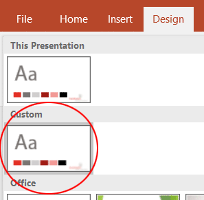
Now open PowerPoint, select the Design tab and drop down the Theme Gallery. Now there’s a new row called Custom and that’s where you’ll find the test SuperTheme:
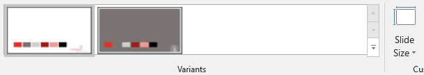
Select it and you’ll see 2 variants appear:
Switching design variants will change all slides in the presentation to that design. Now try changing the Slide Size. There are 2 sizes immediately available, 4:3 and 16:9. Notice that the logo remains undistorted even when the slide size changes. You can’t do that with a normal theme!
But many monitors are 16:10 and using 16:9 leaves big black bars at the top and bottom of your show. That’s not a problem with this SuperTheme. Click on Slide Size>Custom Slide Size (Slide Size>Page Setup on a Mac). Change the Slide(s) sized for: dropdown to On-Screen Show (16:10). The presentation is resized without any distortion to the logo. (Since we’ve set up just 3 sizes, if you picked one of the other sizes like Banner or 35mm Film you would see logo distortion. So don’t do that!)
When PowerPoint is using a SuperTheme with size variants, the Slide Size button works in a different way than normal. Inside of actually resizing the slide, it calls the associated size variant. If there is no variant for the chosen size, then PowerPoint resizes as usual. When you change the slide size to a smaller canvas, PowerPoint will ask whether you want to Maximise or Ensure Fit (Don’t Scale or Scale on a Mac). In a SuperTheme where you are switching to a supported size variant, it doesn’t matter which you choose, because PowerPoint won’t actually be resizing the slides. It just applies a variant theme.
SuperThemes – What You Need to Know
SuperThemes are intended for use with PowerPoint 2013 and 2016. They can be used with earlier versions, but there will only be access to the primary theme. This is normally set to Widescreen, so a user of older software should switch the slide size from the default 4:3 10″ x 7.5″ format.
Research in 2019 has revealed that SuperThemes can only be constructed from Presentations having a single Slide Master. It appears that Microsoft didn’t design the format for the additional complexity of multiple masters.
For a custom SuperTheme, you can supply separate themes or templates for each design and size variant. Each design variant can be completely independant, using different font or color themes, if needed. Multiply the number of designs by the number of sizes to know how many theme to supply. The downloadable SuperTheme above uses 2 designs in 3 sizes, so 6 themes went into its making.
Keep in mind that SuperThemes have the same shortcomings as themes. They can’t contain custom tables styles, macro programming, sample slides or preformatted notes or handout masters. If you need to be distributing any of those, consider using a template instead of a theme or SuperTheme.
When designing for SuperThemes, consider what might happen to an existing deck if the user changes the slide size after inserting graphics. If content placeholders in your variant themes have different aspect ratios, photos will still get distorted. So part of your design would be to include picture boxes that have a constant aspect ratio in all themes. They can be bigger or smaller, as long as the ratio of long side to small side is the same.
For 16:9 themes, we do not recommend the older On-screen Show (16:9) slide size produced by PowerPoint 2007 and 2010. This creates a slide that is 10″ x 5.63″. It’s the right proportion, but when a user creates a new slide in PowerPoint 2013 or 2016, it defaults to the new Widescreen size 13.333″ x 7.5″. This means your theme graphics are scaled up and you lose quality. Instead, create 16:9 themes using the Widescreen size created by newer versions.
For 16:10, we’ve found that a 12″ x 7.5″ slide size works perfectly. Of course, 4:3 slides are still 10″ x 7.5″, as always. This means that you can keep the height constant on all size variants. Only the width changes.
Then email the themes to us and we’ll assemble them for you. Too complicated? We’re a full-service Office shop: we can create complete SuperThemes from an InDesign or Illustrator file. Just tell us which slide sizes you want to support and we’ll do the rest. When we create a deck, it’s always guaranteed to work as expected, since we know Microsoft Office at least as well as you know Adobe software. Contact me at production@brandwares.com
Last time, I wrote about how to make great color themes. But what about if you (or your client) have discovered that an existing color theme has a problem. If you catch them early, most issues with color themes can be corrected using PowerPoint’s user interface. Say you’ve created a theme or template, but some of the tests in the last article show problems. Repairing color themes requires rearranging the theme colors, then recoloring any graphic elements on the Slide Master and Slide Layouts.
If you didn’t test the template or theme and you’ve already created a presentation before finding the theme problem, it’s more work to fix. Follow the same sequence: rearrange the colors in the theme, fix the Slide Master, then the Layouts and finally repair any element on each slide that still needs help.
But what about if there are multiple templates, or several decks that have been created from a faulty theme? Repairing color theme problems manually quickly becomes an ordeal. It’s time-consuming and error-prone to try to make all the changes by hand. Searching and Replacing using a text editor would be much quicker and more thorough. It’s time to hack some XML!
We’re going to fix all the color theme problems by searching for XML text and replacing it with corrected values. Professional test editors really shine for this kind of work because of their abilities to do search and replace on multiple folders full of files, saving you hours of work. NotePad++ for Windows and BBEdit for macOS are 2 excellent choices for this work, they both have multi-file search and replace.
If you’re using Windows, unzip the files in a separate folder. On a Mac, open the theme or template in BBEdit.
Start by correcting the color order of the theme file located in ppt\theme\theme1.xml. During design, you may have applied more than one theme and PowerPoint hoards them all. If you have more than one theme file, check the name attribute to ensure you’re changing the one actually used in your deck. (If the theme is called Office Theme, that’s a Microsoft default, you don’t have to update it.) You may also have more than one theme if your presentation contains more than one slide master. Here are before and after examples, showing only the first 4 colors:
This has blue in the lt1 (Light 1) slot and white in the dk2 (Dark 2) spot. One symptom is inserted SmartArt that shows blue text instead of the expected white.
If a presentation uses Chart Templates, you may also see files in the Theme folder like themeOveride1.xml. This override component allows a chart template to have a color theme different from the presentation into which it’s placed. All chart templates created from a template contain this themeOverride component, which is simply a copy of the main color theme. If the template color theme is bad, then you’ll also have to open all the chart templates and update chart/theme/themeOverride1.xml.
Repairing Color Themes – The Slide Master
For our simple example, we can skip this step, but for more complex repairs, it may also be necessary to adjust the color map in the slide master. If the presentation was based on a color theme exported from Word or Excel, this is necessary. It’s also often needed for legacy decks that have been imported from PowerPoint 2003 and earlier.
The Slide Master has 2 parts. First is the slide formatting that displays in the Slide Master view of PowerPoint. It’s tagged with <p:cSld>. Immediately after that are parameter storage sections holding references to the slide layouts, title, body and other text formatting, etc. The very first section <p:clrMap is what we’re looking for. The full default color map looks like this:
You can see that the dark colors dk1 and dk2 are mapped to the background instead of the text, while text is formatted with lt1 and lt2. The color theme hasn’t been altered, just the way it is mapped to the presentation elements. There is nothing in the program interface to fix this, you must edit the XML. Mental organization becomes very important when changing both the theme and the color map, you can easily get confused.
Repairing Color Themes – Search and Replace
The above steps are preparatory to making the actual changes. Now we need to change the color tags attached to all affected elements in the Slide Master(s) and all Slide Layouts and Slides. Let’s use the example of switching the blue and white. The blue was in the lt1 slot, which is mapped in the Slide Master to bk1 by default. The white was in the dk2, mapped to tx2. After switching the color order, we need to change all bk1 color tags to tx2 and all tx2 tags to bk1.
Wherever a tag is used as an attribute, it has straight quotes before and after. Include these in your search terms so you don’t mess up the color map in the Slide Master. It’s simplest to run this on all files in the archive:
Find what: “bk1” – Replace with: “tx22”
Find what: “tx2” – Replace with: “bk1”
Find what: “tx22” – Replace with: “tx2”
That should do it! Zip up the files with the same file ending as the original, if you’re using Windows. On the Mac, just save the file. Test in PowerPoint.
After: SmartArt Appearance
This is the simplest repair scenario. Sometimes you have to move more colors around, particularly if the creator was someone unfamiliar with PowerPoint. Make notes ahead of time, to make sure you’ve got the right colors moving to the right slots. And always work on a copy of the file, not the original! If it gets too complicated, just send it to us, we do this kind of thing all the time.
Next time, I’ll be discussing PowerPoint SuperThemes. Brandwares has cracked the construction of these, so I’ll cover what you need to know.
Great color themes in Office are not a random collection of swatches. Each spot in a color theme has a job. Once you learn those functions, great color themes will roll out from your office.
I’m always astounded to hear a Office “professional” who says “I don’t use themes.” I’m amazed because in modern versions of Office it’s impossible to not to use themes. If you haven’t set a theme for your template, then you’re using the default Office theme. Whether you like it or not! Themes are an integral part of Office, so you’d better learn how they work.
I’ve previously covered Font Themes and how to hack them, a necessary skill for macOS creators. Check out XML Hacking: Font Themes and XML Hacking: Font Themes Complete. In this post, I’m covering the inner workings of theming to show you how to create great color themes. I’ve touched on this subject previously in Office Charts: 6 Colors Maximum! For ideas on how to include more than one color theme in a template or presentation, please see XML Hacking: Color Themes
Great Color Themes: The Basics
When you create a color theme in PowerPoint, the color set is added to the theme1.xml file in your presentation and it’s saved on your computer. If you create a second color theme, that theme is also saved to your computer, but it replaces the first one in your deck. When you’re using the user interface, each Slide Master has only 1 theme at a time. So for more color themes, create more slide masters. If the color theme is for a special purpose, like differently-colored charts, the extra slide master might have only 1 slide layout. That’s less confusing for users.
Great Color Themes: Color Slot Functions
Almost every slot in a color theme has a PowerPoint function, a job that it fulfills for the program. If you don’t know what these are, you’ll place the wrong color in the slot and get a result that looks weird in the program interface. Needless to say, this doesn’t help your professional cred with your client.
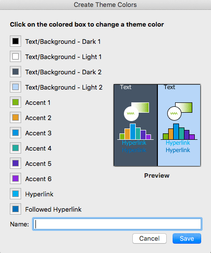
Here’s the Color Theme editing dialog as seen in PowerPoint 2016 for Mac. In Office for Mac, you can only create color themes in PowerPoint. In Windows versions, you can create them in any Office program.
The following advice covers standard presentations that have a light background and dark text. If you’re going for the mysterious look with a dark background, then reverse the following instructions putting text colors into the light slots and backgrounds into the dark ones.
The first 4 colors are for text and backgrounds. Although all 4 are called Text/Background, that just to accommodate the occasionally light text on a dark ground, as mentioned in the previous paragraph. In reality, Dark 1 is the main text color. If you have black text in the deck, leave this set at black. You should only change this if you have no black text (Please dont’t tell me you’re doing that trendy look of black text that’s dark grey and makes it look like your printer ran out of toner. Eww.)
You may have a secondary text color for headings. That must go in the Dark 2 slot. Not in Light 1! Not in Light 2! All text colors go in the dark slots!
Light 1 is for background colors. Most of the time, this is white, so leave Light 1 set at white. If the design calls for a different background color than white, set it here.
Light 2 is the only slot in the theme that doesn’t have a secondary job. You can make this slot any color! It doesn’t matter! Woo-hoo! Let’s hold off, this is a good spot for an extra color that doesn’t fit elsewhere.
Accent 1 is the default color for inserted SmartArt, Text Boxes and Shapes. Almost all the time, you will make Accent 1 the primary corporate color. For our company, PMS 481C is the code color, so Accent 1 is the RGB equivalent in all our company themes.
If the company has a secondary brand color, Accent 2 is the logical position for it. So what about Accents 3 to 6? You’re thinking “Hey! 4 empty slots! Throw some colors in, we’re done!” Not so fast, junior.
Great Color Themes: Chart Fills
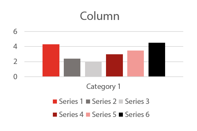
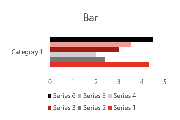
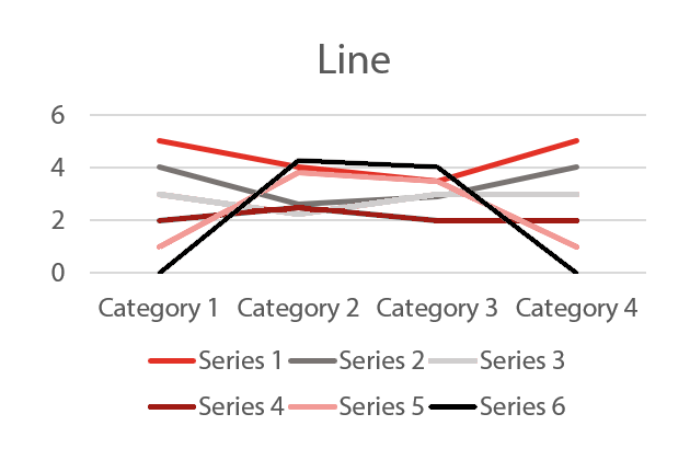
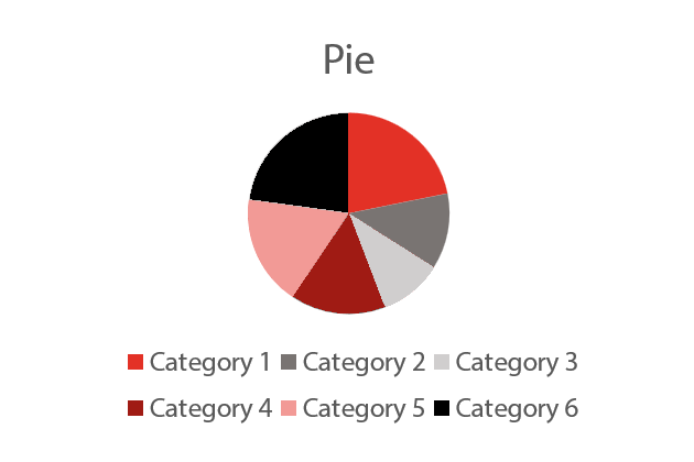
The set of Accent colors have a huge responsibility of their own: chart fills! I’ve created a color sequence to show how these are applied by PowerPoint.
Office programs fill charts using these 6 six colors in sequence. So when you’re designing, it’s best to know what that sequence is. The colors will be used in the same order:
Left to Right for Column ChartsBottom to Top for Bar ChartsFirst to Last for Line ChartsFrom 0 degrees (top dead center) clockwise for Pie Charts
If there are no additional colors in the design standards, we create a pair of lighter and darker variations of the brand colors for Accents 3 to 6. But don’t just create a pretty series of swatches! Is the chart readable when printed on a black and white laser? Can color-blind people read it? You’re a Designer! You’re supposed to be thinking of these things! The rule of thumb is to alternate darker and lighter colors in a sequence so they can be distinguished from one another even in monochrome. Not sure? Test it!
Of the 12 colors in the theme, only the first 10 are accessible to the user in color picker dialogs. The last 2, Hyperlink and Visited Hyperlink, are applied automatically when the user inserts a hyperlink in the document. I usually use 2 of the theme colors for these, rather than Microsoft’s standard colors. If there’s a blue, that’s a good choice for the hyperlink, it’s a visual cue. The followed hyperlink can be a lighter grey or other tint, if there is one in the palette.
Great Color Themes: Recognizing Trouble
Before shipping the deck, here are a few quick tests you should be performing to show any color theme problems:
Insert SmartArt: Is the text readable?Insert a chart: Does the preview look right?
If either of these look odd, you probably have a color theme problem. If the text or background of either the chart preview or SmartArt don’t match the background of the deck, you’ve probably inserted a dark color into the Light1 slot
Insert a table: Do the auto-generated variations contain many useless combinations?
Most of the autogenerated table combinations in this example are hideous and unworkable, sure sign of a bad color theme. You may also see a table style preview that looks different from the actual table. If the table preview shows a different color for table text (it will just show colored lines, not actual text), then the colors in Light2 and Dark2 have to be switched. Another problem indicator is if it appears you are selecting one color in the picker, but the actual color applied is different.
Insert a chart in Excel: Does the chart background match the worksheet background?
If you see any of the above symptoms, take the time to fix them and do it right. Your client will notice these glitches and you won’t be able to ‘splain them away.
The general method to fix these issues is to put the theme in correct order, then go through the entire deck starting with the Slide Masters, correcting the colors back to the designed appearance. This effort isn’t too bad if it’s a single template or theme you’re correcting. Groups of finished presentations are a different matter that need a more automated approach. Next time, I’ll be writing about how to repair presentations with a bad color theme, using XML Hacking.
Recent colors are handled inconsistently by Microsoft Office programs. Word and Outlook only retain recently used colors only as long as the program is running, and those colors are visible in every document that’s open. By contrast, PowerPoint and Excel both include them in the document. As soon as you open a different file, the previous colors disappear from the color picker. Return to the first document and there they are again.
If you’re creating files for clients, you may generate quite a few colors in the design process. Your work will look a little more professional if you purge the Recent Colors from the PowerPoint or Excel file before sending it on.
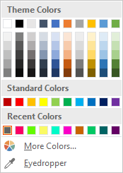
The row of Recent Colors that PowerPoint and Excel include in the file is a distraction for your client.
Recent Colors Removal Steps
Under Windows, begin by unzipping the file. On a Mac, open it in BBEdit or other advanced text editor.
If this is a PowerPoint deck, look in the ppt folder for the presProps.xml file. The recent colors begin on the third line of a prettified (human-readable) file. Simply delete the entire clrMru section:
To remove the Recent Colors from an Excel workbook, open the xl folder, then edit styles.xml. Look for the colors section, then delete the entire mruColors part:
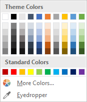
After editing, rezip the files if you’re using Windows or save and close in your macOS text editor. Test that the file opens as expected and no longer has Recent Colors in the color picker, that send it off to the client.
A more presentable dialog for your client.
PowerPoint VBA to Remove Recent Colors
There’s a simple alternative if you’re using PowerPoint for Windows: you can run a macro to remove the recent colors. It’s dead simple, here’s the code:
Sub ClearRecentColors()
  ActivePresentation.ExtraColors.Clear
End Sub
Unfortunately, PowerPoint for Mac VBA is missing the .Clear method, so you’ll have to hack the file. There’s VBA no equivalent in Excel for Windows or Mac, you’ll have to edit the XML to get rid of them.
Don’t Reuse Recent Colors
Occasionally an artist will try to include special colors in the Recent Colors section, to give the client some additional color choices. This is a bad idea because the Recent Color section is dynamic. When any new color is created, it’s added to the left end of Recent Colors. If the row is full, the oldest color gets pushed off the right end. A better solution is to create Custom Colors. Here’s my how-to on the subject. Custom Colors don’t move or change and can be named, which is a little extra help for your client.
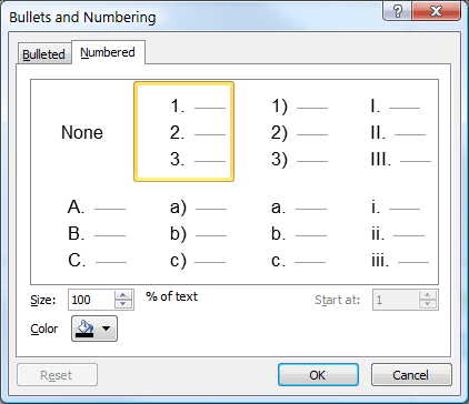
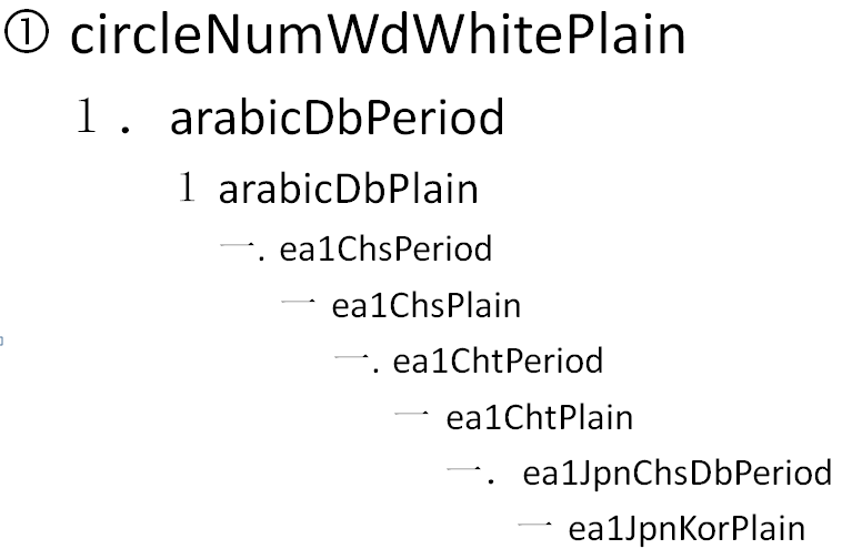
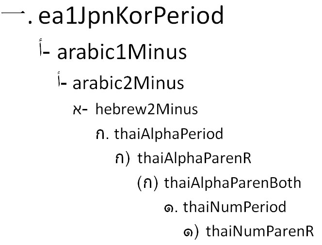
If you believe the user interface, there are only 7 PowerPoint numbering styles:
In fact, there are 41 numbering styles available. About half of these apply to languages using other alphabets. These language variants become available to the user interface when the presentation text and keyboard input method is set to a relevant language.
Microsoft uses “Arabic” for both western European numbers and for numerals in the Arabic language. In this article, I refer to Western numbers for the European/American numbering system.
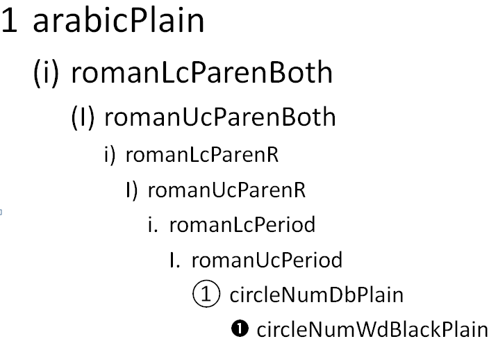
There are a dozen hidden PowerPoint numbering styles that you can only use if you hack the XML. This subset includes the ever-popular circles within numbers format. Here’s how to implement these.
Hacking PowerPoint Numbering Styles
Here’s a typical listing of a style using numbering. Bold text is the numbering style type.
If we examine the dialog displayed by the program, the styles available from the upper left are arabicPeriod, arabicParenR, romanUcPeriod, alphaUcPeriod, alphaLcParenR, alphaLcPeriod and romanLcPeriod. You can see the full list of styles at Datypic.com.
The illustrated XML is from the bodyStyle section of the slideMaster1.xml, but you can use exactly the same syntax for the otherStyle section of slideMaster1.xml, to format table text, or for p:defaultTextStyle in presentation.xml to handle text boxes.
PowerPoint Numbering Styles – the Complete List
Here are examples of all 41 numbering styles. The text of each line is the XML parameter to use. Uc = Upper case, Lc = Lower case, Db = Double byte, Plain = No character following the number/letter, Period = Following period, ParenR = Following parenthesis, ParenBoth = Parentheses before and after. Please note there are only a few Plain styles and those are mostly for Western numbers. PowerPoint does not have any ability to create custom numbering styles (I’ve tried!), so you’ll have to live with these.
As an alternative to hacking the XML, you can select text and run a VBA snippet to set one of these styles:
Sub NumberStyling()
  With ActiveWindow.Selection.ShapeRange(1).TextFrame2.TextRange.ParagraphFormat.Bullet
    .Type = msoBulletNumbered
    .Style = msoBulletArabicParenBoth
  End With
End Sub
Edit the .Style = msoBulletArabicParenBoth line to one of the style names below, adding msoBullet to the front of the name to get the VBA parameter. So thaiNumParenBoth becomes msoBulletThaiNumParenBoth in VBA. Thanks to John SR Wilson for the VBA.
Brandwares can help set up complex numbering and bulleting schemes for PowerPoint and Word. Contact me at production@brandwares.com with your project needs.
When you choose fonts for Office, it takes a different approach than selecting typefaces for an InDesign document. One obvious difference is that you only need to install the font for a design document on the computer where it’s being created. Using the same font in an Office program will require the font to be installed on every computer using the document. Clearly, this is a much more costly solution. Aside from that, let’s look at the pitfalls of choosing fonts for Office templates.
Choosing Fonts for Office – Fake News
Most of what you see on the internet comparing font formats is wrong. Almost all modern professional fonts are OpenType format. There is PostScript-flavor OpenType, favored by Adobe and ending with .OTF And there is TrueType-flavor OpenType, Microsoft’s choice, ending with .TTF. It’s the continued use of the .TTF file ending that has misled many into thinking that they’re old-fashioned TrueType fonts. They’re not.
To verify this in macOS, open FontBook and examine a font with a .TTF ending. Make sure choose View>Show Font Info. Now look at the Kind parameter. Old-fashioned TrueType fonts would say TrueType here, but more likely you’re seeing OpenType TrueType.
In Windows, if you right-click on any file ending in .TTF and choose Properties, Type of file is reported as TrueType font file (.TTF). But this is illustrative of Windows’ relatively brain-dead design rather than any real information about the font.
Confirming this in Windows requires a few more steps. Start by opening the C:\Windows\Fonts folder. Set the View menu to Details. Now right-click in the row that displays the categories like Name, Font Style, etc. A list of avilable categories display. Choose Font Type. Now you can see that almost all the fonts are OpenType. You’ll only see TrueType if you’ve installed some old fonts from the 90s.
Choosing Fonts for Office – Designer Vanity
Designers from different geographic areas spec fonts differently. As one example, Toronto designers tend to focus on the practicalities of electronic document distribution. As a result, they will often choose Arial or Times New Roman for the user-filled portion of a template. By contrast, designers from New York focus on creating a distinct visual appearance. They choose unusual designer fonts. This creates logistical problems for their clients. They must spend money licensing for all workstations and then take time to install the fonts for each user.
Test fonts from small foundries to licensing a lot of copies. I’ve written about this issue before: Cross-platform Fonts from Small Foundries: Beware! In a mixed Windows/OS X environment, a poor quality font will not display correctly in documents that move between Mac and PC. One typical symptom is Italic text that displays as Roman or Bold when viewed on a different OS, or some similar weight/style mixup.
Choosing Fonts for Office – Collaboration
If the client uses Office documents for collaboration (Don’t know? You should be asking these questions!), you should seriously reconsider a “designer-y” font choice. When the documents arrive at your client’s client, that computer will not have the fonts and the document appearance will change drastically. Unlike web pages, Office documents do not have a font fallback setting. There is no practical way to preset which font will be substituted when the original is missing.
I know what you’re going to say next: “What about if we embed the fonts?” Here are several reasons why that might not work.
Embedding does not work at all in Office 2011 or earlier for Mac. Users of these versions can neither embed fonts, nor can they view fonts that have been embedded in Windows.
Embedding doesn’t work in Word or Excel for Mac, in both the 2016 and 2019 versions. PowerPoint 2016 for Mac users must have at least version 16.11 to view embedded fonts. The 2016 retail version (as opposed to the Office 365 subscriber version) cannot embed fonts in PowerPoint. Mac users must have at least Office 2019 retail or Office 365 version 16.17 to save embedded fonts in a PowerPoint file.
Many typefaces have restrictive embedding permissions. So even if you can embed the font and your client can see it, they will not be able to edit the document using the embedded font. You can get around this if you contact the foundry and request a version with Editable or Installable permissions. Expect to pay a surcharge for this. Some foundries charge a lot for this service, because they’re concerned about losing sales to possible piracy.
Choosing Fonts for Office – Font Families
Designers are used to Single versions of fonts. The is where each font variant appears as a separate entry in the font list in Office. If you want to change to bold or italic, you select a different font from the list. Office doesn’t usually work this way and Office users are not used to this method.
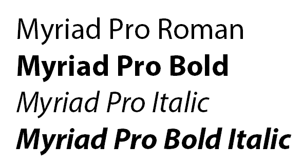
When all four faces in a font family are installed, using the bold and italic buttons has the intended effect of switching fonts.
Instead, Office users are familiar with Family fonts. This is where where a group of (usually 4) fonts is linked. To get bold or Italic variants, they click on the Bold or Italic buttons, leaving the font name the same. The foundry usually creates the font families, though there are some type utilities available that let you make a family out of single fonts. As I mentioned earlier, Microsoft hasn’t figured out how to consistently display an .OTF font family correctly. Symptoms vary but are along the lines of you choose Bold and you get Bold Italic, or a similar variant. The wrong font is shown and printed. Typocially this will manifest when moving a Windows-created document to macOS or vice versa.
If the font is not set up as a family-style font, then using the bold and italic buttons fakes the look with stroking and/or slanting the roman. The result is a disastrous visual effect.
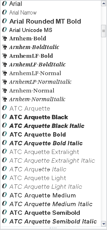
In macOS, it’s not obvious when you are using single versus family fonts. MacOS creates family groupings on the fly. In Windows, it’s easy: install the fonts, then look at the font menu in an Office program. A font family will only have one entry for the family, while singles will list every font variant. In this screen shot, the Arials are families. Arnhem and ATC Arquette are collections of single fonts:
The Arials are families, while Arnhem and ATC Arquette are singles.
The logical conclusion to the font family approach is that your client should almost never be licensing just one or two typefaces. If four family members are not installed, Office will fake them by stroking the font for bold and slanting it for italic. As you might guess, this looks ghastly and completely off-brand.
The exceptions to this rule are:
If the document is a fillable form in Word or Excel. Those documents are typically locked so the user can’t change the font or its attributes.
The the font is used only for Headings. These are usually bold and stay that way, so there is less chance of a user applying attributes.
In either of these 2 situations, you should be able to get away with licensing a single typeface instead of a complete family.
A font family with all 4 members installed. The bold and italic button work as expected.Here is a family-style font with only the Roman installed. Using the bold or italic buttons gets you this dreadful look, plus an out-of-memory warning from Office.
If your design calls for an unusual mix of weights, like Light and Demibold instead of Regular and Bold, contact the foundry to request a custom family. There is normally a small charge for this service. However, if the licensing deal is large enough, the foundry may waive this.
Choosing Fonts for Office – 2 Solutions
To sum up, for each different font used in your design, your client should be licensing a complete family of 4 typefaces in TrueType or Truetype-flavored OpenType.
Brandwares is a font reseller and we’ve been speccing type for Office for years. If you choose us to create your templates, we can also source your client fonts in the correct format and family. This service includes free tech support. We’ll help your client with any installation or usage issues and communicate with the foundry, if necessary.
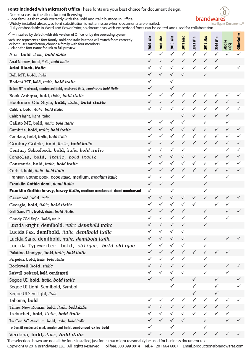
Working on your own? A simple way to eliminate all these issues is to design with the fonts that are already installed by Office. There are many faces more interesting than Arial and Times New Roman in this collection. The fonts that come with Office don’t require any additional licensing fee. They are already installed and they have relaxed embedding permissions to make collaboration easy. They are all high-quality typefaces licensed from major foundries like Monotype. Here is a list of the families that are useful for business communications (we left out Comic Sans!). For maximum compatibility among all versions of Office, use a font that is checked in every column.
Click to view larger image
This list is available as a free PDF that shows character listings for every font by clicking on the font name. Email me to get a copy: production@brandwares.com