It can be a bewildering subject, figuring out which video formats are going to work in a presentation. It’s doubly difficult when a presentation is designed on one computer, then played on another. I can’t count the number of seminars I’ve observed where the presenter is humming and hawing about the video: “Well it worked in rehearsal…” Even Microsoft’s web site has inaccurate information about choosing a video format, so what’s a user to do?
Fortunately, we’ve done lots of research and testing on the subject. I’m focusing here on the use of video in PowerPoint and Keynote presentations to find what works reliably. But I make one assumption: that you are using current versions of the software and operating system. In Windows, you should be on Windows 7 or better and be using Office 2010 or better. In macOS, I regard El Capitan (10.11) as a minimum, running at least Keynote 6 and/or Office 2016 for Mac. You may be able to get away with less, but the degree of uncertainty and need for testing goes up.
Video Formats – Containers
The main reason why there is so much confusion around video formats is that each video has at least 2 types of format. One is the Container format and is denoted by the file ending of the video. MP4, MPG and MOV are Container formats. Most people refer to the container format, but most can hold a variety of video and audio streams that be differently encoded. An analogy might be a Word document that can contain a variety of languages. A .docx file ending doesn’t tell you if it’s an English text!
Video Formats – Codecs
The second format is the encoding, referred to as the Codec (short for Compression/Decompression). H.264 or MPEG-2 are both video codecs, but there are also audio codecs like MP3 and AAC. To ensure a video plays reliably in any given context, you have to have both the right container and codec formats. This is the source of the common complaint “Well, I used an .MP4 file, but it didn’t work.” The codec was wrong.
It’s not such a big issue when all computers in a company are one operating system. If you’re only using Windows, slap in a WMV file, it will work. Usually. But when a company has mixed operating systems, or when you’re designing one one operating system for use on another, you have to be much more selective.
So here’s my recommendation: stick with MP4 for a container format with H.264 for a codec. It is supported by most software, plus HTML5. An MPG container with the MPEG-2 codec is also reliable for desktop software. Using either of these 2 format combinations, the video will play in Keynote or PowerPoint in macOS and PowerPoint in Windows. Always.
But how do you tell what codec is used in a given file? The MP4 or MPG file ending gives nothing away.
Video Formats – Finding the Codec
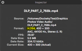
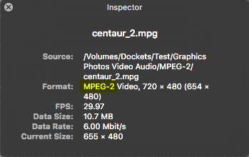
In macOS, open the video file in QuickTime Player, then choose Window>Show Movie Inspector. The video and audio codecs will display beside the Format heading. Here’s what you’ll see with a usable MP4 or MPG file:
macOS – MP4 + H.264macOS – MPG + MPEG-2
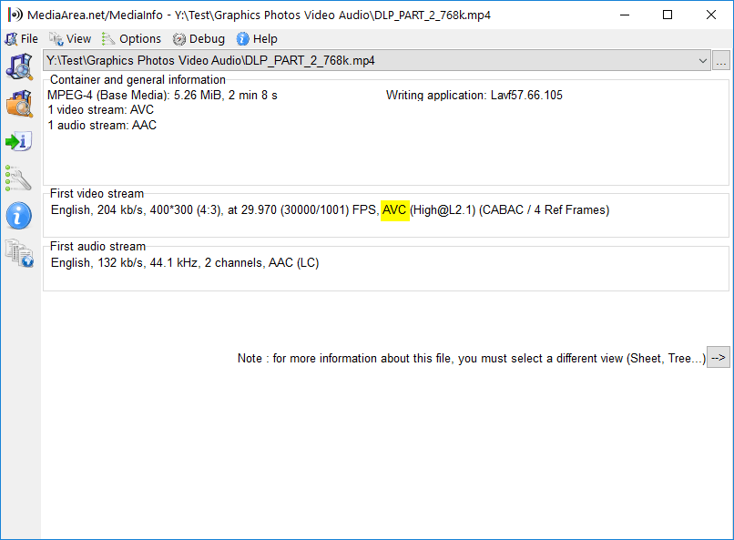
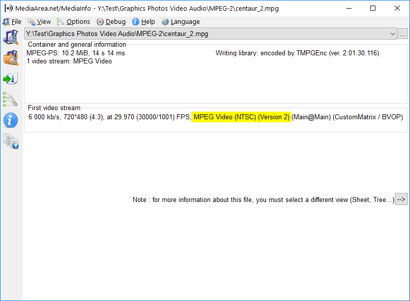
Windows users must install third-party software. You can use the VLC video player for this, but I prefer MediaInfo, which is focused on simply providing information. One note: MediaInfo shows the H.264 codec as AVC. These shots show the video format highlighted in yellow:
Windows – MP4 + H.264 Windows – MPG + MPEG-2
Let’s hear what your experiences are with video in cross-platform presentations. Victories and horror-shows are both entertaining, I look forward to reading your comments.
Great color themes in Office are not a random collection of swatches. Each spot in a color theme has a job. Once you learn those functions, great color themes will roll out from your office.
I’m always astounded to hear a Office “professional” who says “I don’t use themes.” I’m amazed because in modern versions of Office it’s impossible to not to use themes. If you haven’t set a theme for your template, then you’re using the default Office theme. Whether you like it or not! Themes are an integral part of Office, so you’d better learn how they work.
I’ve previously covered Font Themes and how to hack them, a necessary skill for macOS creators. Check out XML Hacking: Font Themes and XML Hacking: Font Themes Complete. In this post, I’m covering the inner workings of theming to show you how to create great color themes. I’ve touched on this subject previously in Office Charts: 6 Colors Maximum! For ideas on how to include more than one color theme in a template or presentation, please see XML Hacking: Color Themes
Great Color Themes: The Basics
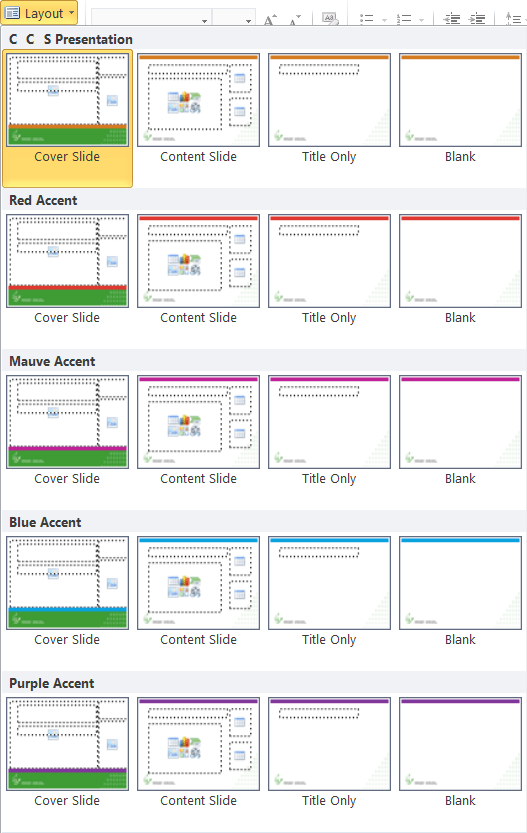
When you create a color theme in PowerPoint, the color set is added to the theme1.xml file in your presentation and it’s saved on your computer. If you create a second color theme, that theme is also saved to your computer, but it replaces the first one in your deck. When you’re using the user interface, each Slide Master has only 1 theme at a time. So for more color themes, create more slide masters. If the color theme is for a special purpose, like differently-colored charts, the extra slide master might have only 1 slide layout. That’s less confusing for users.
Great Color Themes: Color Slot Functions
Almost every slot in a color theme has a PowerPoint function, a job that it fulfills for the program. If you don’t know what these are, you’ll place the wrong color in the slot and get a result that looks weird in the program interface. Needless to say, this doesn’t help your professional cred with your client.
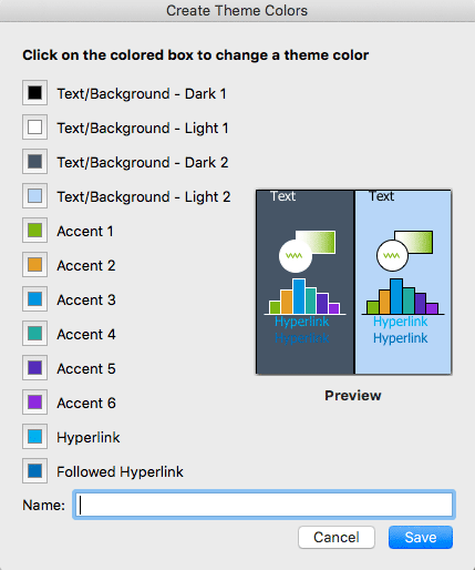
Here’s the Color Theme editing dialog as seen in PowerPoint 2016 for Mac. In Office for Mac, you can only create color themes in PowerPoint. In Windows versions, you can create them in any Office program.
The following advice covers standard presentations that have a light background and dark text. If you’re going for the mysterious look with a dark background, then reverse the following instructions putting text colors into the light slots and backgrounds into the dark ones.
The first 4 colors are for text and backgrounds. Although all 4 are called Text/Background, that just to accommodate the occasionally light text on a dark ground, as mentioned in the previous paragraph. In reality, Dark 1 is the main text color. If you have black text in the deck, leave this set at black. You should only change this if you have no black text (Please dont’t tell me you’re doing that trendy look of black text that’s dark grey and makes it look like your printer ran out of toner. Eww.)
You may have a secondary text color for headings. That must go in the Dark 2 slot. Not in Light 1! Not in Light 2! All text colors go in the dark slots!
Light 1 is for background colors. Most of the time, this is white, so leave Light 1 set at white. If the design calls for a different background color than white, set it here.
Light 2 is the only slot in the theme that doesn’t have a secondary job. You can make this slot any color! It doesn’t matter! Woo-hoo! Let’s hold off, this is a good spot for an extra color that doesn’t fit elsewhere.
Accent 1 is the default color for inserted SmartArt, Text Boxes and Shapes. Almost all the time, you will make Accent 1 the primary corporate color. For our company, PMS 481C is the code color, so Accent 1 is the RGB equivalent in all our company themes.
If the company has a secondary brand color, Accent 2 is the logical position for it. So what about Accents 3 to 6? You’re thinking “Hey! 4 empty slots! Throw some colors in, we’re done!” Not so fast, junior.
Great Color Themes: Chart Fills
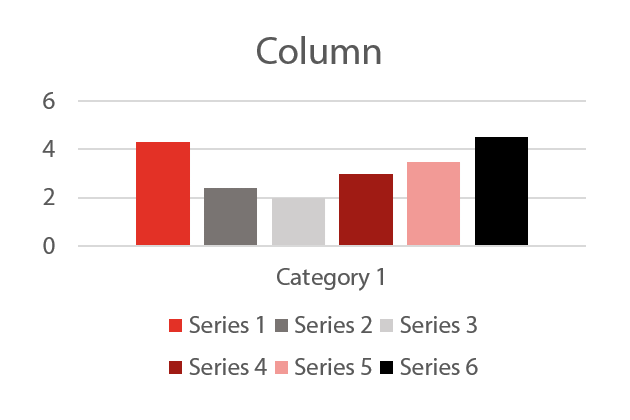
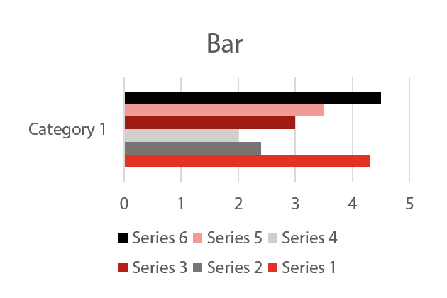
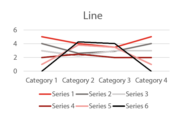
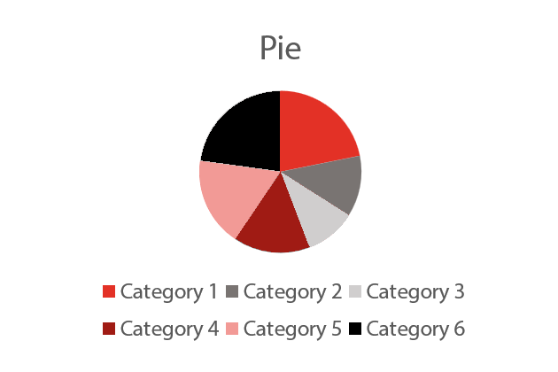
The set of Accent colors have a huge responsibility of their own: chart fills! I’ve created a color sequence to show how these are applied by PowerPoint.
Office programs fill charts using these 6 six colors in sequence. So when you’re designing, it’s best to know what that sequence is. The colors will be used in the same order:
Left to Right for Column ChartsBottom to Top for Bar ChartsFirst to Last for Line ChartsFrom 0 degrees (top dead center) clockwise for Pie Charts
If there are no additional colors in the design standards, we create a pair of lighter and darker variations of the brand colors for Accents 3 to 6. But don’t just create a pretty series of swatches! Is the chart readable when printed on a black and white laser? Can color-blind people read it? You’re a Designer! You’re supposed to be thinking of these things! The rule of thumb is to alternate darker and lighter colors in a sequence so they can be distinguished from one another even in monochrome. Not sure? Test it!
Of the 12 colors in the theme, only the first 10 are accessible to the user in color picker dialogs. The last 2, Hyperlink and Visited Hyperlink, are applied automatically when the user inserts a hyperlink in the document. I usually use 2 of the theme colors for these, rather than Microsoft’s standard colors. If there’s a blue, that’s a good choice for the hyperlink, it’s a visual cue. The followed hyperlink can be a lighter grey or other tint, if there is one in the palette.
Great Color Themes: Recognizing Trouble
Before shipping the deck, here are a few quick tests you should be performing to show any color theme problems:
Insert SmartArt: Is the text readable?Insert a chart: Does the preview look right?
If either of these look odd, you probably have a color theme problem. If the text or background of either the chart preview or SmartArt don’t match the background of the deck, you’ve probably inserted a dark color into the Light1 slot
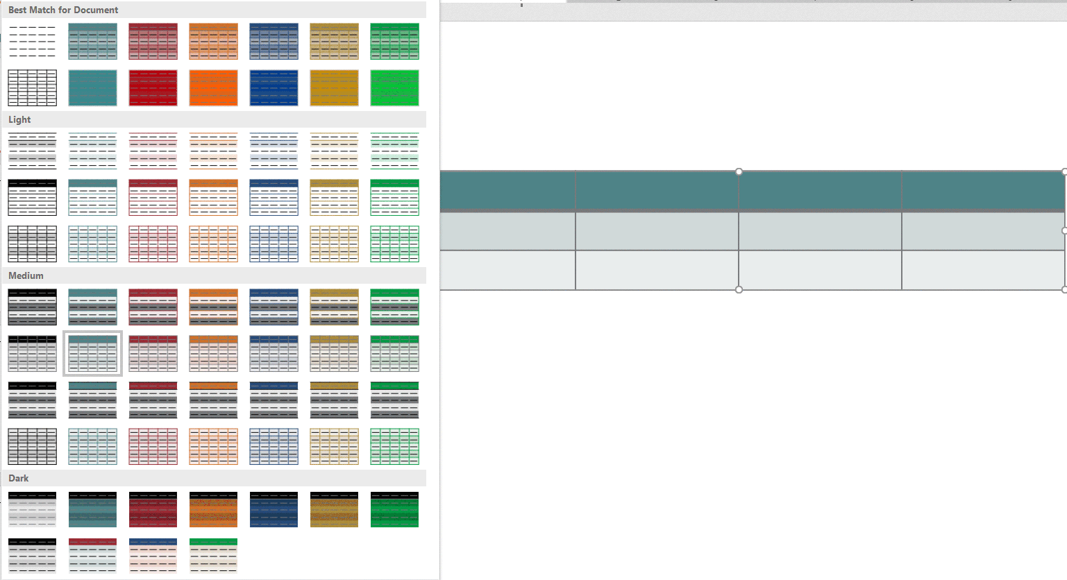
Insert a table: Do the auto-generated variations contain many useless combinations?
Most of the autogenerated table combinations in this example are hideous and unworkable, sure sign of a bad color theme. You may also see a table style preview that looks different from the actual table. If the table preview shows a different color for table text (it will just show colored lines, not actual text), then the colors in Light2 and Dark2 have to be switched. Another problem indicator is if it appears you are selecting one color in the picker, but the actual color applied is different.
Insert a chart in Excel: Does the chart background match the worksheet background?
If you see any of the above symptoms, take the time to fix them and do it right. Your client will notice these glitches and you won’t be able to ‘splain them away.
The general method to fix these issues is to put the theme in correct order, then go through the entire deck starting with the Slide Masters, correcting the colors back to the designed appearance. This effort isn’t too bad if it’s a single template or theme you’re correcting. Groups of finished presentations are a different matter that need a more automated approach. Next time, I’ll be writing about how to repair presentations with a bad color theme, using XML Hacking.
When you choose fonts for Office, it takes a different approach than selecting typefaces for an InDesign document. One obvious difference is that you only need to install the font for a design document on the computer where it’s being created. Using the same font in an Office program will require the font to be installed on every computer using the document. Clearly, this is a much more costly solution. Aside from that, let’s look at the pitfalls of choosing fonts for Office templates.
Choosing Fonts for Office – Fake News
Most of what you see on the internet comparing font formats is wrong. Almost all modern professional fonts are OpenType format. There is PostScript-flavor OpenType, favored by Adobe and ending with .OTF And there is TrueType-flavor OpenType, Microsoft’s choice, ending with .TTF. It’s the continued use of the .TTF file ending that has misled many into thinking that they’re old-fashioned TrueType fonts. They’re not.
To verify this in macOS, open FontBook and examine a font with a .TTF ending. Make sure choose View>Show Font Info. Now look at the Kind parameter. Old-fashioned TrueType fonts would say TrueType here, but more likely you’re seeing OpenType TrueType.
In Windows, if you right-click on any file ending in .TTF and choose Properties, Type of file is reported as TrueType font file (.TTF). But this is illustrative of Windows’ relatively brain-dead design rather than any real information about the font.
Confirming this in Windows requires a few more steps. Start by opening the C:\Windows\Fonts folder. Set the View menu to Details. Now right-click in the row that displays the categories like Name, Font Style, etc. A list of avilable categories display. Choose Font Type. Now you can see that almost all the fonts are OpenType. You’ll only see TrueType if you’ve installed some old fonts from the 90s.
Choosing Fonts for Office – Designer Vanity
Designers from different geographic areas spec fonts differently. As one example, Toronto designers tend to focus on the practicalities of electronic document distribution. As a result, they will often choose Arial or Times New Roman for the user-filled portion of a template. By contrast, designers from New York focus on creating a distinct visual appearance. They choose unusual designer fonts. This creates logistical problems for their clients. They must spend money licensing for all workstations and then take time to install the fonts for each user.
Test fonts from small foundries to licensing a lot of copies. I’ve written about this issue before: Cross-platform Fonts from Small Foundries: Beware! In a mixed Windows/OS X environment, a poor quality font will not display correctly in documents that move between Mac and PC. One typical symptom is Italic text that displays as Roman or Bold when viewed on a different OS, or some similar weight/style mixup.
Choosing Fonts for Office – Collaboration
If the client uses Office documents for collaboration (Don’t know? You should be asking these questions!), you should seriously reconsider a “designer-y” font choice. When the documents arrive at your client’s client, that computer will not have the fonts and the document appearance will change drastically. Unlike web pages, Office documents do not have a font fallback setting. There is no practical way to preset which font will be substituted when the original is missing.
I know what you’re going to say next: “What about if we embed the fonts?” Here are several reasons why that might not work.
Embedding does not work at all in Office 2011 or earlier for Mac. Users of these versions can neither embed fonts, nor can they view fonts that have been embedded in Windows.
Embedding doesn’t work in Word or Excel for Mac, in both the 2016 and 2019 versions. PowerPoint 2016 for Mac users must have at least version 16.11 to view embedded fonts. The 2016 retail version (as opposed to the Office 365 subscriber version) cannot embed fonts in PowerPoint. Mac users must have at least Office 2019 retail or Office 365 version 16.17 to save embedded fonts in a PowerPoint file.
Many typefaces have restrictive embedding permissions. So even if you can embed the font and your client can see it, they will not be able to edit the document using the embedded font. You can get around this if you contact the foundry and request a version with Editable or Installable permissions. Expect to pay a surcharge for this. Some foundries charge a lot for this service, because they’re concerned about losing sales to possible piracy.
Choosing Fonts for Office – Font Families
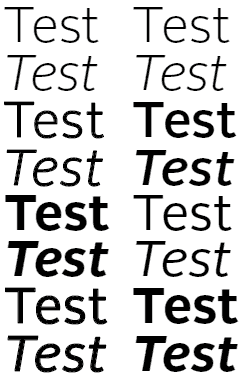
Designers are used to Single versions of fonts. The is where each font variant appears as a separate entry in the font list in Office. If you want to change to bold or italic, you select a different font from the list. Office doesn’t usually work this way and Office users are not used to this method.
When all four faces in a font family are installed, using the bold and italic buttons has the intended effect of switching fonts.
Instead, Office users are familiar with Family fonts. This is where where a group of (usually 4) fonts is linked. To get bold or Italic variants, they click on the Bold or Italic buttons, leaving the font name the same. The foundry usually creates the font families, though there are some type utilities available that let you make a family out of single fonts. As I mentioned earlier, Microsoft hasn’t figured out how to consistently display an .OTF font family correctly. Symptoms vary but are along the lines of you choose Bold and you get Bold Italic, or a similar variant. The wrong font is shown and printed. Typocially this will manifest when moving a Windows-created document to macOS or vice versa.
If the font is not set up as a family-style font, then using the bold and italic buttons fakes the look with stroking and/or slanting the roman. The result is a disastrous visual effect.
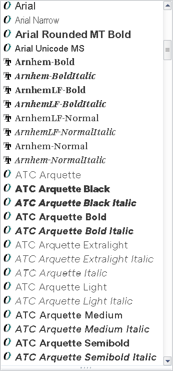
In macOS, it’s not obvious when you are using single versus family fonts. MacOS creates family groupings on the fly. In Windows, it’s easy: install the fonts, then look at the font menu in an Office program. A font family will only have one entry for the family, while singles will list every font variant. In this screen shot, the Arials are families. Arnhem and ATC Arquette are collections of single fonts:
The Arials are families, while Arnhem and ATC Arquette are singles.
The logical conclusion to the font family approach is that your client should almost never be licensing just one or two typefaces. If four family members are not installed, Office will fake them by stroking the font for bold and slanting it for italic. As you might guess, this looks ghastly and completely off-brand.
The exceptions to this rule are:
If the document is a fillable form in Word or Excel. Those documents are typically locked so the user can’t change the font or its attributes.
The the font is used only for Headings. These are usually bold and stay that way, so there is less chance of a user applying attributes.
In either of these 2 situations, you should be able to get away with licensing a single typeface instead of a complete family.
A font family with all 4 members installed. The bold and italic button work as expected.Here is a family-style font with only the Roman installed. Using the bold or italic buttons gets you this dreadful look, plus an out-of-memory warning from Office.
If your design calls for an unusual mix of weights, like Light and Demibold instead of Regular and Bold, contact the foundry to request a custom family. There is normally a small charge for this service. However, if the licensing deal is large enough, the foundry may waive this.
Choosing Fonts for Office – 2 Solutions
To sum up, for each different font used in your design, your client should be licensing a complete family of 4 typefaces in TrueType or Truetype-flavored OpenType.
Brandwares is a font reseller and we’ve been speccing type for Office for years. If you choose us to create your templates, we can also source your client fonts in the correct format and family. This service includes free tech support. We’ll help your client with any installation or usage issues and communicate with the foundry, if necessary.
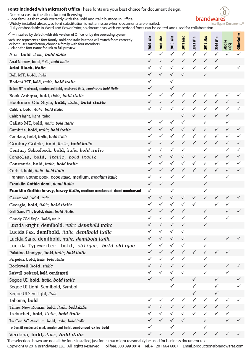
Working on your own? A simple way to eliminate all these issues is to design with the fonts that are already installed by Office. There are many faces more interesting than Arial and Times New Roman in this collection. The fonts that come with Office don’t require any additional licensing fee. They are already installed and they have relaxed embedding permissions to make collaboration easy. They are all high-quality typefaces licensed from major foundries like Monotype. Here is a list of the families that are useful for business communications (we left out Comic Sans!). For maximum compatibility among all versions of Office, use a font that is checked in every column.
Click to view larger image
This list is available as a free PDF that shows character listings for every font by clicking on the font name. Email me to get a copy: production@brandwares.com
It’s a challenge to create the absolute best quality logos for client files in Microsoft Office. Most artists choose bitmap formats for logos, usually JPEG format. Apparently this is some kind of received wisdom from artist to artist, because JPEG format is close to the worst possible format for logos. But I’ve already covered this subject in JPEG Logos? Fail! back in 2013.
Brandwares has used indexed-color PNG format for most line art (a term for non-photographic art that is mostly flat color areas). Most logos qualify as line art. But there are a couple of disadvantages to using any type of bitmap format for branding information.
With Office files, Microsoft is determined to foist image “compression” on us. I put compression in quotes because Microsoft’s solution is really downsampling by another name. Whatever the name, the results are blurry and absolutely do not reinforce the brand. All bitmap files will be downsampled unless the user chooses only a single file. You can’t protect the company logo, even with XML hacking. Let’s face it, sooner or later, bitmap logos will look like mush.
The other persistent problem with bitmap formats is what happens when you create a PDF from a document. Acrobat’s default settings assume you want to create a small file to post on a web page. This was a serious problem 20 years ago. So, once again, a software company’s helpful authoritarianism leads to default settings that cream the logos in any Office file.
Vector Formats for Best Quality Logos
For many years, we at Brandwares were aware that a vector format was a potential way out of this. Vector formats are naturals for line art, because they easily handle geometric shapes with simple coloring. But there are relatively few vector formats from which to choose, and the available formats didn’t seem up to the job.
One grandaddy of vector formats is the EPS file. Well-known to designers, the EPS doesn’t get great support in Office programs. Printing them at high resolution requires PostScript support from the printer, which is dicey in most business offices. Office programs can’t ungroup them, so adding theme color support in an Office file is out of the question.
CGM was an early contender, and is still used in technical applications. But it never got support in common file formats. SVG is making inroads on the web, but Office is only beginning to support the format.
Let’s be honest, Microsoft offers the best support to the formats it invents. For vector graphics, that is WMF and EMF. WMF is a 16-bit format that was invented in the ’90s. In practice, it’s not too useful today. All too often, WMF files do not render the inside curve of shapes like O or D. In addition, Adobe Illustrator’s WMF export is horrendous, turning every curve into a series of angled straight lines. Corel Draw does a better export, but the format is limited by its 16-bit capacity.
The format we’re left with is EMF (Enhanced MetaFile). Brandwares has developed a method to create the highest quality EMF files possible. Whatever you do, do not use EMFs exported by Adobe Illustrator! Illustrator’s curve accuracy goes down the toilet when it exports as EMF. Here’s what you’ll get, versus the type we produce:
EMF from Adobe Illustrator: wonky curves!EMF from Brandwares
We create robust logos with a tiny file size and razor sharpness at any resolution and transparent backgrounds and they will never get downsampled by Office or Acrobat!
Best Quality Logos In Use
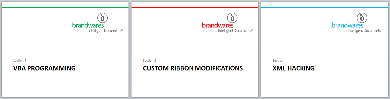
Once we’ve placed our EMF logos in your presentation, they can be ungrouped in Windows versions of PowerPoint, then you can key part or all of it to a theme color. If your presentation contains multiple color themes, changing theme colors will change the keyed logo element automatically. This can be a slick trick for presentations with different sections in different code colors. If you’re working with a Mac, let us know and we can ungroup and key the logo parts for you.
The layout for these slides is identical. Each uses a different color theme that varies one code color.
Transparency is not supported in most EMF exports, but by importing and ungrouping the logo, you can add transparency back in. In PowerPoint, choose Drawing Tools>Shape Fill>More Fill Colors…, then set the Transparency slider. This works the other way around from Illustrator, but the units are the same. If the Illustrator file used 40% Opacity, set 60% Transparency in PowerPoint.
From L to R: each character has 10% more transparency. You can’t get this by adding transparency in Illustrator, you must re-create it in Office.
EMF are not a great candidate for objects like disclaimers. Each letter includes one or 2 complex curves, so a paragraph of text will be much larger that the same disclaimer rendered as an indexed-color PNG or even a JPEG of the same text. But for logos, they’re pretty great. You get the same small file size and pin-sharp appearance regardless of how much you enlarge it. Applying image compression or printing to a low-res PDF leaves EMF logos in pristine condition. It’s by far easiest way to create the best quality logos for Microsoft Office.
Multiple color themes in the same PowerPoint template are useful for companies with several divisions or for presenters who need color-coded sections. Here are 3 ways to add that capability to your presentations.
Multiple Color Themes: Using Super Themes in PowerPoint
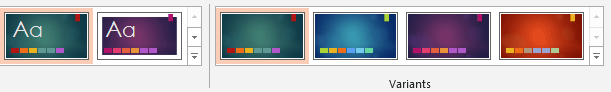
PowerPoint 2013 and 2016 for Windows and Mac all feature a new theme format developed by Microsoft: the Super Theme:
Super Theme Color Variants
The user sees a preview of the color palette that will be used, then picks the variant they want to use. It’s an elegant, attractive interface and makes the design variants plainly visible on the Ribbon. Super Themes also allow the inclusion of size variants, so that resizing a deck doesn’t distort the logos.
Brandwares now creates custom Super Themes, so we can make these for you. However, the technique is tricky, so if you’re an independent designer without the budget for professional assistance, you’ll have to find another way. Fortunately, there are other methods to add multiple color themes.
Multiple Color Themes: Hacking XML
This technique works to add multiple color themes to PowerPoint. You can also add them to Word and Excel files, but those programs will simply ignore them. These extra color themes will travel with a theme saved from such a Word or Excel file, but you already knew that PowerPoint is the program to use for creating theme files. To hack the XML, start by reading XML Hacking: An Introduction. If you’re using a Mac, you should also read XML Hacking: Editing in OS X.
Now, expand your Office file to see the XML. Open the ppt folder, then open the theme folder inside that. PowerPoint saves every theme that’s ever been applied to the presentation, starting with theme1.xml, so you’ll have to check the theme name in each variant to get the right one. If you’re trying this with Word or Excel, look in word\theme or xl\theme respectively, where you will find only one theme1.xml file.
Format the XML to be readable, then go right to the bottom of the listing, where you’ll find the self-closing stub called <a:extraClrSchemeLst/>. First, open up the stub:
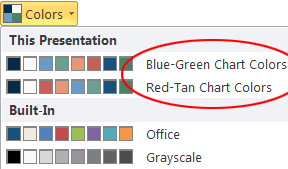
The syntax is exactly the same as for the clrScheme listing that every theme includes as its main color theme, so you can simply copy and paste the whole block of XML. The theme file can hold any number of extra color schemes. When you are using the final file, you can change the theme colors by choosing View>Slide Master>Colors in PowerPoint (actual menu names change in different versions of Office).
Clicking on the Colors dropdown shows the extra color themes.
When you choose a new color theme, all elements keyed to the color theme will change throughout the presentation.
Multiple Color Themes: Multiple Masters (PowerPoint only)
For Word and Excel, a document can have only one color theme applied at a time, and that theme affects all pages in the file. PowerPoint allows more flexibility, since it can have multiple master slides and each of those master slides has its own color theme. This means that different parts of a PowerPoint file can have different color themes. This is often used to color-code different sections of a presentation.
In its most basic form, this is the simplest technique. No XML hacking required:
In PowerPoint, choose View>Slide Master to view the masters.
Right-click on the Slide Master (the larger slide at the top of the left-hand display) and choose Duplicate Slide Master. The new master is added below the slide layouts for the first master. (In Windows versions, right-click and check that each Master has the Preserve Master attribute checked, or they’ll vanish later.)
Select the new master, then choose Color>Customize Colors.
Revise the color theme, or apply a color theme you created earlier. OK out.
Repeat the steps above for each different color theme you need to include. In the program interface, the user will see a group of slide layouts for each slide master. Here is a presentation where only one colors changes in each color theme:
Each master has its own color theme and slide layouts.
While this is the simplest method to use, it’s not self-evident to all users that you change color themes by choosing a different set of slide layouts. So you’ll probably have to include at least an explanatory note with the template when you distribute it. But what if you want a premium solution for a high-end client? Read on…
Multiple Color Themes: XML Hacked Multiple Masters (PowerPoint only)
A solution that is simpler to use is to combine techniques 2 and 3. Create multiple masters, each with a different color theme. This will create a theme#.xml file in ppt/theme. Open all the theme#.xml file and copy the clrScheme for each to an extraClrScheme tag in all the others. So if you have 3 masters and color themes, copy the clrScheme tag for theme1.xml to an extraClrScheme tag in theme2.xml and theme3.xml. Then copy the clrScheme from theme2.xml to extraClrScheme tags in theme1.xml and theme3.xml.
The result is that it doesn’t matter so much which master you choose, you can change the color theme later. Of course, changing the color theme affects all slides based on the same master. This is an easy-to-use method for providing presentation with sections in different colors.
My thanks to Timothy Rylatt for his assistance with fact checking and corrections in this article.
Brandwares employees are world experts in PowerPoint template and theme creation. Send me a line at production@brandwares.com for assistance with your project.
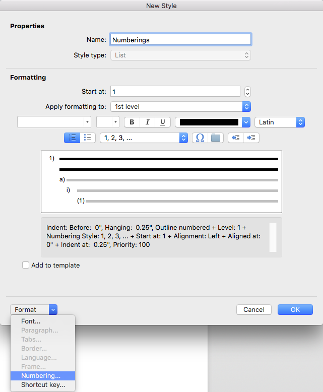
In my last post, I translated the classic method of outline numbering for macOS. But Shauna Kelly’s original steps have an element of personal preference them. We can also get reliable results from outline numbering variations.
I think one notable restriction of Shauna’s procedure is that she relies on the built-in Heading styles. Often a numbering scheme is required that has nothing to do with headings. Here’s how we can separate these concepts and create solid numbering using an arbitrary style set. This applies to both Windows and OS X versions of Word.
Outline Numbering Variation – Alternative Styles
In Shauna’s classic technique, the first step is to revise the built-in Headings 1 to 9 so that Heading 1 is independent of other styles, then all the subsequent headings inherit characteristics from Heading 1. We’ll reuse this basic concept for a different style set.
First create a style that will be the basis for the first level of your outline numbering. For a start, this style should be based on No Style (Word for Mac: Format>Style>Modify>Style based on:>(no style) Word for Windows: Ctrl + Alt + Shift + S to open the Styles list>Click on Manage Styles button>Modify>Style based on:>(no style)). This style really only needs to include the font, font size, line spacing, space before and after the paragraph. Any indenting or number style will be handled later. For this article, let’s call it Number Style 1. There is one essential parameter you must set. In the Paragraph format for the style, you must set the Outline level to Level 1 (With the Modify Style dialog still open, click on Format>Paragraph>Outline level. This is the key to making this work!
Next, we’ll create the second style. Start by basing it on Number Style 1, then format whatever variation it might have, staying away from indentation or numbering. Outline numbered styles are often very similar, this style might be exactly the same as Number Style 1. However, in Format>Paragraph, Outline level must be set to Level 2. Are we picking up the pattern yet?
Each additional style in the outline numbered series must be:
based on the previous style, and
have an outline level that is one level down from the previous style.
As long as you can format a chain of styles following these principles, you should be able to get it to work with the technique on this page for MacOS (replace the first section Outline Numbering in Word for Mac – The Classic Method with the procedure on this page) or Windows (replace section 3. Set up your Heading paragraph styles with this page’s technique instead.
You can create nested sets of bullet styles by following the same steps as above. When the Define new Multilevel list dialog is open, use the dropdown called Number style for this level, scroll all the way down and you’ll find 6 bullet presets and options for choosing a different bullet or a picture bullet. Nested bullet styles work like outline numbering for bullets, though they’re a new concept for most users.
Feel free to post constructive comments suggesting improvements, I’m always trying to make these articles better.
Unlike most of my articles, this one is not a piece of original research. Shauna Kelly wrote the definitive method for producing outline numbering in Word several years ago. Unlike most of what you’ll read about techniques for creating numbering in Word, Shauna’s procedures actually work reliably. Unfortunately, Ms. Kelly passed away several years ago, though her web site has been kept going by volunteers. You can read her original posts here: How to create numbered headings or outline numbering in Word 2007 and Word 2010. My contribution is to document the steps needed to produce outline numbering in Word for macOS.
The names of some commands are different, or they’re found in a different place. I’m sticking to the step-by-step approach. For an in-depth explanation of why the steps work, please consult Shauna’s original pages. These instructions are quite specific. Please don’t include any steps not on the list below, or you’re on your own for the results.
Shauna argued strongly for using the built-in heading styles Headings 1 through 9. There’s nothing wrong with this and it can save a few steps. Sometimes, however, I prefer to save heading styles for headings and create a separate set of styles for numbering. In this article, I’ll translate Shauna’s classic method. The next post shows some optional variations: Outline Numbering Variations. If this is to be the basis for future documents, you want to be making these changes in a template. If you do this in a document and don’t apply the changes to the source template, you’ll have to redo all these steps for the next document or copy the styles using Word’s Organizer (Tools>Templates and Add-ins>Organizer in Word for Mac). Whenever you copy outline numbered sequences, you need to copy the styles that are linked (Headings 1 to 9 in this example) plus the List style (Numberings in this case).
Outline Numbering in Word for macOS – The Classic Method
Setting up the Styles
Choose Format>Style and select Heading 1. (If you’re not already using Heading 1 in your document, change the List: dropdown to All styles)
Click on the Modify button.
Change the Style based on: dropdown from Normal to (no style) at the top of the list, then click on OK. While the dialog is open, choose Format>Paragraph and set the Left indent to 0 and the Special indent to (none). If there is any indenting, these will be set later. If you had already formatted Heading 1, you may need to make some changes after detaching it from Normal.
Select Heading 2, click on Modify and change Style based on: to Heading 1. OK out.
Repeat step 3 for each built-in Heading style, for as many levels of outline numbering as you require. Each style should be based on the one before.
Opening the Right Dialog Box
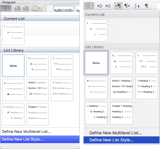
In the Paragraph section of the Home tab, choose Multi-level List>Define New List Style. Avoid starting from Numbered List, that is not reliable. Multi-level List>Define New List Style in Word 2011 (left) and 2016/2019/2021/2024 and 365 (right)
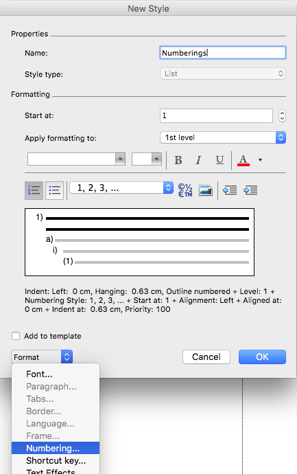
In the Define New List Style dialog, give your style a plural name like Headings or Numberings, since this will apply to several styles.
Click on the Format button and choose Numbering.
Word 2011:Word 2016/2019/2021/2024 and 365:
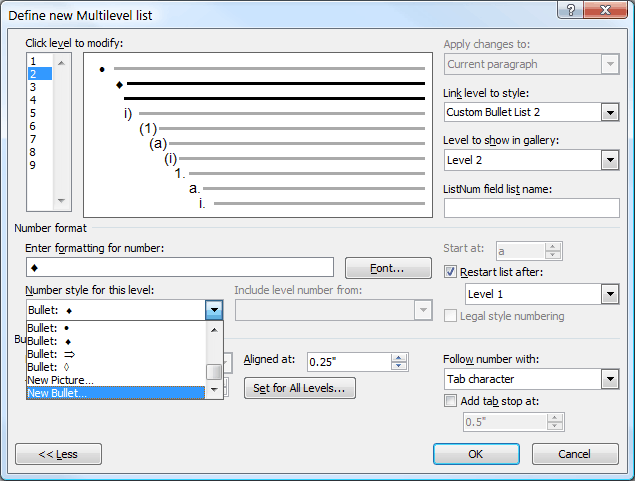
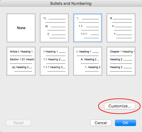
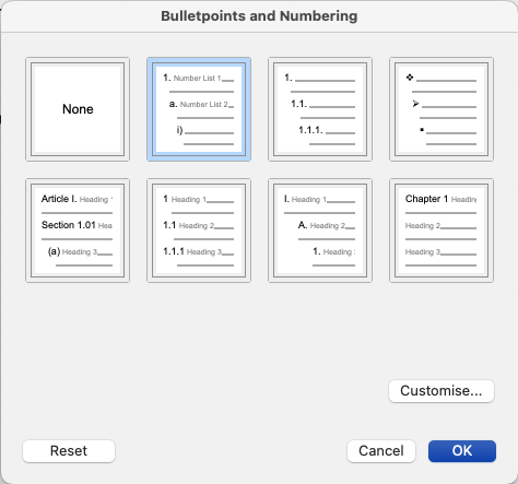
Now the Bulletpoints and Numbering (or Bullets and Numbering) dialog opens, an extra step that doesn’t happen in Word for Windows. If you just need plain legal-style numbering, there is a preset you can select for that. But for custom numbering, click on the Customize button.
Link a Paragraph Style to a List Style
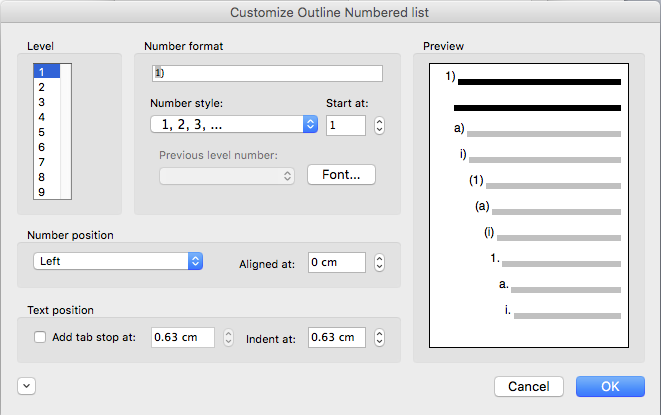
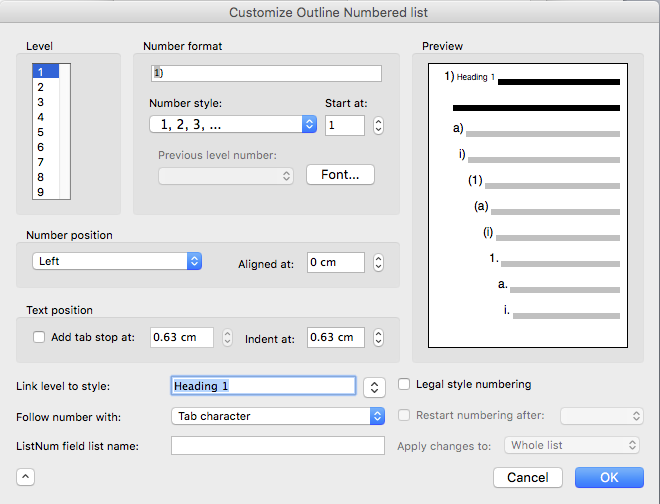
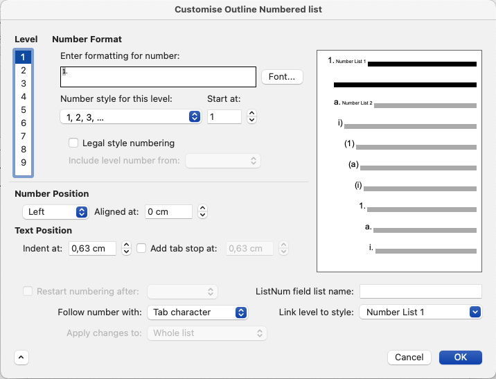
Finally we get to the Customize Outline Numbered List dialog. Once this dialog is open, we will leave it open until all levels are set up. Start by clicking on the dialog expander button (the button in the lower left with a down-pointing arrowhead) to see all the options: Word 2011:Word 2016/2029/2021/2024 and 365:
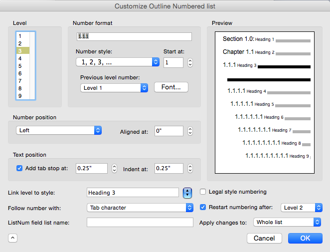
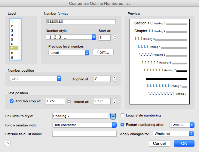
Start by selecting 1 in the Level list.
Next, we attach the paragraph style to the list style. Select Heading 1 in the Link level to style dropdown: Word 2011:Word 2016/2019/2021/2024 and 365:
Now set the numbering for the style. In the Number format (Word 2011) or Enter formatting for number (Word 2016/2019/2021/2024 and 365) field, delete any content displayed. If the first outline numbering level starts with text, like Chapter 1 or Section 1, type in the text and a space.
Using the Number style: (Word 2011) or Number style for this level: (Word 2016/2019/2021/2024 and 365) dropdown, choose the number appearance. Outline Numbering in Word for Mac has a quirk: the Level 1 choice is already displayed, even if no number appears in the Enter formatting for number: box. Just click on the dropdown and re-select the Level 1 that already appears selected and Word will do the right thing. A number appears in the Number format: or Enter formatting for number: field.
Return to Number format (Word 2011) or Enter formatting for number (Word 2016/2019/2021/2024 and 365) and add any punctuation, symbol or text that is to follow the number.
Set the Number position and Text position. Both numbers are the distance from the left margin. Left alignment for numbers is most common, but Roman numerals can look better right-aligned, since their width varies more. Normally the tab and indent are set for the same amount. The tab controls the position of the first line, and the indent sets all the lines in the paragraph after that.
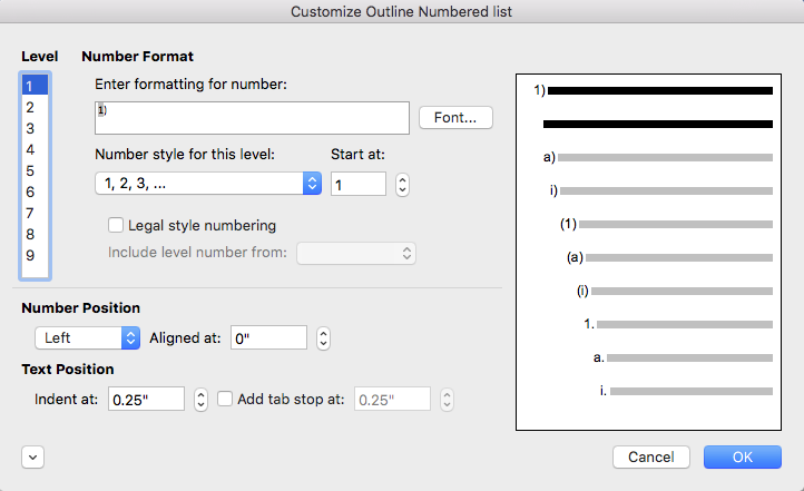
Repetition for All Levels (Legal-style Numbering)
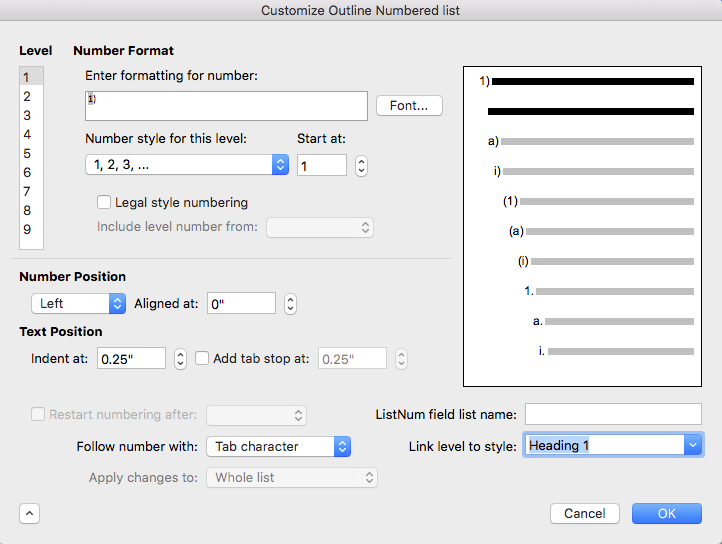
Doing the rest of the levels involves repetitive steps that get a little longer with each level. Here are the steps for level 2:
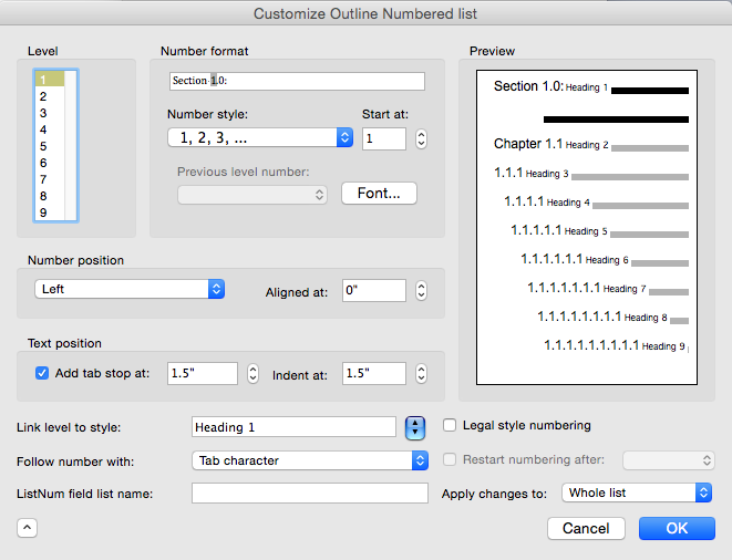
Select 2 from the Level list.
Choose Heading 2 from the Link level to style dropdown.
Delete the contents of Number Format (Word 2011) or Enter formatting for number (Word 2016/2019/2021/2024/365).
Set Previous level number (Word 2011) or Include level from (Word 2016/2019/2021/2024/365) to Level 1.
In Enter formatting for number, type a period.
Click on the Number style (Word 2011) or Number style for this level (Word 2016/2019/2021/2024/365) dropdown and choose 1,2,3, … or other number style.
Set the Number position and Text position.
So far, so good. Now let’s do level 3:
Select 3 from the Level list.
Choose Heading 3 from the Link level to style dropdown.
Delete the contents of Number Format or Enter formatting for number.
Set Previous level number or Include level from to Level 1.
In Enter formatting for number, type a period.
Set Previous level number or Include level from to Level 2.
In Enter formatting for number, type a period.
Click on the Number style or Number style for this level dropdown and choose 1,2,3, ….
Set the Number position and Text position.
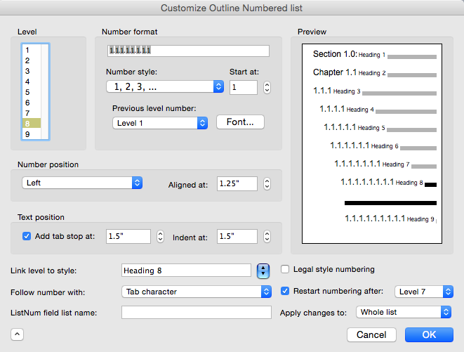
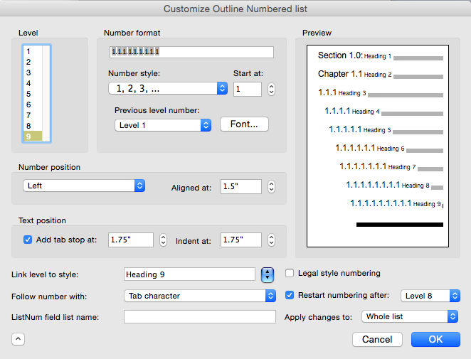
Steps for Level 4:
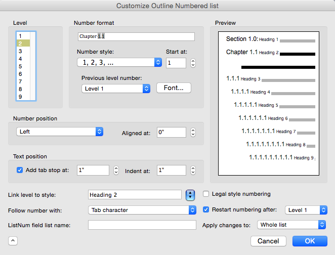
Select 4 from the Level list.
Choose Heading 4 from the Link level to style dropdown.
Delete the contents of Number Format or Enter formatting for number.
Set Previous level number or Include level from to Level 1.
In Enter formatting for number, type a period.
Set Previous level number or Include level from to Level 2.
In Enter formatting for number, type a period.
Set Previous level number or Include level from to Level 3.
In Enter formatting for number, type a period.
Click on the Number style or Number style for this level dropdown and choose 1,2,3, ….
Set the Number position and Text position.
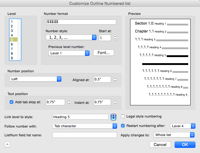
Are you seeing the pattern? Each additional level repeats the previous steps and adds 2 new steps. By the time you get to level 9, you’ll have set the previous level and typed a period 8 times before setting the last number!
Editing Outline Numbering in Word for Mac
Like every good designer, you’ll probably want to tweak these styles later. For paragraph styling, like the amount of space before or after, you can simply modify the paragraph parameters. That’s easy. In the Quick Style Gallery, right-click on Heading 1 and choose Modify Style.
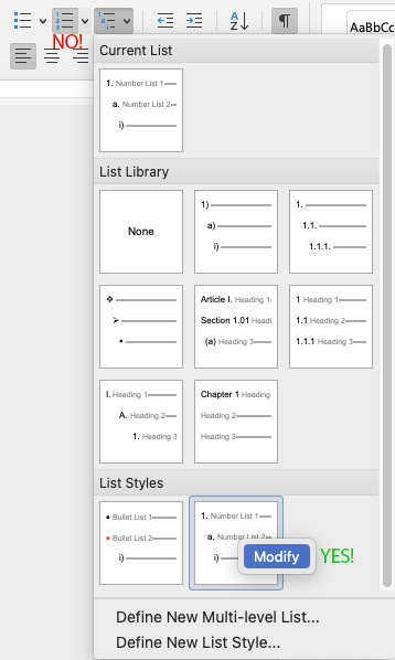
But for anything to do with the numbering or its positioning relative to the paragraph, you need to edit in the Outline Numbering dialog. Unfortunately, Word for Mac has a completely non-intuitive method for getting a list style into editing mode.
When the insertion point is in an outline numbered style, the Home>Numbering dropdown will be highlighted. But that’s the wrong dropdown for list style editing! Instead:
Click on Home>Multi-level List. The custom list style(s) are at the bottom of that dropdown below the heading List Styles.
Right-click on the list style you want to change and choose Modify:
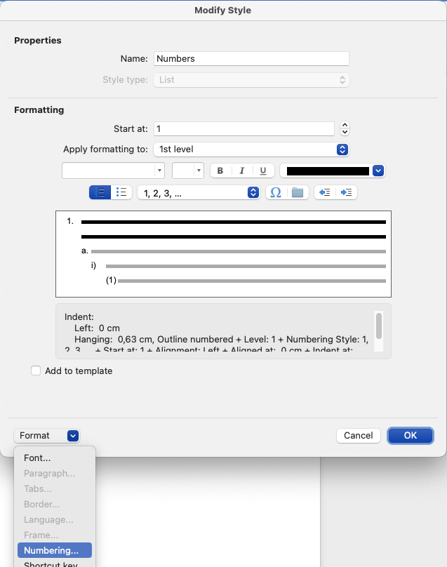
In the Modify Style dialog, choose Format>Numbering.
In the Bulletpoints and Numbering dialog, look at the highlighted list style. It should display the paragraph style names in the preview, the styles that are attached to the list style. If it does, click on Customize.
The Customize Outline Numbered list dialog opens, where you can teak the numbering, lettering and/or bullets, and the indentation.
OK out when you’re done. The numbered style should automatically update.
Outline Numbering in Word for OS X: The Customize Outline Numbered list Dialog
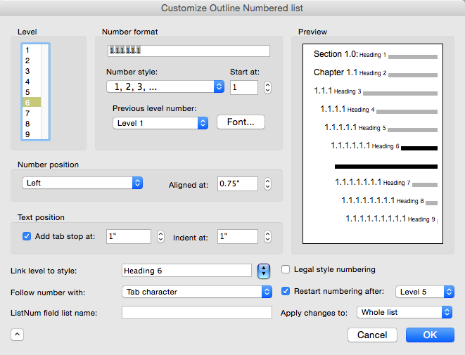
Here are the final results for an outline numbered style. These shots are from the same dialog, only the Level number has been changed.
You can use Brandwares’ expertise to set up your outline numbering. Contact me at production@brandwares.com for an estimate.
Word is found everywhere, but Word users with training are a scarce commodity. It’s a shame, because a little training can go a long way to get really nice results. This article will cover the most common formatting mistakes that Word users make. If you’re a designer, you could still benefit, I see plenty of these errors from design companies as well.
Formatting Mistake #1: Not making the Non-printing Characters Visible
Pretty View
By default Word is set up to show “pretty” documents. Microsoft has decided that users want to see what the printed output will look like on-screen. So Word hides all the control characters that are vital for reliable formatting. Users can’t see the hidden formatting that they are inserting or deleting. Result: formatting mistakes! The only way you can provide professional documents for clients is by making these visible so you can deal with them. When you want to see the printed result, do a Print Preview. It’s fast and more accurate than the “pretty” screen display.
Useful View
The exact steps for show the control characters is slightly different for each version of Word, so I’m not going to list them all here. To start in OS X, look for Word>Preferences>View, in Windows, choose File>Options>Display. Make all the non-printing or formatting characters visible. It’s also helpful to display Bookmarks, Object anchors and in Word 2010/2011 or earlier, Text Boundaries. In Windows, these last three are found on the Advanced tab of Options.
Now you can see Paragraph Marks, which hold the paragraph formatting for the text that precedes it. You can see the Section Breaks that hold all the header/footer, margins and page orientation information for the paragraphs preceding it. And you can see the Anchors for text boxes and floating pictures, which makes it much easier to anchor to a paragraph that is likely to stay on the same page.
Formatting Mistake #2: Creating New Pages with Multiple Carriage Returns
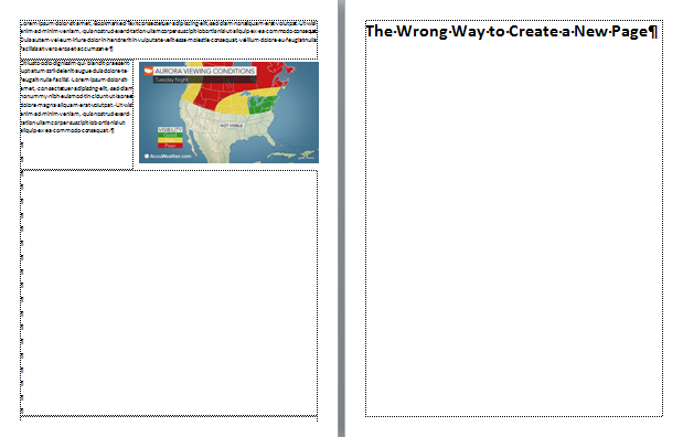
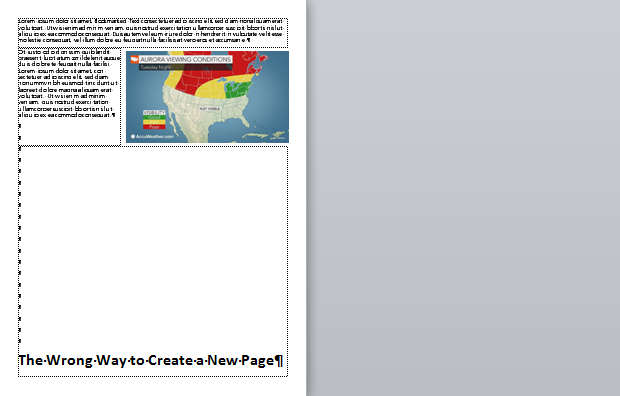
This is the classic hallmark of the Word user who has never taken a course or cracked a book. At the end of a topic, they’ll type enough carriage returns to get to the next page, then type a new heading. It looks perfectly fine on the original computer:
How it looks on your computer.
But then it’s sent to a different computer with different fonts or a different printer. The heading that supposed to be at the top of a page either moves to the bottom of the preceding page, or moves down so it’s not at the top of the page anymore. It doesn’t matter much which one happens, because the formatting mistakes scream Amateur Hour:
How it looks on a different computer.
Text flow in Word depends heavily on the font being used and the printer that has been selected. If you move the document to a different computer, they might not have the same font. Even a change in the version of a font is enough to make the text break differently. As for the printer, Word fabricates pages on the fly by using the metrics of the selected printer. These metrics come from the printer driver. So if the user who receives the documents has a different printer, or even a different driver for the same printer, the pages will be laid out differently.
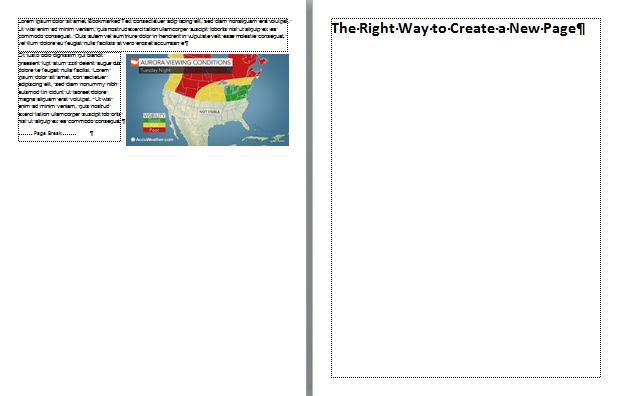
The knowledgeable Word worker will insert a Page Break (not a Section Break) at the end of a text block to create a new page:
Page break: How it looks on every computer.
A really clever user will create a heading style that includes the paragraph attribute Page break before, so that whenever the heading style is applied to text, it automatically pops to the top of a new page:
Heading Style using Page Break Before Setting
Formatting Mistake #3: Using Tabs to Arrange Data in a Grid or Table
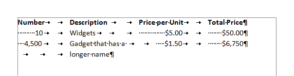
Whenever you need to arrange comparative information in rows and columns, you’re creating tabular arrangement. It’s always a good idea to pause for a moment and really look at the kind of data you want to present, so that you can choose the best format for that. If you find yourself using tabs and spaces to create a grid of data, STOP.
Making a lame table with tabs and spaces.
Information in a grid is tabular data (from which the tab key takes its name), but tabular data should go in a table. That’s what they’re for! Tab keys are left over from typewriters, when there was no other way to create a data grid. Designers are also guilty of creating grids with tabs, because table tools are relative newcomers to page layout software.
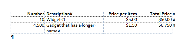
Use a table to arrange tabular information.
Tables are also the only professional way to make forms, which brings us to our next common mistake:
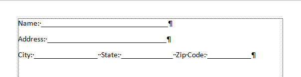
Formatting Mistake #4: Using Typewriter Techniques to Make Forms
Word, especially Windows versions, is loaded with excellent form-creation tools. But you’d never know it from the forms I almost invariably see created in that program. The common approach is to type a text heading, then dozens of underscores to indicate where the form-filler is to enter their data. This could pass for forms that are printed out and filled with a a pencil. You know, like people used to do 50 years ago:
Typewriter-style Form
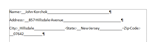
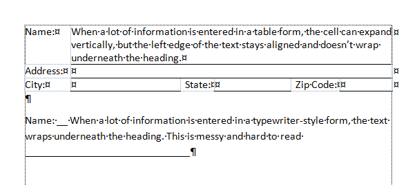
Open the Word “form” on your computer and try filling it in. As you type, the underscores remain, trailing after your text. Type a couple of line of text: the left side of the filled portion falls underneath the heading, not to its right. The professional term for this is “a dog’s breakfast”.
The form falls apart when filled.
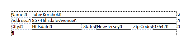
For forms that are filled on a computer, you need a much more robust method. Create a table with a cell for the heading and a separate cell for the filled-in area. If the form will only be filled out on the computer, you don’t need any horizontal rules to guide your text. The computer does that for you. If the form is intended to be dual purpose computer or hand-filled, add a thin border to the bottom of the filled-in cell. No other border are necessary or desirable. All of a sudden you have a form that is neat before and after filling, easy to read, even, dare we say, good-looking!
The right way to make a form: with a table.
Here’s a comparison of a table form and a typewriter-style form when filled with longer text:
Inserting long text
Formatting Mistake #5: Local Formatting Instead of Styles
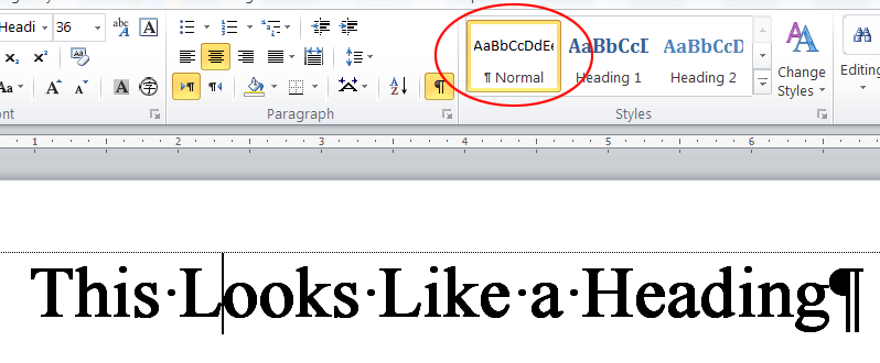
Another giveaway of the Word amateur is when you click on different types of text and heading, but the Style always says Normal. This means the creator of the document made no use of Styles. Perhaps they think they are saving time, but the opposite is true. Repurposing or updating an unstyled document takes almost as long as creating it in the first place. Plus, useful Word features like a Table of Contents or the Navigation Pane don’t work well without using styles.
Using local formatting to imitate true styles.
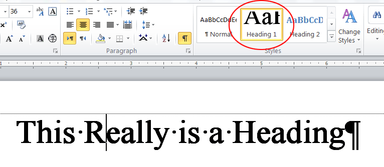
After taking just a few minutes to create some basic styles everything about document creation and revisions is much faster. Styles are a true productivity booster. If you’re not using them, either you are wasting a lot of time, or you’re making someone else fritter away hours of their work day. Styles ensure your documents have a consistent, professional appearance. Updating their appearance in the future takes only a few minutes. It’s what the pros do!
A Heading Style applied.
We’re Word professionals! Brandwares will create technically perfect templates and documents for your company. For bullet-proof files, contact me at production@brandwares.com.
This article was written a few years ago, but changes to both Windows and macOS have made the issue of setting accurate color easier to solve.
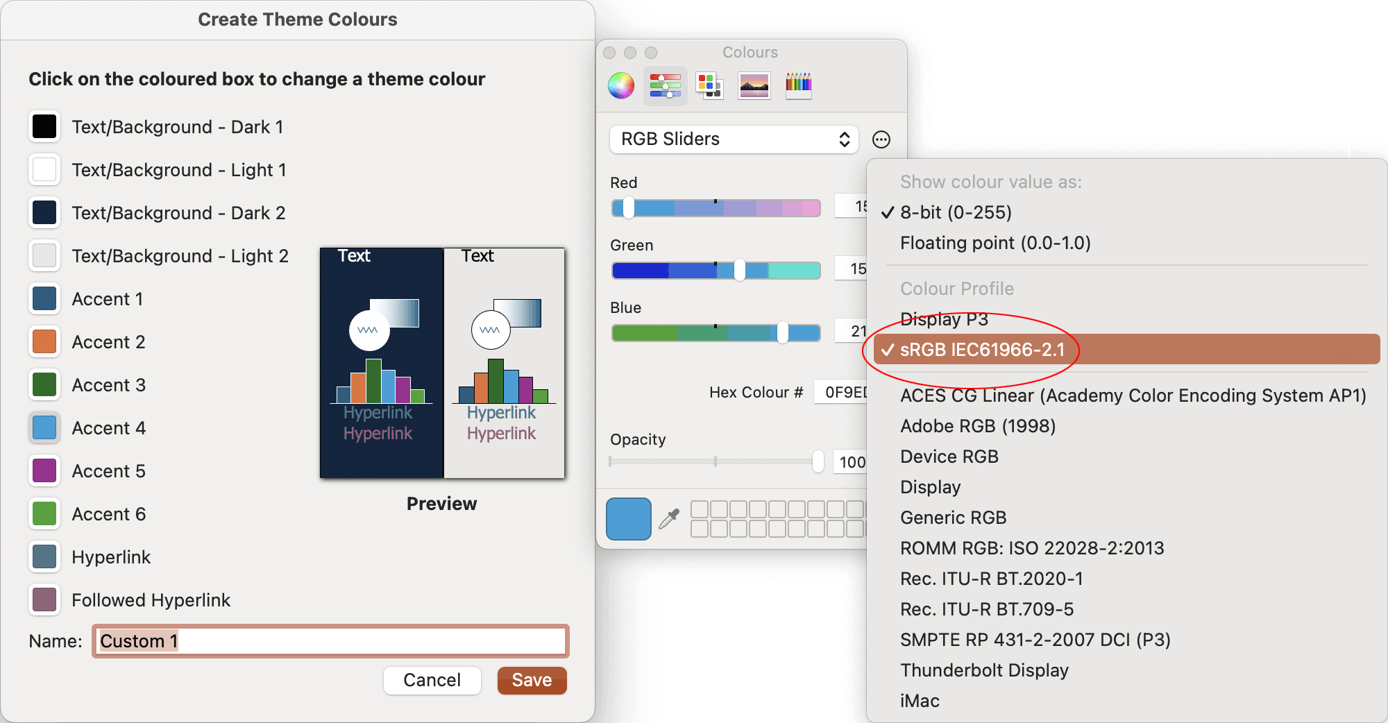
Current versions of Windows set the default display color management to sRGB IEC61966-2.1. In current editions of macOS, the color picker has an option to choose colors from that same profile. Switch the color picker to RGB sliders, select the sRGB IEC61966-2.1 profile and your RGB values should match values set in Windows. In testing here, it’s working to set mostly accurate color in PowerPoint for Mac and for Windows.
It’s still important to choose RGB colors when exporting from Illustrator to Office, as mentioned in the article below.
Just a reminder, though PowerPoint allows you to use the color picker to select CMYK colors or Grayscale, those selections are always converted to RGB and stored in RGB format. Always select colors with the RGB sliders for predictable results!
The 2015 article:
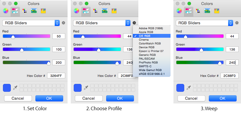
With the advent of Yosemite, the Mac color picker has acquired color management. While this may be a godsend to users in a color-management workstream, everyone else is put in a tough spot. You can’t create accurate color values for apps that are not color-managed, which is the majority. This isn’t such a big deal in, say, BBEdit, where the color only has to be close. But for corporate presentation software like PowerPoint, it’s a disaster. It’s simply impossible to set accurate corporate RGB colors in a presentation.
You can see this in action if you have PowerPoint on a Mac. Open it up, select any text or shape and set the color. RGB Sliders is the place to do this. Enter R50 G100 B200, then click on OK. Now, reopen the color panel: the values have changed! Continuing the test, enter R50 G100 B200 again. Click on the gear icon beside the RGB Slider dropdown and select a different color profile. The color values change before your very eyes! Yikes!
When I first ran across this issue, the only 2 workarounds I could think of were to run PowerPoint on an older OS or on Windows. I have a couple of machines on Snow Leopard and there is no problem settings colors accurately. I also use Bootcamp and Parallels and PowerPoint under Windows sets colors correctly. But both of those a clunky options, so I kept researching.
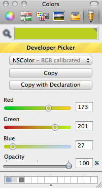
I’ve found several alternative color pickers that solve the problem. Today I’m writing about Developer Color Picker. While this is aimed at web developers, it works well for graphic designers as well. There instructions that come with the download, but basically you just copy the downloaded file into your user Library>Color Pickers folder, then restart your applications. (If your Library folder is hidden, hold down the Alt key and click on Go in the Finder. Library will be in the list.)
When you restart PowerPoint, you’ll discover an additional panel in the picker. The colors you enter on this panel are accurate and stable, unaffected by color management. Use this to set your PowerPoint theme colors and you’ll have happy clients once again!
EDIT
This article is a few years old, and the color picker I mentioned has been mostly retired. However, there are lots of alternatives. Just do an internet search on macOS web developer color picker.
EDIT
Since publishing the above, a client mentioned a similar problem area: exporting client logos from Adobe Illustrator. It’s not enough to set RGB colors in Illustrator. You also have to use File>Document Color Mode to change the default CMYK mode to RGB. Otherwise, Illustrator’s color management will alter your RGB values and the resulting logo will not match brand standards.
Specifying fonts for electronic documents creates more hassle for clients and users than designing for print or web. This is because desktop applications need to have the font installed on each computer creating the documents. The cost can be high and installation by the client’s I.T. department is usually required. But these are technical hurdles that can be overcome if the client buys into a perceived necessity to have a different look than the competition.
There are 2 inter-related problems that crop up next: font families and cross-platform use. Font families are grouping of fonts that are linked so the user can switch between regular, italic and bold variants by clicking on attribute buttons. This is different from standard usage in the design world, where single fonts predominate. Designers are used to switching to a bold or italic look by picking a different font from the font menu, rather than by clicking on a bold or italic button. I’ve previously discussed font family issues here.
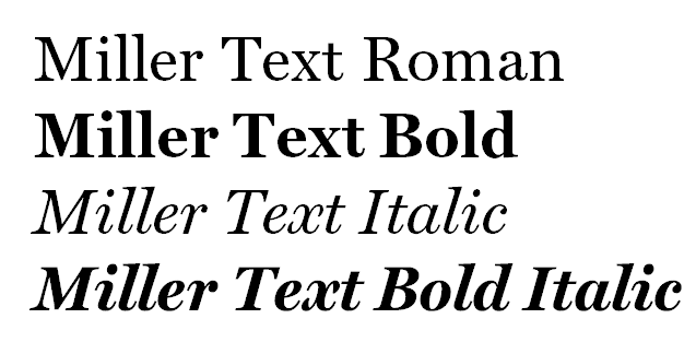
Same font, same document, different platform. The small-foundry font displays and prints with tighter linespacing on a Mac (at right).
Today I’m focussing on the awful things that can happen when font families are specced for use with both Windows and Mac OS X. Surprisingly, it is not easy or simple to create families that work well on both platforms. The most popular software used by independent font designers doesn’t do this correctly, though we have filed numerous bug reports with the company. The net result is that if you spec a font from a small foundry that is going to be used on both Mac and Windows, it’s very likely not going to work. It’s not universal, there are some very skilled individual font jockeys who have the knowledge and skill to do it right. But you’re only going to find out the hard way, by buying the font and trying to use it.
Let me clarify, these fonts will work fine on either Windows or Mac. We can set up a template to make it work for either platform. You only see the anomalies when you move a document from one platform to the other.
Brandwares can provide fonts for your client’s project. Our service includes speccing the correct family groupings and supporting installation and troubleshooting. This includes working with the foundry to create correct families for cross-platform fonts.
I also encourage designers to ask your client the Mac/Windows question sooner rather than later. Call the foundry and ask if they can test on both platforms. I’ve known type designers who only own a Mac and don’t have any way of testing on Windows. When files are going to be used on both, speccing fonts from a large foundry is a good solution. They use different software and we have never seen a bad Mac/Windows family from one of the big companies. But the most practical solution is to stick with the wide variety of fonts that come free with Microsoft Office. They are high-quality faces, already installed and FREE! Your client appreciates a bargain, too!
Testing Light and Regular font families from a small foundry. Windows on the left, OS X on the right. Yes, they’re supposed to be the same. No, they’re not.